PHOTOGRAPHING THE ENGLISH NORTH: 1890-1990

This* is an exhibition at Bolton Museum and Art Gallery which lasts until the end of April. It’s solid, unpretentious and has something for everyone, photographically speaking: landscape, cityscape, coast, industry, portraiture and photojournalism. There are some fifty prints in a beautiful mezzanine room toplit through rooflights which you enter by a broad staircase.  Fifty is a good number: big enough for variety but small enough for you to give each one some attention.  Each image is mounted (sloppily in some cases) and framed, apart from three Leeds City Council Archive prints which are set on foamboard for some reason.  The hanging scheme seems to be geographical, starting with the north-east, down the coast, then inland to Yorkshire and over the Pennines to the north-west.  This is a bit confusing chronologically but never mind.

The theme, as set out by curator Dr Ian Glover of Bolton University is to examine the photographic representation of the north of England over the century 1890-1990.  That’s a big task for fifty  photographs.  All the names are here: Bill Brandt, Bert Hardy, Frank Meadow Sutcliffe, Martin Parr, Sirrka Lissa Konttinen, Fay Godwin, Humphrey Spender etc.  Naturally enough, many, many of the images are old friends, too. 

Bill Brandt: Durham Coalminers’ Houses. A well-known image but still carrying a lot of impact.

Bill Brandt: Durham Coalminers’ Houses. A well-known image but still carrying a lot of impact.

George Melly by Chambré Hardman © National Trust

George Melly by Chambré Hardman © National Trust

There are  surprising omissions as well: no Peter Mitchell or Don McPhee or Denis Thorpe or Martin Jenkinson or Dorothy Bohm or Shirley Baker. But there were others that I hadn’t seen before like the charming portrait of George Melly to the right which was one of a series of images in the exhibition of the Liverpool middle classes by Edward Chambré Hardman. I had been vaguely aware of Chambré Hardman’s existence from the National Trust stewardship of his old studio in the city. I thought these were a standout of this exhibition (including a rather Hitchcockian Archbishop and a truly surreal-looking portrait of a family named Woolley).

Chronologically the exhibition is tilted quite steeply towards the later 20th century.  There are only two photographers representing the first decades: Frank Meadow Sutcliffe and Thomas Shires (new to me; a Victorian photographer of Vanishing Bolton).  Nearly all of the rest (bar Hardman and Brandt) are post WW2.

Tow Path, Blackburn, Lancashire, 1984, © Michael Kenna. I love Michael Kenna’s work, too, but I wouldn’t have said it is particularly representative of the north of England. He is known more for his mystical, dreamlike style.

Tow Path, Blackburn, Lancashire, 1984, © Michael Kenna. I love Michael Kenna’s work, too, but I wouldn’t have said it is particularly representative of the north of England. He is known more for his mystical, dreamlike style.

In the booklet accompanying the exhibition the curator says: “I think it is important, at this time in our geographical, historical and demographic development, as we leave the European Union, to examine how the north of England has been represented by photographers.” (I am not entirely sure what he means by geographical development - or indeed demographic development.) That is very ambitious and I can’t say that, for me anyway, any themes emerged from the images themselves or from the rest of the curatorial essay.  How was the north in fact photographed – accurately, sympathetically, dramatically, distortedly….?   At one end of the scale you have Martin Parr as a kind of Donald McGill of the camera; and at the other you have serious social commentators like Bill Brandt.  In between, documentarists, landscapists and social reformers all have their say.  But you could get a very similar range of pictures for that period from Clydeside or Wales.  The image of the north of England, in the popular imagination anyway, is of coalmines and milltowns strung across a  mystical Pennine landscape but I’m not sure that in fact the north hangs together as easily as that. Huge parts of the region were never industrialised and aren’t Pennine: the Lake District, the East Riding, much of the North Riding and Northumberland. There is a significant east/west split as well.* So maybe we could say that photography has played a part in perpetuating a not inaccurate but not very inclusive view of the north.  That is perhaps why Hardman’s photographs stand out for me in this exhibition: a smiling bourgeoisie perhaps but an interesting departure from the standard northern themes. (One or two of the photos in the exhibition are of Cheshire, by the by.  Cheshire?  That’s not The North.) 

I thoroughly enjoyed the exhibition.  Good size, no nonsense, some knockout photos and a great venue. I followed it with fish and chips at Bolton’s wonderful Olympus Fish and Chip Restaurant with live piano player, too. (Okay, he’d hardly be dead, but you know what I mean.) Then I took a good long walk with the mighty Hasselblad on Smithills Moor above the town. 

Does life have any more to offer than a day like this? I think not.

 *Photographing The English North 1890-1990: at Bolton Museum, Le Mans Crescent, Bolton, BL1 1SE : 14 March - 26 April 2020. There is nothing on its website but I imagine that the museum is shut now due to virus restrictions. I hop that the exhibition may continue a little beyond its set dates. Photographers exhibited: Bill Brandt, John Bulmer, John Davies, Ian Glover, Fay Godwin, Edward Chambré Hardman, Bert Hardy, Michael Kenna, John Kippin, Sirrka Lissa Konttinen, John Macdonald, Tish Murtha, Martin Parr, Humphrey Spender, Chris Steele-Perkins, John Stoddart, Frank Meadow Sutcliffe.

**See the opening chapter of Peter Ackroyd’s History of England, Volume 1 for some basic facts about that.

CECIL BEATON: SIC TRANSIT GLORIA

Cecil Beaton: Portraits And Profiles; ed. Hugo Vickers; Frances Lincoln Publishing 2014)

Cecil Beaton: Portraits And Profiles; ed. Hugo Vickers; Frances Lincoln Publishing 2014)

Cecil Beaton.  It’s that first name which pins him to an epoque.  Despite the current fad for old-fashioned forenames, ‘Cecil’ seems to be a step too far for most of today’s parents with its hint of the fop, dandy, boulevardier or popinjay.  Perhaps for that reason I always had Beaton down as a minor talent but a book I picked up recently for a song changed that (right).

It is nearly 300 pages of Beaton’s portrait photographs ranging from the bright young things of the twenties, through the war years, Hollywood of the forties and fifties and then the swinging world of the sixties, consisting of film stars, politicians, artists, socialites and royalty.  The only requirement for a sitter is celebrity. It’s interesting as a sociological record and also as a personal chronicle of those times – especially the years now receding from living memory. Who now remembers the likes of Stephen Tennant, Paula Gellibrand, Daisy Fellowes, Clarissa Churchill – or the soldier below?

Lt. General Sir Adrian Carton de Wiart VC. A hero in his day - but who remembers him now? (© Cecil Beaton Archive at Sotheby’s)

Lt. General Sir Adrian Carton de Wiart VC. A hero in his day - but who remembers him now? (© Cecil Beaton Archive at Sotheby’s)

It’s funny.  Photographs of the common people, the unknown and unsung, always seem to me to grow in stature as the years pass while those of celebrities seem to shrink.  The only reason a celebrity is photographed is because he or she is well-known.  As the sands of time bury them that celebrity is gone and it seems as though very little is left – as if that glamorous shimmer were nothing more than a trick of the light.  The reason that these ones have survived is not so much due to the standing of the sitter as that of the photographer.

Unlike, say, Jane Bown, the Observer’s great photographic portraitist who often had absolutely no idea whom she was photographing, Cecil had a bat-like radar for social standing and an incurable social ambition.  And he brought something more than his camera to the party because he had sensibility and talent beyond the mere photographic. That gave him a status with the beau monde that a mere photographer would not otherwise have had.  He was a diarist, artist, writer, and set and costume designer and as his reputation grew so he took his own place in the world he was photographing. So these are, above all, the photographs of an insider.

To my eye, the photography ranges from so-so to exceptional: in a career as long as his not every shot could be a winner after all.  But portrait photography must be tough.  You have maybe a few minutes or a little longer to set up something which you hope will be memorable and revealing with little more than the surroundings you find yourself in or the props you may have brought with you - without even thinking of the sitter and their attitude. Here are two of his royal portraits.

A picture of the Queen in which he has captured a really charming informality while the one below………

A picture of the Queen in which he has captured a really charming informality while the one below………

………..just says “Vampire” to me. Both pictures © V and A Museum.

………..just says “Vampire” to me. Both pictures © V and A Museum.

The best bit about the book though is that each photograph is accompanied by Beaton’s little pen picture of the sitter.  They can be flattering, adoring even, or waspish and acidic but they are always very well written.  Offhand, I can’t think of another photographer who writes so well.  So you get an insight into what he was trying to achieve with the portrait and you get to know him, Cecil, that little bit better.  Your imagination is activated as your eye darts from text to picture and back again several times, matching the two up.

Joan Crawford. Cecil’s first impression: “A five-foot, carrot-topped redhead.” His diary records something else though: “In repose the face is as unalterable as one of Euclid’s axioms…..Yet, given a moment’s preparation she can transform her feature…

Joan Crawford. Cecil’s first impression: “A five-foot, carrot-topped redhead.” His diary records something else though: “In repose the face is as unalterable as one of Euclid’s axioms…..Yet, given a moment’s preparation she can transform her features into a kinesthetic marvel.” Photo © Cecil Beaton Archive at Sotheby’s.

I eventually give most of my photobooks away but I am keeping this one both for its great examples of the development of the portrait photographer’s art, as a historical record and as a unique example of how photo and word can complement one another to mutual advantage.

Popinjay?  Fop?  Well, he was a man of a certain, now rather outmoded, style but he was from a generation (1904-1980) which didn’t have things easy; and doubtless he needed an image to counterbalance that of his famous sitters.  But in the sixties the photographic mantle was passed on to a new generation with different equipment and a resulting different style. So it is not only Cecil’s name which is vintage but also the style of photograph which forms our visual memory of his age.

Self-portrait about 1910. Will you just look at that eyeliner. © Cecil Beaton Archive at Sotheby’s.

Self-portrait about 1910. Will you just look at that eyeliner. © Cecil Beaton Archive at Sotheby’s.


THE GOALIE AND THE CLOUDS

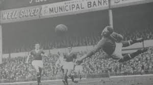
I always loved playing football but once I had hung up my boots my interest waned.  I do often leaf through the sports pages of the newspapers though just to keep in general touch and because there is often fine photography. When one of my boyhood heroes, Harry Gregg, died recently I was struck by the photos published of his playing days.  Here’s one.

Playing for Manchester United in 1958. (PA Images)

Playing for Manchester United in 1958. (PA Images)

Same moment - different photograph

Same moment - different photograph

(In fact this is only one of several similar ones – originally I thought it had been doctored but now I see they are clearly different photos of the same moment. See right).

What struck me was how differently the game is portrayed now.  In the days of dubbin and centre partings and black and white photography no one ever talked about “the beautiful game”.  It was more Kipling’s muddied oafs and flannelled fools.  Even the very high points were portrayed as existential moments – such as Harry Gregg’s dive above.  Here’s another one. 

Harry Gregg playing for Northern Ireland. Photographer unknown.

Harry Gregg playing for Northern Ireland. Photographer unknown.

 The individual player seems to be slightly divorced from reality in these shots.  He is singled out heroically.  Emotion is absent. 

When these shots were taken the telephoto lens existed but the technological advances since then - zoom lenses, colour reproduction, shutter speeds, burst rates, lens length - all make possible now what was unimaginable in the 1950s.  Photographic technology - digital technology - has changed the reality. What was once more like an elemental struggle is now more a form of theatre.  (Every TV now comes with motion smoothing software to enhance the aesthetics of athletic performance.  You didn’t think they moved as beautifully as that in reality, did you? What you see from the stand can be quite disappointing in comparison…….)

Theatre - or maybe amphitheatre? (Photographer unknown)

Theatre - or maybe amphitheatre? (Photographer unknown)

And where the postwar footballer was an icon of manly stoicism the modern footballer is more of an emotional maelstrom.  Back in the day, a goal scorer got an encouraging pat on the back from his colleagues and no more.  But in the digital age, a goal scored is as much emotional release as sporting achievement. The histrionics of celebration are all part of the show. 

It’s done for the camera, of course. Photographer unknown.

It’s done for the camera, of course. Photographer unknown.

The Greek word, techne, meaning ‘art’ is the root of the modern English ‘technology’.  This might seem curious because technology appears to be more based on scientific process - so excluding the vagaries of artistic endeavour.  Yet if we see ‘art’ as being something which can change your view of reality then maybe we can also see that technology, and digital technology in particular, is not necessarily quite as straightforward as it might seem. It looks like the bearer of truth but in fact it is the coordinator of truth. It marshals data to create reality.

I would have left it there for today’s blog but by complete coincidence the current issue of Blithe Spirit, the British Haiku Society journal, dropped onto my doormat this morning and in it I find published one of my own haikus on the subject of the man between the goalposts.

playing goalie -

so much time

to study the clouds

That was my experience of playing in goal, anyway.

THE PASSING OF THE DAYS

The recent death of an old friend of mine from my Afghan days sent me rushing to my small photo archive to pull out some pictures of him. To my astonishment I had none. I was deeply saddened. So instead of any images of the friend himself I had to make do with the photographs below - which at least helped smoke a few memories out of the back of my brain. They are some forty years old now. I had never owned a camera before but I bought a little Pentax SLR, taught myself the basics and got cracking. I can vaguely remember taking most of these images but I destroyed the negatives long ago so they are scans of prints originally made by local photo shops in the backstreets of Kabul, using who knows what chemicals. The first and second images have always made me think that if you could time travel back to medieval England with a camera you might bring back to the present images like these. Looking back all those years I remember the Afghans as being both dignified and friendly people and I think that maybe you can see some of that in these images.

The lesson I’ve learnt: take photos of your friends and keep them somewhere safe because they mark out the days of your life and provide something to hold onto when the friends themselves are gone.

A teashop, I think.

A teashop, I think.

Firewood sellers.

Firewood sellers.

3.jpg
4.jpg
Preparing firewood.

Preparing firewood.

6.jpg
Guard outside the British embassy. A lovely young man who always waved rather than saluting.

Guard outside the British embassy. A lovely young man who always waved rather than saluting.

7.jpg
8.jpg
9.jpg
10.jpg

BOOKMAKING

DSCF7063.jpg

This fabulous array – if I may be so immodest – is the product of a couple of courses that I have been on recently at Hot Bed Press and The Portico Library.  The three thinner ones, bottom right, are all pretty simple combinations of paper and thin card cover which are stitched together in the middle.  The long thin one (bottom middle) is known as Japanese stab stitch and is the same simple construction but you can see how the stitching holds it together.  The bigger grey one and the smaller, thicker one at top left are both open spined so that you can see the decorative stitching which is holding them together.  Top right is a standard hard back with blocks of paper aligned inside (known as ‘signatures’)  The smallest one at top middle is a concertina book with lettering – which I will come back too.

There is a good hour’s worth of stiitching there so I thought I might as well show it off. You get a better idea of the concertina book (acting as support) too.

There is a good hour’s worth of stiitching there so I thought I might as well show it off. You get a better idea of the concertina book (acting as support) too.

This kind of bookmaking is not expensive and not too difficult if you are reasonably dexterous.  It is also very contemplative. The handling of simple objects such as paper and card, needle and thread, the coordination of hand and eye, and a steady pace all combine to lower the blood pressure significantly.

My personal interest, as regular readers will know, is in the use of this kind of book for the interaction of text and photograph.  In particular the larger open-spined book and the Japanese stab stitch make layout very simple because they have no signatures: they consist simply of page upon page all sewn together.  This means that layout is a cinch.  With the others layout is more complicated because sections are folded into sections so you have to work out the whole scheme before you start printing.

The other subject that I picked up some good tips on was paper weight.  Paper weight is expressed in ‘grams per square metre’ (gsm) and goes of course from the flimsiest paper to the thickest card.  Obviously there is an optimum range for a book which will combine the practicalities of folding with a reasonably long life.  There are also questions of shade, texture and grain.  Fortunately, at Hot Bed Press, I stumbled on the enormous G F Smith catalogue (also available online) with its seemingly infinite ranges of paper.  Each paper is annotated with shades, weights and so on but best of all, printer compatibility.  Two papers recommended for laserjet printing by our tutor from this range were Munken and Syklus.  (Impressed with that detail?  Just thought I’d let you know.)

So bit by bit I am edging crab-like towards the goal of producing a hand-made photobook combining text and image.  I just have to work out what to put in it now.

Just one last thing.  The rather eyecatching cover of the concertina book is in fact a woodblock letter print that I also made at Hot Bed Press.  We were supposed to be printing words but when I saw the letter outlines in such a large size I decided to ditch meaning and just go for shape.  This was the result.

DSCF7064.jpg

 I was pleased.  I thought it had a touch of the Soviet Constructivist about it.  I’ll probably frame it.

THE PRICE AT THE PUMP

A little while ago I was at a Lartigue exhibition in a private gallery.  I was the only one in the place and the atmosphere was flat.  Somewhere stage right a woman’s voice drawled endlessly into a telephone about ‘New York prices’.  I guess gallery owners can smell money and in that sense I am odourless so my presence seemed to excite the attention of no one.

I was about to leave when a couple bounced in with that saveloy tan and freshly laundered look which carry the unmistakable aroma of spondulicks.  They whispered excitedly to one another, pausing here and there. The owner appeared as if from nowhere and locked onto them.  I decided to hang around, metaphorically tying a shoelace, to see what would happen. 

They pointed to a photograph.  How much was that, they wanted to know.  The owner said there were no prints of that one left.  Their gaze roved again and they picked out another: how much was that?  A price was quoted.  It went on like this for some time.  How much was that one?  And that one?  Their attention seemed to bounce around like a pinball off the cushions.  In the end I lost interest and left them still skittering haphazardly around the walls, the owner in pursuit.  Presumably his skill is to turn this random interest into a sale.

I thought of this couple when I was digesting the list of highest priced photography auction lots for 2019 on the Collector Daily website.  (Collector Daily is a site which reviews shows, photobooks, auctions and so on for collectors.  It’s a serious and well-informed website with many good exhibition and photobook reviews.)

For 2019 the top ten prices paid at auction for a lot ranged from $1,820,000 to $569,850: you can see all the details on the link above so I won’t repeat them here. The names are all well-known and so are the photographs. If I’ve understood the table correctly it is listing lot prices and not necessarily prices for individual photographs.  The $1,053,990  for the August Sander lot was in fact the total paid for some 70 portraits from his People Of Our Century.

August Sander: Young Farmers. 1914. I always thought that this much-discussed photograph looked like the opening page of a great sprawling novel and then I found out that it has actually inspired one: Three Farmers On Their Way To A Dance by Richard…

August Sander: Young Farmers. 1914. I always thought that this much-discussed photograph looked like the opening page of a great sprawling novel and then I found out that it has actually inspired one: Three Farmers On Their Way To A Dance by Richard Powers.

 If you click on the Previous/Next under the Helmut Newton photograph on the link above you have the details of each lot.  It is here, in the auction titles, that you can see the faultline which has always bedevilled the world of photographic art.  Some of them (Gilbert and George; Cindy Sherman; Andreas Gursky; Wolfgang Tillmans) are sold under the banner of Art (“Contemporary Art Evening Sale”) and some are sold under the banner of Photography (Lissitzky; Newton; Avedon).  In her book Photography And The Art Market* Juliet Hacking writes (see my review, January 2019, below) that it is always in the Art sales that the really big prices are paid.  For example, Cindy Sherman’s Untitled #96 (1981) sold for $3.89m in May 2011; and Andreas Gursky’s Rhein II (1999) sold for a world record $4.3m a few months later.  Yet the top three prices in the Collector Daily list are all from photography rather than art auctions.

The website suggests that the market is currently reliant on classic or vintage photographs since contemporary work is not appearing much at auction.  You might think that by and large the work of dead photographers would fetch more since supply is terminated while contemporary photographers keep on producing. But, as the figures for the 2011 Sherman and Gursky works show, recent records have been set by the living and not the dead. And it must be quite hard, too, to promote a dead photographer to the ranks of Artist posthumously.

Cindy Sherman, Untitled Film Still #21, 1978. Yours for £615.000.

Cindy Sherman, Untitled Film Still #21, 1978. Yours for £615.000.

Whether or not the distinction (between artist and photographer; not the living and the dead) is becoming blurred I suspect that something on the artistic horizon will obliterate it completely before long: computational imaging.  My rudimentary understanding of this is that it is a ‘vision system’ that uses algorithms to create images from incomplete data. So you might start off with an image on a sensor in the conventional way but by the time you have finished reconstructing it ( spatial filtering; depth map augmentation; pulse stretching; spatial light modulation. Are you ready for this?) it bears so little resemblance to the original that it can no longer be called a photograph. In fact, what would have been seen traditionally as the essential characteristics of a photograph are now considered to be its “limitations”.

Another way of expressing it might be to say that photography up until now has been non-fiction whereas computational imaging, in an artistic context, would be fiction.  Another analogy might be biological: analogue photography is one species of image; digital is another; and computational is an evolutionary new third species.

Back in that private gallery with the Lartigues: it is not by any means beyond possibility that as you approach an image in a gallery of the future it will ‘read’ you (as digital adverts in the street now can), access personal information about you and start to change to make itself more attractive to you.  Where that leaves prices is anyone’s guess.


RIGHT PLACE, RIGHT TIME: PHOTOS AND COPYRIGHT

When I was studying law we once had an exam question in which a road accident was described involving the death of a horse.  It was surprising how many examinees thought that this would be governed by the Fatal Accidents Act 1976 – legislation which permits relatives of people killed by wrongdoing to seek compensation.  No one during lectures had actually said the Act only covered dead humans: in legalspeak it was axiomatic - that is, blindingly obvious.

So does the law confer rights on animals?  You wouldn’t have thought that a photograph would shine a light into this fairly arcane area  – but it has.  I should have written about it when the case was current a couple of years ago but it slipped my mind.

Naruto, or maybe Ella - see text. © David Slater / Wildlife Personalities Ltd

Naruto, or maybe Ella - see text. © David Slater / Wildlife Personalities Ltd

What happened was this.  In 2011 David Slater, a British nature photographer, who for some time had been photographing Celebes crested macaque monkeys set up his camera with an electronic remote shutter device near a group of these animals he had been following.  He was hoping to get a closer shot of them than he had been able to up until then.  It’s not entirely clear how he got the shots in the end because, when they were picked up by national newspapers they were dubbed ‘animal selfies’ which the photographer played along with.  Later, his account of the session suggested that his own role had been more significant because he had used a remote trigger release, steadied the tripod and so on.

After the press splash, Wikimedia Commons published the images without licence and when Mr Slater objected they said that he had no copyright because he hadn’t taken the photos: the monkeys had.  M’learned friends then got involved.  Then PETA (People For The Ethical Treatment of Animals) piled in, claiming that the monkeys themselves owned copyright in the photos.

The case duly went to court in the USA and turned upon the photographer’s input: had he done enough for it to be deemed a “creative act”?  The court found in his favour but by then (2017) it was a bit late: Mr Slater thought he could have made about £10,000 from licensing the images but by that point interest had died since everyone had seen them.  He has said that he intends to sue Wikimedia but so far proceedings have not been issued.

It’s a sad tale for the photographer but interesting for spectators.

For a start PETA’s argument looks tricky.  How can an animal have legal rights?  You might say that an animal, under English law, has a right not to be treated cruelly but that is perhaps better seen as a constraint on human action rather than an animal’s legal right.  After all, historic buildings also have protection under the law but you would hardly say that that means they have rights.  PETA weren’t helped either when it seemed that the monkey they had named as plaintiff, Naruto, appeared not to be the one in the photo.  Whoops. 

PETA then reached an agreement with Mr Slater under which he would pay 25% of future income from the photos to the organisation. The court was having none of that: PETA was ditching its case (the ‘monkeys have rights’ argument) to enrich itself!

David Slater on location in Sulawesi, Indonesia (photo: © David Slater / Wildlife Personalities Ltd

David Slater on location in Sulawesi, Indonesia (photo: © David Slater / Wildlife Personalities Ltd

PETA launched its case in the USA.  Mr Slater might be better advised to start any further proceedings in the UK.  Case law here* has considered whether “the mere taking of a photograph is a mechanical process involving no skill at all other than the labour of merely pressing a button,” or whether  it requires originality.  It has identified the following series of acts that can convey originality in a photograph:

  • the angle of shot, light and shade, exposure and effects achieved with filters, and developing techniques;

  • the creation of the scene to be photographed; and

  • “being in the right place at the right time”.

It is these three elements which determine originality rather than the pressing of a button.  “Being in the right place at the right time” seems to be a shoo in for Mr Slater.

The case seems like a metaphor for the plight of the modern photographer.  When you think about it, quite a few people made money or publicity out of the incident: the lawyers, the expert witnesses, the journalists and other commentators, Wikimedia and PETA.  Only the poor photographer, David Slater, has lost out.

*Temple Island Collections Ltd v. New English Teas [2012] EWPCC 1

IN PRAISE OF OLDER PHOTOBOOKS

You can pay a lot of money for a book of photographs by even a minor name.  £50 or so for a new one would be quite common and if it’s out of print then even a secondhand copy could be a lot more.  I paid about £50 if I remember rightly for Dave Heath’s   “Multitude, Solitude”  When I had my great book giveaway a couple of years ago I saw it on resale in the charity shop I had given it to for over a £100.  Now it is going on Amazon for £195 used and £378 new. 

So, a while ago, I decided to set myself a limit of £20 in order to bring a little discipline into this whole process.*  And, as ever, that discipline has its rewards.

41kcmh8pvqL._SX362_BO1%2C204%2C203%2C200_.jpg

This book is one of them.  I picked it up for £9 in a secondhand shop before Christmas.  I have no idea who Jenifer Roberts is, or was, and can find out nothing about her on the net.  Published in 1992, in many ways it’s a standard kind of book containing landscapes and portraits from the author’s travels around the world.  They are classical, perhaps even a little out of fashion now but there is nothing wrong with that.  The landscapes can certainly hold their own with the classic ‘Land’ by Fay Godwin which would probably be seen as the benchmark for this kind of work.  Plus she does quote Virgil: “To the spirit of the place and to earth/ the first of the gods….”

What makes the book unusual (apart from the Virgil) is the author’s openness in setting out her general technical approach both to taking the photos in the first place and then to developing and printing them.  And the great lesson is this: the whole process is very, very simple.  That is not to say for a moment that it is easy.  It’s just a great relief in the kaleidoscope of digital imagery tools to have someone set out fundamental rules very clearly.  For example, she says that when you produce your prints there are only two main variables: one is how dark or light you want the print to be, and the other is how much contrast you want.  To be honest, I had never thought of it that simply.  In fact, now I look at the controls in my software, Lightroom, I see that Exposure and Contrast come first.  Unfortunately, they are followed by Highlights, Shadows, Whites, Blacks, Clarity, Vibrance, Saturation, more Highlights, Lights, Darks, Shadows and Point Curve.  And those are just the tonal controls. Like many, I suspect, I have arrived at my own system largely through intuition.

In the darkroom, beyond those two main variables, the author darkens and lightens tones locally in the print – and that is about it in general terms because grain and sharpness have been taken care of in developing the negative.  A tonal change which you can make in a second onscreen now would have taken her a few hours through from execution to dried print in the darkroom.  She writes that It could take her a week or two to perfect a print.

Then, as you go through the book, for each picture she tells you how she how she saw it when she clicked the shutter – which generally means how she judged the exposure and whether or not she used a filter on the lens – and how she enhanced that in the darkroom.  It takes a lot of confidence and a lot of goodwill to be that open.  It’s really helpful.

41fdJDVgoLL._AC_UY218_ML3_.jpg

I also picked up this one, at the same time for £8.50.  It’s a 1979 publication and that ‘2’ in the title suggests that maybe it’s one of a series.  It contains the thoughts of eight photographers about photography in general and their darkroom technique in particular.  Some of them are pretty well known: Lisette Model, Aaron Siskind, Charles Harbutt, Cole Weston.  It’s fascinating – not least because the tone is so even: it’s just a kind of sensible chat.  It reminds me of the Paris Review series of interviews with well-known authors that I used to devour years ago.  You learnt a lot from the references and asides and methods.

This idea, that there are authorities, whom it is worth listening to, is a bit passé these days.  They are probably still there somewhere but everyone is shouting so loud.  The older, cheaper books take you back to a time when voices were not so raised.

“ In order to maintain the rigorous standards of honesty to which this blog aspires I have to confess that I offered a seller on ebay £25 for Charles Harbutt’s “Travelog” for which he was asking £40. He obviously didn’t share my views on rampant consumerism in the photobook market and turned me down.

HAPPY NEW YEAR

After I left the world of full-time employment I had a lot of time on my hands and I realised that I needed a strategy to deal with that.  Having read a bit and thought a bit I decided to chunk that time into four areas of activity which were: earning some money; pursuing the spiritual; charitable volunteering; and having fun.  I stuck to these for quite a while and each New Year I would devise some short-term and some longer-term points of reference within these activities so that I could plot my course.  I wouldn’t call them goals because I am not a great fan of goals: direction I like, but goals I avoid.  I just prefer to maintain a general tack.

After about a decade or so I dropped this system because I was more confident about where I was going and what I was doing.  More recently I’ve found myself in need of some sort of a framework again for my creative activities.  In fact, this blog is part of that because it helps me reflect on what I’m doing both in writing and in photography.

Then last January I set up a few resolutions to navigate my way creatively through the year.  These were mostly courses: an online course in modern architecture (which got cancelled); some bookmaking tuition which I will have completed by the end of January 2020; and some darkroom work - which I did in March.  I may rebook the architecture course but I can’t help thinking that courses, while helpful in their way, can easily become a distraction.  So how can I plot a line through 2020? 

Well, perhaps I have been a little adrift photographically since making the move over the Pennines to Manchester. Photographing whatever happens to float across your lens is a reasonable day to day strategy - for an amateur anyway - but it’s also good to have something longer term in the background.  My new cataloguing system is helping (see Blogpost 25 October) but I am devising at least one self-contained photographic project which I intend will bear some sort of fruit before the end of the year.  Obviously, my lips must remain sealed because the more you talk about these things the less you do anything about them.

Secondly, browsing through this year’s crop of photographs, I realise that I must exercise more control technically.  Swapping from digital to film is not for the fainthearted.  Digital cameras flatter you enormously but a simple film camera lays bare your technical shortcomings mercilessly. A significant weak point for me has been in the development of negatives.  You send them away to a lab and you have no idea what chemicals they are to be steeped in. This affects overall results because the development of the negative is critical to image quality.  To the barricades then!  I will develop my negatives at home because that is the only way to control that bit of the process.  Printing is another matter but I’ll stick to scanning and digital printing for the moment.

And what of Words + Photos?  This seems to have emerged as a major blog theme over 2019.  I keep turning it over in my mind and am going to try this year to put together some short text and images in a way that satisfies me at least.  This will be in handmade book form.

In order to maintain quality in the text I will be submitting haiku to various journals as well. I’ve had longer form prose published in the past but haiku are a completely different discipline. I’ve written lot of them over the years yet have never sent any for publication.  Looking back at them now, that may not have been a bad thing.  A long apprenticeship presumably makes for a better craftsman.

So that should see me through 2020 quite safely. As should this blog, too, of course.

Here’s a photo to end the year with.

I’ve heard it said that all words are metaphors in the sense that they stand in for reality. I suppose the same might be said of photographs. So here you get two metaphors for the price of one.  Or maybe a photograph of a word is a double metaphor? …

I’ve heard it said that all words are metaphors in the sense that they stand in for reality. I suppose the same might be said of photographs. So here you get two metaphors for the price of one. Or maybe a photograph of a word is a double metaphor? This was a rather beautiful gravestone which I chanced across when visiting the ex-cotton town of Rochdale - which just happens to be my birthplace.

LETIZIA BATTAGLIA: SHOOTING THE MAFIA

At one point in this film* the photographer Letizia Battaglia** talks about holding an impromptu exhibition of her photographs on the streets of Corleone, a Sicilian mafia stronghold.  You think that maybe this is that film convention – the pivotal moment, an act which changes the tide of events. The interviewer asks what it was like to do such a thing, to take the war into the enemy’s camp, so to speak.  “It was terrifying” says Letizia. and you see footage of the town’s residents looking at the horrifying images of violence and murder and walking silently away.  Clearly, nothing is changing.

Uncredited publicity shot

Uncredited publicity shot

From the mid-1970s on Battaglia photographed the results of Mafia violence in Palermo and beyond when it did seem as though the Italian state was losing the fight against organised crime.  She wanted to show that this was not simply a war exclusively between so-called mafia men of honour but a campaign which used fear and violence to silence a population.  The photographs themselves are both shocking and mesmerising, showing corpse after corpse and murder after murder.  The photographer says that at times she was shaking so much she had trouble even remembering basics like exposure and focus.  Still some reviewers insist on talking about the aesthetics of the images, of her sense of composition and so on – which just seems like a way of avoiding the reality of the photograph.

One of the main themes that emerges from the film is the sustained courage that it must take to do this work over such a long period in the face of harassment and death threats and an all-pervasive fear.  Yet she has captured also other sides of Sicilian society in very beautiful photographs.  This mercurial quality comes out in the film: she talks deeply and passionately about her work and then suddenly dismisses it and suggests it achieved nothing.

I came out of the film feeling a bit shaken myself.  Partly it is the sheer power of her personality: being in her company must be a bit like being on a bicycle in a hurricane.  Partly also it was the nature of the photographs. And then it was the archive footage of a society on the brink of chaos.  Not unlike the photos of Gordon Parks that I reviewed in a December 2017 blogpost.  you think that these images have done their job and that they are now history.  Then suddenly that same chaos in a different guise reappears on the horizon.  Then photos like these are back in the fray.  In that sense, this is a very timely film.  

The focus of the film, though, is the photographer. She provides the narrative which is filled out by colleagues and lovers plus old newsreel and documentary clips. The visuals, including her own photography, tend to be ancillary. It’s that imbalance again between the word and the image. Many of the photographs are unexplained shots of male corpses: we have no real idea who the victims are. Personally I would like to have heard a little less of the Letizia herself, compelling presence though she is, and seen a little more of the photography with details of how it was used in the anti-mafia campaign.

*  Shooting the Mafia (2019) is a documentary directed by Kim Longinotto and produced by Niamh Fagan

** LB appears not to have a website - that I can find anyway, though any search engine will pull up plenty of material about her. 


WORDS AND IMAGES (3)

To summarise:  I am trying to find a way to marry text and photograph in an equal partnership.  Image then will not simply be an illustration drawn from the text and the writing will not simply be a description of what’s in the image.  Neither will be subordinate to the other.

BV.jpg

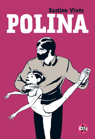
Pursuing this I recently read my first graphic novel, Polina by Bastien Vivès.  Though chosen largely at random, it might, I thought, give me some clues about how the two could balance one another out.  The story is slight - about a young Russian dancer who undergoes conflicting teaching but eventually finds fame and fortune. 

If you divide a standard work of prose fiction into dialogue, narration and description then in a graphic novel you can dispense with the last of those because the pictures do description for you.  In Polina the author also uses no narration – which in other styles can appear in different fonts and different frames to distinguish it.  So we are left with just image and dialogue – see below right.

Polina (2).jpg

The pared-down artwork is easy on the eye but I find the convention of the speech bubble has two drawbacks.  First it reminds me of all the comics that I used to read as a boy; and second, it partly obscures the image.  I suppose you could read it as part of that imagery but I don’t.  The interesting fact, though, is that words and image do achieve some kind of parity.  They play roughly equal parts in the storytelling.

EF.jpg

Next I turned to Incidental Inventions by well-known novelist Elena Ferrante.  This is a collection of short prose pieces on a given theme each of which carries an accompanying illustration.  The artwork, though beautiful, is very much the junior partner here – doubtless because the star of the show is the author and not the illustrator  Every piece is set out in the same format – first the picture then the words; and the picture is an imaginative interpretation of the text’s theme (see below). I couldn’t help feeling that the quality of both writing and art were not well served by the straitjacket of this layout.

123+%282%29.jpg

I wrote about this topic in September and June but I still can’t see a way forward at the moment.  My recent experiences have not been encouraging.  I sent in a couple of Shahai (Photo + Short Verse) to a local competition; and I used the Shahai form as the centre of an application for an artistic mentoring programme.  Neither of these got anywhere.  It may just be quality of course, but the art world has categories.  Writing is writing and image is image.  Mixing the two up leaves you in a bit of a no man’s land.

I console myself with the thought that if I knew how it was all going to turn out there wouldn’t be much point in doing it.


FOOL'S GOLD

 You might think that digital technology had resolved the old tussle between black and white and colour photography.  You can take everything in colour, desaturate it, and then decide which version you like best.  Yet choice may well be fool’s gold.

When colour started to get a foothold after WW2, Walker Evans famously reflected the traditional view of the photo-artist when he said: “Color photography is vulgar.” But change was coming and Mary Warner Marien* describes its cusp in the 1950s and early 60s like this:

“In spite of the efforts of Kodak and Polaroid to convince artists to work with the new technique, the biases against colour photography expressed by [Edward] Weston and [Walker] Evans permeated the world of serious art photography.  Notwithstanding the occasional museum exhibition of color work, art photography persisted mostly as a black and white medium.  This attitude put it at odds with commercial photography and photojournalism, both of which adapted more quickly to the possibilities of color to promote products or interest readers.  The art photographers’ preference for black and white contrasted sharply with the adoption of color film by amateurs who happily moved from black and white snapshots to color pictures.  The reality effect – the sense of authenticity and honesty passed from black and white film to color.”

The idea, plain and simple, that colour photography is vulgar and that black and white is artistic looks very dated these days.  After all there is some great colour photography around - though maybe the best homes in on colour itself:  Saul Leiter, say, or Harry Gruyaert or Ernst Haas.   The stew gets a bit thick, for my taste anyway, when we have to get both the colour and the content on board. ( I saw an exhibition of a very well known colour photographer a year or two ago at the National Portrait Gallery and just could not get a foothold.  Can’t say who obviously – well, okay, William Eggleston.  My eyes just kept sliding off the photos.)

De gustibus non est disputandum, then? (When I was a lawyer I eventually realised why no one translates the latin maxims that the law is so fond of. It’s because there is no agreement about what they mean in English, and therefore how to apply them. They are the dark matter of the courtroom, little black holes which suck in the unwary.) Is it simply a matter of personal taste? Ernst Gombrich”** has another suggestion.  It goes something like this.

Everyone knows, when they look at a black and white photograph that there is no black and white world out there.  It is a transformation of the world we see into monochrome tones.  In that sense it is a full code which we learn to interpret by separating the code from the content.  Colour photography on the other hand tends to persuade us that it is an accurate image of what exists out there.  Yet some of its colours may be quite accurate when others are not.  A comparison of the same shot from any two different models of camera or any two types of film soon shows that because they vary so much.  So that makes it a partial code.  This creates confusion because we do not know what is real and what is not: we cannot separate the code from the content. So it is more a matter of communication than of art. An analogy which often occurs to me is that black and white is to colour as radio is to television. Your imagination has to work harder with black and white/radio. It requires more effort but in the end is more satisfying.

Fool’s gold? With a computer you can adjust your image infinitely after the event. You need very little time or skill. Once you saw a scene and recorded it in a photograph. Now you take a photograph and can decide later what to record: monochrome or colour It’s not the same thing at all. Process is reversed. The discipline is gone.

O tempus, O mores.

Some scenes just seem to dispense with any need for colour. A dirty old rope and an upturned boat that I took earlier this year.

Some scenes just seem to dispense with any need for colour. A dirty old rope and an upturned boat that I took earlier this year.

Ditto this lovely Rochdale mural

Ditto this lovely Rochdale mural

On the other hand………

On the other hand………

* Photography: A Cultural History. Laurence King Publishing 2002. See the section on colour photography in Chapter Six.

** Ernst Gombrich: The Visual Image: Its Place In Communication. From The Essential Gombrich, Phaidon 1996. I’ve paraphrased - perhaps to the point of distortion.

TREES, TREES, TREES

Over the years I have tried very hard with my tree recognition skills. For a long time I had a lovely copy of The Observers’ Book Of Trees and several others too and I even took them on my walks with me but, try as I might, I simply could not keep in my head the details I needed to sort out even the most common types. It wasn’t only trees either: I had books on birds, butterflies, shrubs, clouds and even grasses.  At times I was carrying half a library with me on my rambles. But my head just became a kaleidoscope of beaks, wings, leaves and branches.  It was very stressful.

When I moved to Manchester and my new urban life I got rid of nearly all of my books and these nature volumes went too.   Goodbye sylvan tranquillity; hello urban grit. 

All of which is a bit of a lengthy prelude to explaining why, when I walked across Northumbria this summer I was not altogether sure what trees I was taking photos of.  There wasn’t a lot else to snap. I don’t really do your standard landscape.  And no disrespect to Mrs Barker but after nearly forty years of peaceful coexistence I think we have just about reached mutual exhaustion photographically.  Alfred Stieglitz and Georgia O'Keeffe we are not. 

So to give myself a challenge I decided to concentrate on trees and took one a day. 

Everyone recognises the hawthorn, don’t they? There is something indomitable about their twisting growth pattern.

Everyone recognises the hawthorn, don’t they? There is something indomitable about their twisting growth pattern.

And the birch - such a lively tree. We had two of these in the back garden of our old house and when the wind and sun caught the leaves the reflected light would dance around the back rooms.

And the birch - such a lively tree. We had two of these in the back garden of our old house and when the wind and sun caught the leaves the reflected light would dance around the back rooms.

Hmmmm. I kind of had it my mind that these were poplar but now I’m not so sure.

Hmmmm. I kind of had it my mind that these were poplar but now I’m not so sure.

And birch, birch, birch.

And birch, birch, birch.

I read somewhere that you will take more photos if you walk round with a camera in your hand than if the camera is slung round your neck. And either of those two will give you more photos than if you walk around with the camera in your bag. But walking ninety odd miles with a camera in my hand or round my neck is just not practical. Especially with the mighty Hasselblad which weighs in at around four pounds. The truth is, I think, that if you are doing serious distances in all weathers then the photography is not going to take priority. But one or two shots a day is not only doable but is an excuse for a break and can make for an interesting mini-project: kissing gates; fence posts; cows’ eyes; signposts; gravestones; footbridges; pylons. They are all there for the taking.

MANCHESTER

Part of the fun of living in the city is thinking about the city.

In Manchester for some years now there has been a series of 4 x 4 evenings in which 4 speakers are given 15 minutes each to opine on a set urban topic.  The latest one this week was “Sin City: The Morality Of Urban Growth” in which the star turn was  The Guardian’s Architecture Correspondent, Oliver Wainwright who had done some flame fanning by writing a rude article in that paper about the belt of skyscrapers currently being built around the city centre.

Usually each of the speakers gets the same time as all the others.  In this case,  OW was given forty minutes or so to set out his case. This was that the skyscrapers are ugly, out of place and will do nothing for Manchester’s economy; are mostly investment vehicles for rich foreigners; that of 15000 residential units none are affordable homes (ie let at less than 80% of market value); and that the council should be ashamed of itself for granting them planning permission.  He had even managed to get hold of an advertising promotion for the city from one of the investment fairs held in the hot places where rich people tend to congregate.  The strapline?  “Turn Your Determination Into Envy”.  Great stuff.

Consultant Shelagh McNerney was given about five minutes to reply.  This broke with the 4x 15 minutes format and was unfair given the time allotted to the main speaker. 

In her position I would have started by  introducing myself as the representative of The Devil.  Very courageously however she set to with a basic proposition that “economic growth has delivered every single improvement to humanity”.  There was no great conspiracy against Manchester and any successful city was constantly reconfiguring itself; Manchester was never that pretty anyway;  urban growth is not the cause of the city’s homelessness and other problems; and that low growth is not the answer.  Given the handicap she had I thought she made a pretty good stab at a defence.

The other two speakers didn’t add that much and at the end the chair asked each of the participants for one phrase to sum up what was needed to improve matters.  “More power to the public sector” said OW.  “More cash” said Shelagh.  There was simply no common ground between them and as so often these days you were implicitly invited to take sides – which will get us nowhere.

Oddly enough, the comment which seemed to cause most offence was that Manchester is not a pretty city.  I’d have thought it’s self-evident. I like the place very much and think it’s a great city but ‘pretty’ – such a demeaning word - is not an adjective I would apply to it. 

Visually, there are some very interesting buildings but it’s not really an architectural wonder either.  For me the real knockout visuals are the city’s engineered structures.  I never fail to feel a jolt  coming in on the tram as it whizzes past and under and over the bridges and viaducts which span the city: the bracing and girdling, the bulk and curve – the sheer mass of them.  You can almost see stovepipe-hatted Victorian engineers sucking on their clay pipes and stabbing at creased plans with muddy forefingers.

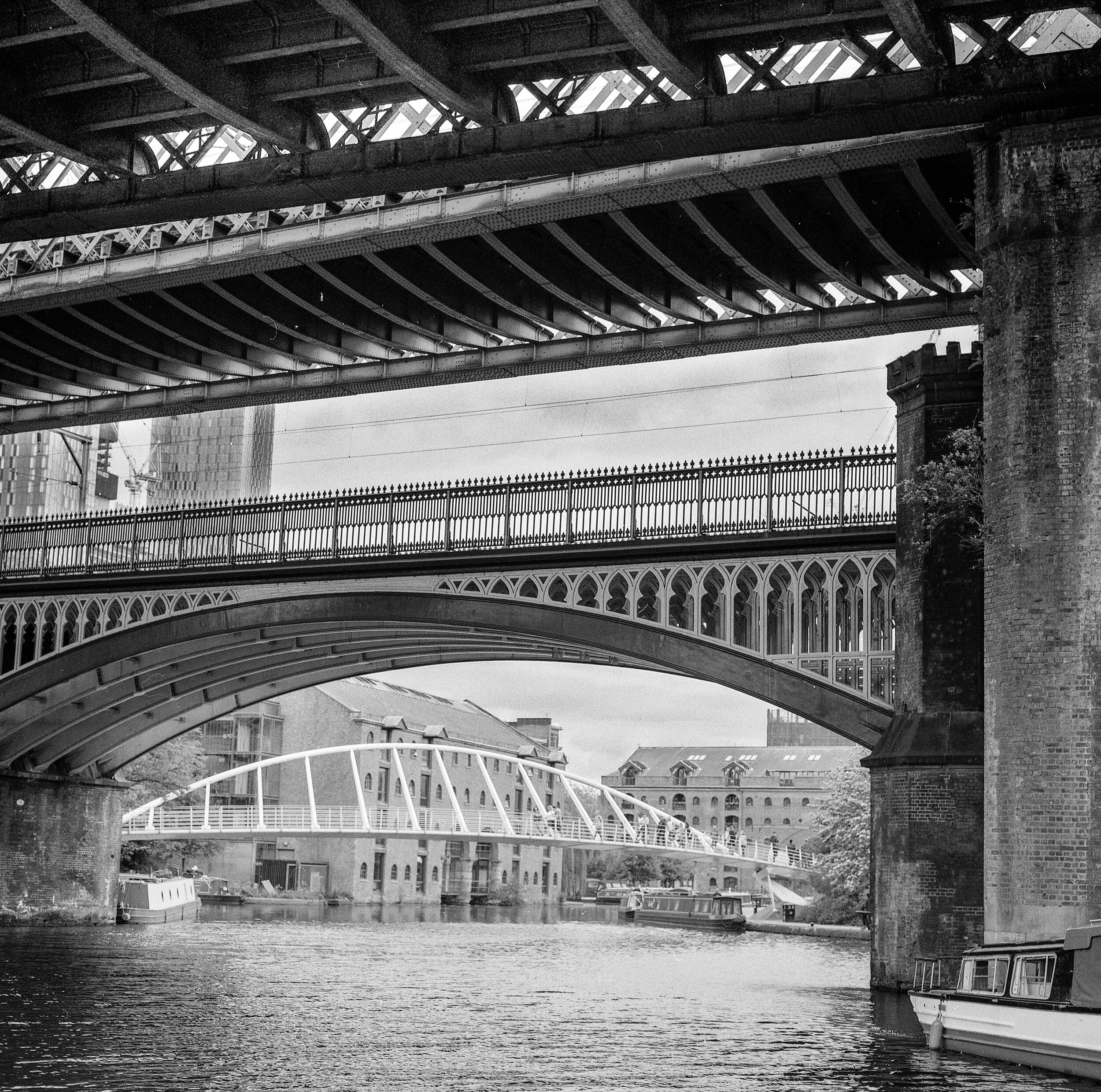
Here’s a shot I took this summer of the Castlefield Basin - which is where the Bridgewater Canal meets the River Medlock. Three 19th century railway viaducts frame the late 20th century Merchants’ Bridge. The modern one says “Look at me!” but the Victorian ones just say “Get outta my way!”. You can see a couple of those controversial tower blocks going up mid-left.

img105.jpg

Here is the MSJ and AR again with a double bounce first over the Rochdale canal and then over the adjacent roadway. It’s a 21st century tramway that it carries now rather than the original 19th century railway.

img110.jpg

Even the footbridges look built for a race of giants.

img109.jpg

It didn’t stop with the Victorians, either. Here is a massive concrete column holding up steel girders to get the tram system across the Mersey to the airport. Pretty? Not really - but pretty impressive, certainly.

img114.jpg

Apparently there are another 21 tower blocks planned for the bottom end of the city. Maybe one day they will have the same aura as the bridges but I doubt it. Bridges are infrastructure. They are for everyone.

THOSE CREATIVE JUICES YET AGAIN!

I dunno. You think you’ve got all four corners of the suitcase battened down then you look over your shoulder and you find that one of them has popped up again.

By using The Little Game from The Online Photographer website I managed earlier this year (see posts 1-3 in this series in April- June below) to refocus my general photopractice and to give it a bit more definition.  I decided then that I would stick to a core of four categories: Spirit, Growth and Form, Cityscape, and People in Situ.  In the past couple of weeks, having the summer’s photos to catalogue, I decided that it would be logical to use those four categories to keep things in order.  So thanks to the wonders of software I can keep them both in chronological sets but also in subject categories. 

I renamed Cityscape ‘Les Alentours’ – which is simply the French for ‘surroundings’  or ‘environs’ but I thought it leant an air of Gallic sophistication to the humdrum realities of my photolife.  Seized by this notion I then changed People In Situ and gave it the new title of Personae. ‘Persona’ was originally a mask worn by Greek and Roman actors and came to mean the part or character played in the world so I thought the new title gave a certain, well, gravitas.  ‘Spirit’ I changed to Contemplative to widen it, and Growth and Form I left as it was. 

Then I took each of these four and subdivided them, rigidly policing my tendency to lapse into the abstract.  So, for Les Alentours, I have Bridges, Buildings, Underpasses, Walls and so on.  For Personae I have Framed, In Space, Talking, Thinking and suchlike. Ditto for the others.  From now on every photo I keep will fall into its category and subcategory in this system!  It may well feature more than once but this is the basic grid. 

You might think, as I did, that this would be just a technical matter, a question of attribution.  But in fact, a small miracle occurred as soon as I had done this.  Look at the existential crisis I had fallen into when I wrote one of my first blog posts in February 2017 (below entitled My Jigsaw Puzzle Of Photographs).  I was clearly all over the place.  Yet suddenly this has sorted itself into clear patterns.  For example, I never knew that I took so many photos of urban walls.  But look!

000021-2.jpg
000036-3.jpg
CNV00031.jpg
CNV00099.jpg

I love these Wallscapes.  They seem so personalised – either in their construction or in the layers that have been added over time.  They run all the way from a classical kind of formality to sheer unruliness.  Who did all this (and, in particular, who put that letterbox so high up on the one second from the top? Was it a humane attempt to save the postie’s fingers from the alsatian’s teeth?)

Who did all this? The ghosts of the city, of course!

I feel really buoyed up by this whole process.  You start off with A Little Game and you end up with A Big Discovery.

WRESTLING WITH FOG (2)

 (WRESTLING WITH FOG (1) appears in July’s blog posts below)

I suppose that going on retreat would be an activity viewed with suspicion by many because there is that element of the religious or metaphysical which is so out of tune with our secular and rational times.  I’ve found it helpful over the years though, having done a kind of tour d’horizon of spiritual traditions: TM, Tibetan Buddhist, Western Buddhist, Quaker, Sufi, Zen Buddhist, Theravadan and so on. My head has had a good airing, I’ve taken what I wanted and left what I didn’t want – and I’ve met some delightfully whacky people, too.

The tradition that I have followed for a few years now is known as Chan which is a Chinese form of Zen.  Chan retreats follow a set pattern of silence and meditation but the one I attended in Cornwall last month was a bit different because it involved an activity element - which was Japanese brushwork.  It was kind of tripartite: there was the usual sitting meditation; then work on what is known as a huatou (see below); and finally two sessions a day on brushwork. It was this brushwork that particularly interested me because of the longstanding connection between Zen and creativity.* What might it tell me about the processes of photography?

A huatou is the historical record of a short but significant exchange, often between Zen teacher and pupil.  In this retreat’s huatou, from around the 9th century, the pupil asks the teacher how to follow the path of Zen.  The teacher says the more you pursue it the farther it will get away: thinking, he says, is delusion; and not thinking is blankness. 

As ever, you are being driven into a corner and you are challenged to find your way out.  How do you neither think nor not think, for heaven’s sake?  The teacher offers a clue: ordinary mind, he says, is the way.  So now you have to consider what is ordinary mind.

Enter the brushwork.  This is large scale.  You have a brush the size of a decorating paintbrush and paper several feet long - something like below.

Fukushima Keido doing calligraphy: Spencer Museum, University of Kansas, 1989

Fukushima Keido doing calligraphy: Spencer Museum, University of Kansas, 1989

DSCF7044.jpg

Each day we practised a different Japanese character on newspaper.  The instant it is done you throw it away.  After a day or two you start putting these characters together in sequence on pristine rice paper.  You aren’t familiar with the characters of course; you aren’t familiar with a brush this size; you aren’t used to putting your whole body into calligraphic action; and everyone else is watching you.  When the rice paper moment comes therefore there is tension.  You soak the brush with the ink and you raise it in the air.  Now!  At this point what is going on…………?  Exactly!  You are either thinking about what you are doing, analysing, commentating, judging, worrying; or you are not thinking at all because your mind has gone blank.  This is where the elusive ordinary mind may help.

This example happens to be about brushwork.  It’s just the same with a camera, though.  What is going through your mind as you stroll along, camera in hand?  What makes you stop and click?  The idea that it will be a good picture maybe; that it’s a beautiful scene; that it’s not a beautiful scene; that this is the kind of thing  you photograph; that your friends will like it; and so on and so on, the endless commentary.  But pointing the camera aimlessly will get you nowhere either.

At the end of these Chan retreats there is traditionally a session where each participant has a minute or two to speak about their experience during the week.  I went first on this one and of course there is that paintbrush-poised moment just before you open your mouth.  There is silence.  Everyone waits.  What will you say?  Will you think, or not think; or simply speak?

It’s not hard to see plenty of other moments in day to day life when such a situation appears and not all are aesthetic choices by any means: quattro stagioni or margherita; left or right at the lights; reading the bedtime story; many a conversation; or that moment when the knife point dents the pear’s skin.   All approached in a soup of thought and blankness so we don’t recognise them.

To the right is my work from the final day with all the characters.  What does it say?  It says: “Ordinary Mind Is The Way” – of course!

  • Way too broad a topic to cover here but if you type ‘zen and creativity’ or even ‘zen and photography’ into your search engine you will disappear under an avalanche of book titles. I think I’ve mentioned it before somewhere but I’ve found Seeing Fresh: The Practice Of Contemplative Photography by Andy Karr and Michael Wood to be helpful.

LIKE FATHER, LIKE SON

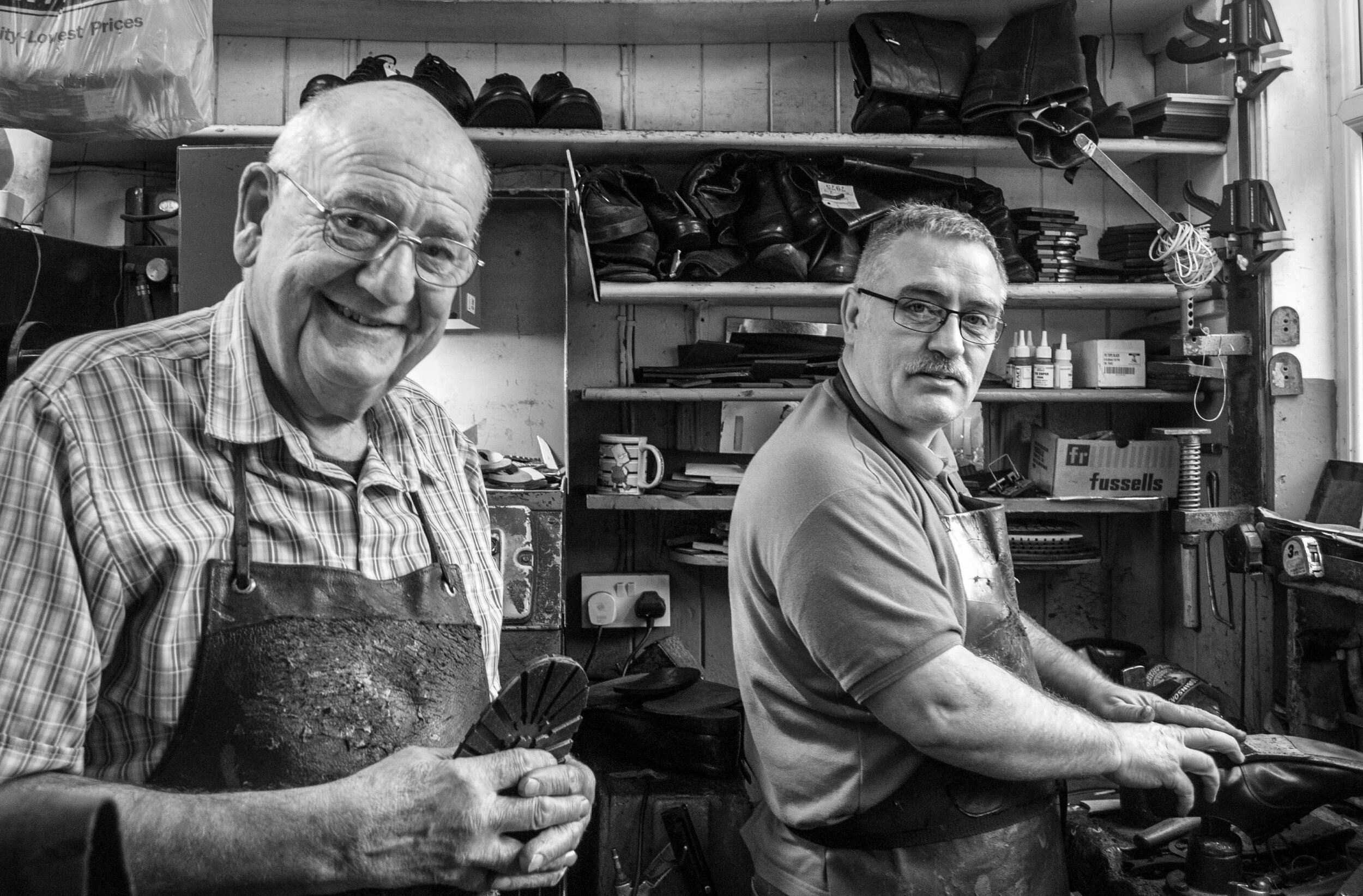
Here are David and Sean, cobblers by trade as you can see. 

DSC_0012-2.jpg

This was a very early shot that I took for a series that eventually became Working Hands.  It didn’t fit the series in the end but it’s still a small piece of social history. At the time, David was into his fifth decade as a cobbler; his five brothers had all gone into the trade and their father had been a cobbler all his life before them.  (Sean is not his son so the line ends there.)

You might think that is a degree of social stability which just doesn’t happen any more.  Yet I’ve been surprised, talking to the various tradesmen who have been working on the house we’ve moved into recently, how many of them went into the same trade as their father.

Here’s another example, kind of, anyway.

_DSF0763-Edit-2-Edit-Edit.jpg

 This is Paul the coal merchant (though his lorry described the firm as Fuelologists: it’s not in the OED but that’s a sad omission in my view).  For many years Paul had run a bar/hotel in France.  He speaks French well and his own sons are bilingual.  The previous generation had built up the coal business and when they retired he decided to come back to the UK and take it on. 

Most recently, both the plasterer and the gutterman who were working on our house had on-site visits from their retired fathers. Whether that was simply social or by way of a work inspection - well, I really don’t know, but I did find it kind of reassuring.

FURTHER ADVENTURES WITH WORD AND PHOTO

If you put an image and some words on a page it tends be the image that captures the attention first.  Common examples: newspaper photos with captions; advertising posters with their catchphrases and slogans; any painting with a title; cartoons. The text is often secondary.  This is particularly true of photographs: accompanying titles often seem very lame. All the effort has gone into the photograph and the text is a mere afterthought. If you are trying to combine word and photo more creatively (which seems to be the direction I am heading in) this is a serious technical problem.

Qingxiang Shi Tao, ‘Calligraphy and Painting’, 1696, detail.

Qingxiang Shi Tao, ‘Calligraphy and Painting’, 1696, detail.

I’m by no means any kind of expert on the art of the Japanese haiga or Chinese calligraphy but one solution to this problem used in both countries was to make the text in the same media as the image.  So a brush painting would be accompanied by text written with a brush.  The text might also be integrated with the image.  The picture to the right shows both solutions.

  I have read also that the characters are often indecipherable at least in part so that the text may surrender explicit meaning to visual effect.  Something like below, maybe, where the lines and circles of the text seem to mirror the shape of the fruit and the branches but hardly seem legible.

Otagaki Rengetsu; Dried Persimmons, 1868

Otagaki Rengetsu; Dried Persimmons, 1868

If you are going to put text with a photo creatively then none of these solutions is open to you – immediately anyway.  Text cannot be created in the original media whether film or digital; and it is hard to play with the 26 letters of the alphabet in the way that seems possible with ideograms.  Digital fonts preclude it – though there are digital freehand options available which might work with practice.  You can also scratch prints though the results that I have seen have rarely appealed to me.

So I am starting to experiment. My aim is to fuse word and photo so that the result goes beyond either. For the moment this is a digital project but I have plans to move beyond that.

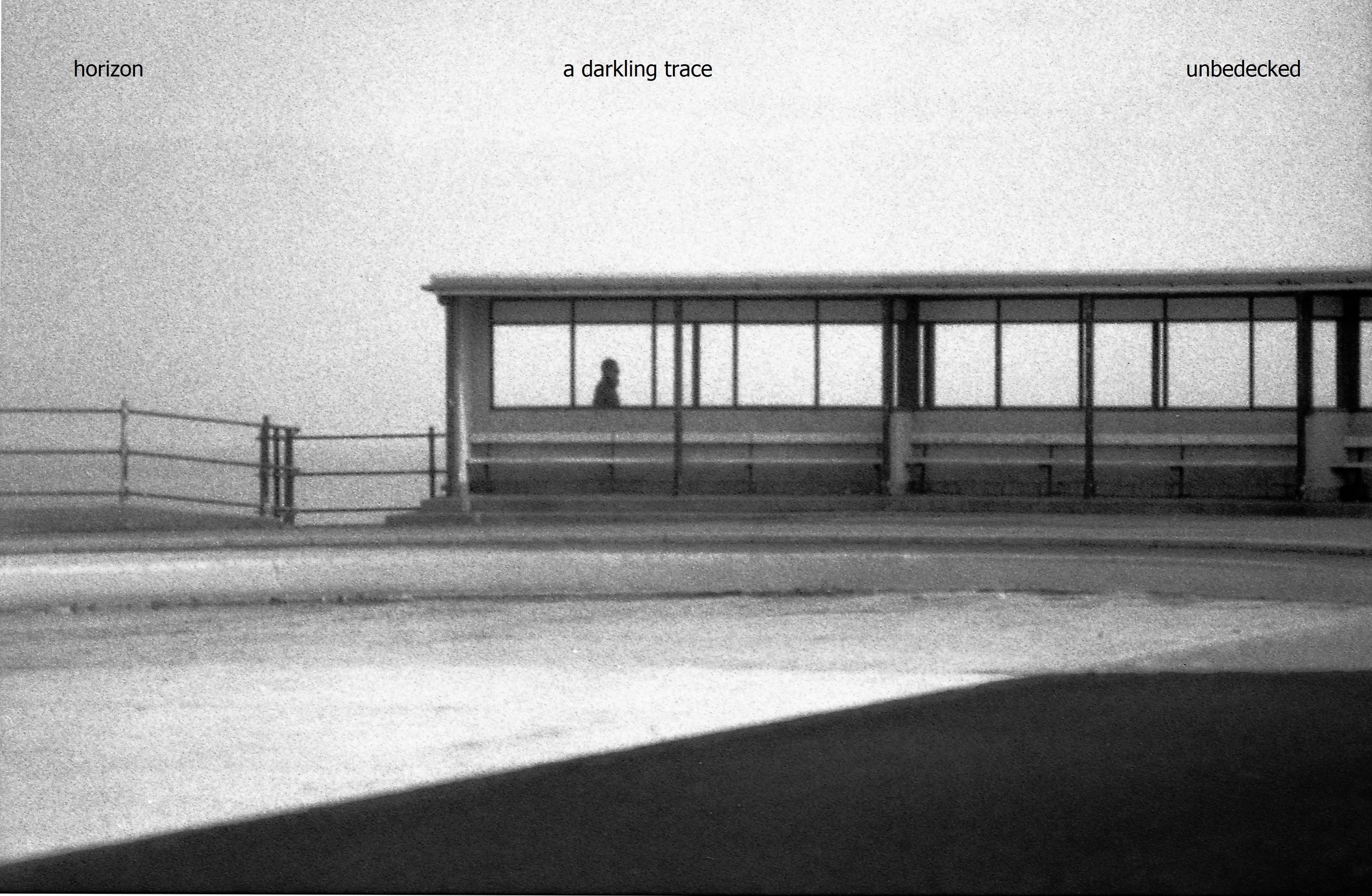
I start with a photo of mine which has been haunting my psyche recently. 

img065.jpg

The following lines eventually appeared in my head to accompany it.

the horizon

a darkling trace

unbedecked

The question was how to marry them.  There are several possibilities below. 

Most obvious: start at the top left and stick to three lines

Most obvious: start at the top left and stick to three lines

Next: ditch the three line set-up and stretch the text right across the full width of the image.

Next: ditch the three line set-up and stretch the text right across the full width of the image.

With the text at bottom right you read the photo first and come to the text last unlike the first two. Font point is higher and there is greater tonal contrast in white on black.

With the text at bottom right you read the photo first and come to the text last unlike the first two. Font point is higher and there is greater tonal contrast in white on black.

These are all options which could be used with certain combinations of text and image. My main hesitation about them is that, inevitably, some of the photo is obscured. I might even go farther than that and say that the integrity of the photo is compromised. It becomes a hybrid.

So here is another possibility.

Instinctively, I prefer this set up. Both image and text have their own space and can be contemplated in their own right.

Instinctively, I prefer this set up. Both image and text have their own space and can be contemplated in their own right.

Another possibility. The experiment here was to get the text to mirror the diagonal running left/right in the image.

Another possibility. The experiment here was to get the text to mirror the diagonal running left/right in the image.

There are numerous other possibilities but if you think too hard the whole thing eventually disappears into its own socks. My general aim though is to get the impact of word and picture to be more simultaneous so as to even out their impact. I am attending a letterpress/bookmaking course at the wonderful Hot Bed Press before Christmas and that may give me further ideas……

GREAT JOURNEYS, SHAME ABOUT THE PHOTOS

serveimage.jpg

I’ve spent a good part of the summer walking across Northumberland and cycling around East Anglia so Nicholas Crane’s Great British Journeys (Weidenfield and Nicholson, 2008) was a good companion for some of that time.  It takes eight British travel narratives from the 12th to the 20th century and retraces the steps those writers took.  It’s a good read: NC seems like an accomplished navigator and researcher and his inquisitiveness inspired me to nose around on my own relatively minor travels.  There is one thing that lets the book down though and it is a very common fault – the photographs.

It is nothing to do with the quality of the photographs themselves.  They aren’t in fact particularly interesting which is a bit surprising since the book came out of a television series: you’d think that professional camera people would have been able to provide better outtakes.  But that is by the by.  The real issue is the way that the photos have been wedged into the book.

There are 250 pages or so of text and the photographs have been divided into three chunks which have been inserted apparently randomly at pages 90, 138 and 170.  They are of the shiniest paper, are in several sizes and vary between landscape shots of spots mentioned in the narrative and landscape shots featuring the author.  Then there are the stock photos of old maps mentioned in the narratives scattered into this sequence. The identifying text is placed wherever seems to have been most convenient and – my particular bugbear – appears to be in more than one font. some photos are laid over others and some text obscures the images. White background appears randomly.

Bit of a dog’s breakfast

Bit of a dog’s breakfast

This hurts my eyes.

This hurts my eyes.

This isn’t that unusual but it is pretty surprising in a book drawn from a documentary television series – a format which has now existed for well over half a century and which is essentially the marriage of words and images.  Yet it is often done so badly: in nature programmes, travel programmes, history programmes, word and image wrestle for domination. The result is often what could have been a radio programme but with images tacked on for TV; or a series of images on television so overcooked that the soundtrack becomes mere embellishment.

Personally, I don’t think the book needed any photos – its historical nature precludes them. (Line drawings or something like on the cover would have been great.) If it had to have shots of the modern-day sites then I would have used high quality stills, probably in black and white to excite the imagination, and inserted into the text where it deserves them.  Several centuries after the Chinese were affirming when they merged image and verse that the image was the host and the words inscribed on it were the guest we still seem to be struggling with the very basics of marrying the two.

ERIC RAVILIOUS

 Strangely Strange Though Oddly Normal

Saffron Walden in Essex is one of those quintessentially English market towns which seems to drowse eternally in warm sunshine.  It manages this to some extent by banishing most car-borne visitors to a huge car park on its outskirts from which you trudge into town.  The clash between a sylvan image of prelapsarian England and the realities of the 21st century are neatly captured in the name of the car park, for this tarmac expanse in which several hundred cars sit bumper to bumper is “Swan Meadow”.

You can experience a not dissimilar dislocation between image and experience when you visit the excellent Fry Art Gallery in the town as I did on my travels this summer.  The Gallery is home to the North West Essex Collection – the work of artists who lived in that area mainly in the middle years of the last century.  The current exhibition features work by Eric Ravilious – an artist who turned his hand to almost any commission but whose prints and paintings in particular have intrigued me for some time – perhaps because, a bit like the carpark and the town, they seem to straddle the eternal and the modern at the same time.

His early work was mostly wood engraving – a black and white form whose use of line, shape, texture and space might be seen in some ways as analogous to monochrome photography.  The photographer has a full range of shades of course, while the engraver can use only black and white – though in the hands of experts such as ER the suggestion of shade from these two extremes often leaves me open-mouthed with admiration.

Boy Birds-Nesting; E. Ravilious; Wood Engraving, 1926; Towner Art Gallery, Eastbourne

Boy Birds-Nesting; E. Ravilious; Wood Engraving, 1926; Towner Art Gallery, Eastbourne

For someone of my age a print such as Boy Birds-Nesting is full of suggestion.  (Eric’s friend Douglas Bliss obligingly draped himself across the back of a settee in his bedsit in rugby gear so that the artist could get the lines right.)  Firstly the boy looks well into adolescence yet is still in short trousers, long socks, some kind of short-sleeved jumper and school shirt (as one was most evenings, having simply cast off the school blazer and cap).  Secondly, the image harks back to the innocent days when taking eggs from a bird’s nest was a respectable hobby for a young chap and not the environmental offence that it is now.  Thirdly, climbing way up in trees was a daily experience for any self-respecting schoolboy yet is a practice which seems simply to have died out.  It suggests to me the eternal sunshine of my boyhood rather than the tarmacadammed realities of adulthood.  I could look at it and other such prints by Ravilious for ever.

He moved on to watercolour and pencil to create works which I find perhaps even more intriguing.  As chance would have it, I read Ravilious and Co: The Pattern Of Friendship by Andy Friend (Thames and Hudson, 2017) earlier this year and what emerges from that is just how uneventful a life ER led: he went to Art School, worked as a jobbing artist, got married, had children and was one of two war artists killed in the war.   That’s it.  The book more or less had to be about a whole group of people because the facts of ER’s life couldn’t have filled it.

In some way this is what I see in the watercolours.  They are full of, well, emptiness. When I first saw them I yawned a little and went back to the prints.  What after all is in them?  This one is representative.

Waterwheel; E. Ravilious; Watercolour, 1934;

Waterwheel; E. Ravilious; Watercolour, 1934;

There is virtually nothing of note in it.  It is a typically English landscape of chalk downland, its tones ranging through pale to paler and then palest.  It seems age-old yet there is an angularity of line that is very modern.  So often there is a slightly odd perspective too, flattened out like a Persian miniature so that what is farther away is not necessarily relatively smaller.

Some of this can be seen in this study of the artist’s temporary bedroom

Attic Bedroom; E. Ravilious; Watercolour 1934; Fry Art Gallery

Attic Bedroom; E. Ravilious; Watercolour 1934; Fry Art Gallery

So often his subject is ordinary: lanes, mills, gardens, potting sheds, fields, fences which seem to reflect the ordinariness of his own life.  Yet he invests them with an aura. Even when he moves on to more concrete subjects such as studies of Newhaven harbour there is still that air of mystery that it is hard to tear the eye away from. I think this comes often from the absence of human form in the work, the timelessness of the subject matter and the modern treatment of line and angle.  Then the modernistic, slightly desaturated palate seems to suggest an undertow of black and white which is often reinforced by the use of pencil with the watercolour.

As a photographer I envy the artist’s absolute freedom to play with line and point in this way.  Perspective is a tyranny in photography.  Although lens length will affect the relative appearance of the planes running through the image, standard perspective cannot be avoided without a trick lens.  You are more or less lumped with a preordained view of a scene in which a single point is supposed to draw the eye of the viewer and everything else is relative to that.  Occasionally you might avoid that but mostly by happenstance. Truth is, if I had one per cent of ER’s talent with a woodblock I might never pick up a camera again…….