JAMES RAVILIOUS

Well, I’m in two minds.  On the one hand, here we have some really beautiful photographs.  On the other, there are about 80,000 of them.  When does enough become too much?

James Ravilious moved to North Devon in 1972 and was given a commission by the local Arts Centre, now the Beaford Archive, to record in photographs the life of the local area.   I had always been aware of him and his work through reading about his father, Eric Ravilious (see my September 2019 post about the latter below).  Then I spotted this recent selection of 75 photographs ‘The Recent Past’ at a very reasonable price new.  Fashion in photobooks is a funny thing: this one was published in 2017 with a cover price of £30 and now it is available new for about two-thirds of that. I’m a sucker for the old-fashioned, well-crafted, black and white documentary photograph but still - the book is worth every penny.

The dust jacket talks of photographs of a ‘vanishing or vanished’ way of life.  I find that quite a tricky idea since ways of life are vanishing and new ones emerging every day and everywhere.  It might be easier therefore to see this as a collection of images of local people who were alive in north Devon in the 1970s and 80s, of their work and social activities, and of the countryside they lived in.  For me the outstanding quality of the photographs is their warmth and humanity.  In her introduction to the book, James’ wife, Robin, says that he got on well with people and made friends easily and that seems to have given him an easygoing approach well-suited to the task he had undertaken.

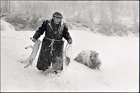
Ivor Brock rescuing a lamb in a blizzard, February 1978.

Ivor Brock rescuing a lamb in a blizzard, February 1978.

Bill Hammond completing a rick of wheat straw for thatching, 1986.

Bill Hammond completing a rick of wheat straw for thatching, 1986.

That 80,000 image archive though: that’s another matter. When I started studying photographic history I thought an ‘archive’ was some sort of formal description of a well-ordered and catalogued photographic collection.  I soon learned that it was no such thing and could often be little more than piles of boxes or filing cabinets whose contents were only dimly remembered even by those in charge of them.  That may be true of all historical archives, but at least files and other written documents with titles would usually be listed at the very least in alphabetical order.  Photographs have no such obvious device to rely on.

I imagine James Ravilious’ 80,000 images will be better ordered than most since he was creating them as a matter of record and The Beaford Archive was preserving them for that purpose, too.  But in any photographic archive it still takes a formidable cataloguing system to enable a researcher to pull out all the prints on any given subject.  If someone does write a history of the small part of North Devon that he was photographing then doubtless this archive will be invaluable.  For just about everyone else I think the value of his work lies not so much in its depiction of a vanishing world as in the timeless and quiet beauty which emerges from such careful photography. 

Percy and Alice Shaxton, No Place, Ebberley, 1975.

Percy and Alice Shaxton, No Place, Ebberley, 1975.

STEEL - OIL - STEAM

Steel-Oil-Steam front cover.jpg

When I first put a series of photos together and tried to think of a title for it I came up against a blank wall.  I seemed to be forcing the little darlings into a strait jacket.  I think I may not be alone because I am often struck when leafing through photobooks of how many are couched in vague abstractions: time, memory, identity and so on.  I even came across one the other week about  “the dualities of mortality”.   My tastes run to rather earthier topics so when I spotted a photobook recently entitled Steel-Oil-Steam I was onto it like a flash.  I got round my self-imposed limit of £20 (it costs £24) by the simple ruse of inviting someone to buy it for me as a Christmas present.  Clever, eh?

It’s a lovely little book of text and photographs by Tom Evans and Terry Hulf* which takes as its subject the doings of the Kent and East Sussex Railway - a heritage line which runs from Tenterden in Kent to Bodiam in East Sussex.  Its 80-some pages depict locomotives, lines, hardware, workshops, employees and volunteers and the photographs are interspersed with quotes from these two latter about work and life on the line.  An introductory essay quite properly concerns itself with the workings of the line and leaves the photos to speak for themselves.

The camera used for the series was a 15” x 12” ultra large format model made by J T Chapman here in Manchester in the 1880s, the characteristics of which lend a timeless quality to the 21st century.  This look is doubtless the product of its lens (the 1875 original) and, I think, also the use of orthochromatic film – an early type of film emulsion which is less sensitive to the full colour spectrum.  So the whole series of images is characterised mostly by a range of clear but dark tones well-fitted to the steel, oil, gleam and grime of its subject.

Shovels and Irons, 2019

Shovels and Irons, 2019

The disappearance of heavy industry from the UK over the last several decades mostly leaves us only with memories of its very distinctive shapes.  There were the large-scale blast furnaces, goods trains, half-built ships and coke ovens  of course. But there were also smaller scale forms around us - tools, signs, workboots, hands, waste - perhaps unnoticed at the time, whose blacks, silvers and greys were enhanced by a patina of filings and oilstains which you can see quite clearly in these pictures: like this one below, for example.

Spanners, Washout Plugs and Fusible Plugs

Spanners, Washout Plugs and Fusible Plugs

(And as anyone who has been in one will know – it’s not only the shapes of a workshop.  It’s also the smells.  On my lunchtime walks around Hull where I used to work I was always drawn inexorably to a small general engineering shop where I would hang around outside its double doors and suck in the narcotic scent of ground metal to counter the sterility of my morning in the office.)

The locomotives themselves, the wheels and the rails and the steel sheeting all set up basic visual forms: cylinder, circle, line and rectangle which draw the eye around the images in a way I find rather reassuring.  They remind me of a quote from Saint Exupéry that I once wrote down and for which I no longer have the source.  He was talking about the lines of an aircraft and said that they seemed not so much to have been designed as discovered.  The same is true of these locomotive images: the basic forms are timeless and were once pressed into service around us over and over again. Yet they seem less noticeable now, as if the modern world of colour had hidden them.

Rolvenden Yard with 0-6-0 Pannier Tank, 2016

Rolvenden Yard with 0-6-0 Pannier Tank, 2016

 Maybe it’s my age.  Maybe it takes me back to my boyhood.  But I do have adult form in these matters as well.  For several decades I rode and fettled my own ageing motorcycles in my homebuilt workshop.  You can’t explain the intoxication of  maintaining machinery in working order.  It keeps you very grounded.

So - without wanting to romanticise - there is a kind of intoxication in this world and it comes in the portraits and quotations which run through the book.  In a sense (and I may be rather cleaving towards the abstract myself here) you might say that one of the book’s themes is the enthusiasm that clearly binds all the workers together.

Sheila McKenna, Volunteer Steam Raiser, 2019.  (It could be 1919 though. The softness of form, the neutral expression, the insouciant flip of the jacket collar: all straight out of the nineteenth century.  And  that head torch and cap: jus…

Sheila McKenna, Volunteer Steam Raiser, 2019.  (It could be 1919 though. The softness of form, the neutral expression, the insouciant flip of the jacket collar: all straight out of the nineteenth century.  And that head torch and cap: just a hint of steampunk I think….)

Here are a couple of the quotes.

“I wake up in the morning looking forward to going to work and hate it at the end of the day when I have to go home.  I would love to just stay and carry on.” (Jamie Clapp.)

A steam engine is the most spectacular and engaging form of power.  You can see it, hear it and smell it.  The exhaust steam, smoke, and motion stimulate all the senses.”  (Richard Moffatt.)

(Which puts me in mind of the immortal words of a Brummie motorcyclist I once fell into deep conversation with.  I’ve never forgotten them.  “Choice of tyre lever, Peter…..” he said, looking me in the eye “……it’s a very personal thing.”)

Steel-Oil-Steam definitely gets my Photobook of 2020 award.  It’s true that it was the only 2020 photobook that I actually bought, since all the others were secondhand, but so what?  It’s a lovely unassuming little publication which raises the spirits and certainly has my warmest recommendation. 

Steel-Oil-Steam, Evans + Hulf, Samson Press, 2020, £24.  You can buy the book from the website link which is in bold in the first paragraph above.  Also, Tom Evans will be giving a Royal Photographic Society talk - on Zoom, of course -about the camera, the photographs and the book on 4 February. Details are at https://rps.org/Steam. Tickets are free and bookings come with a special offer to buy the book at a discount.  See you there.

(Copyright in all photographs and quotations in this blogpost rests with Evans + Hulf to whom I’m grateful for permission to reproduce.)

THE UNKNOWN CRAFTSMAN

Yanagi.jpg

Funny how one thing leads to another, isn’t it?  Over the summer I was reading a biography of Joseph Campbell the renowned American mythologist.  Who should turn up in these pages but Daisetz Suzuki, the Buddhist scholar and at his side his secretary, a young woman named Mihoko Okamura.  She seemed an interesting figure so I looked her up and came to the potters Bernard Leach and Shoji Hamada. She helped them to translate essays by Soetsu Yanagi about craftsmanship and the nature of beauty, published under the title The Unknown Craftsman.*  Right up my street: so I found a copy on the net – and a good job I did.  It’s a kind of creative manifesto for the common man and a rare counterbalance to the cult of the Artist Genius.

I have never understood why I seem unable to appreciate the works of high culture that are so venerated.  When I hear a full orchestral symphony I feel only confusion.  When I look at the paintings of the old masters my head spins unpleasantly.  When I try to read the Great Novels my eyelids begin to droop within minutes (Moby Dick, anyone?). I find it all too much, as though I were being pummelled.  That is not to say that I don’t appreciate beauty.  It’s just that I find it hard to perceive it in such works.

If you have ever felt the same then Soetsu Yanagi may be your man. He lived from 1889 to 1961 and seems to have been to some extent the William Morris of Japan, founding the Japanese craft movement and the Japan Folkcraft Museum in Tokyo.**  He was a great and almost lifelong friend of Bernard Leach – whose ideas and style he influenced greatly.

His ideas, and consequently his essays, are deeply immersed in Buddhist notions of beauty.  While he does not deny the genius of the Great Artist he finds the work of such figures to be personality-based and therefore limited – anything signed is suspect.   In Buddhist terms it is dualistic; it is a direct pursuit of beauty and that must therefore include ugliness. Beauty cannot exist without ugliness just as up cannot exist without down.  One of the words he uses to describe this kind of work is “eventful”.

The alternative is the work of the unknown craftsman.  Back in the day when the hand-crafted object was the norm, the craftsman had to work quickly and unselfconsciously.  He was creating objects for use within a tradition: concepts of beauty and ugliness were not in his mind.  In Buddhist terms this is non-dualistic or “eventless”.  One example to which Yanagi refers constantly is that of sixteenth century Korean Ido tea-bowl. 

Kizaemon Ido teabowl, Korea, sixteenth century.

Kizaemon Ido teabowl, Korea, sixteenth century.

Produced on a large-scale in their day and cheap as chips then, these are  uncalculated and straightforward, their beauty lying, says Yanagi, in their very ordinariness.  Many other examples are given in the illustrations which form the first 90 pages of the book. In Yanagi’s words these are objects which are “born and not made”.

It is not easy to transfer these ideas to the modern world (he was writing these essays before and just after the second world war).  Even then machine-made products had taken over in the West and Japan was not so far behind.  The advent of mass production and the profit motive signalled the end of grace and feeling in the production of everyday goods. In his view it is the designer who has inherited this responsibility.  Maybe that accounts for the popularity of shops such as Habitat, Ikea and Muji today whose products seem to have emerged from some similar ethic even though they are all machine-made.

 I know that not everyone gets their rocks off on these kind of ideas.  (When one of my daughters saw me reading this book she rolled her eyes and mimicked falling asleep.  See what I have to contend with?)  When I was studying photographic history I, too, found most theoretical approaches induced a mental state bordering on catatonia.  But for me this book took some previously fuzzy suspicion and really snapped it into focus.  Why do I so like a mass-produced glass bowl in our kitchen which is chipped and scarred and which I can’t even remember buying?  And why have I always hung onto a couple of small wooden boxes that I remember lying around in my grandparents’ house fifty or sixty years ago.  I think they might even be somebody’s school woodwork projects.

English earthenware pitcher, eighteenth century.

English earthenware pitcher, eighteenth century.

Obviously, I try to apply these ideas to photography but it’s not easy.  A photograph is not the result of craft these days and is not in any way the equivalent of these hand-produced objects from the past.  I did however once go to a small photograph exhibition given by a local photo club.  Just at the entrance to this exhibition was a table with photographs made on simple digital cameras by young children at a nearby primary school.  They took my breath away with the directness of their seeing.  The children had clearly made no attempt to produce beautiful photographs as we all had in the main exhibition.  They just pointed the camera at whatever interested them and clicked: “good” and “bad” were of no concern to them.  The results really were on another level.

It’s quite possible for an adult to do this but it takes practice.  You are simply trying to see without responding as you habitually do.  We look and we consider things to be beautiful, or ordinary or unusual or whatever yet there is a space between the looking and the labelling and we can expand that space if we practise.  Here is Yanagi’s advice.

“First, put aside the desire to judge immediately; acquire the habit of just looking. Second do not treat the object as an object for the intellect. Third, just be ready to receive passively, without interposing yourself. If you can void your mind of all intellectualisation, like a clear mirror that simply reflects, all the better. This nonconceptualisation……….. may seem to represent a negative attitude but from it springs the true ability to contact things directly and positively.”

* The Unknown Craftsman: A Japanese Insight Into Beauty.  Soetsu Yanagi. Kodansha Publishing, 1972. I’ve just noticed that Penguin also published “The Beauty Of Everyday Things” by Yanagi in 2019 though I don’t know how much overlap there is between the two.

** There is an interesting longterm project afoot to collect and restore a film archive documenting these years of the Japanese folk craft movement and Leach’s involvement: http://mingeifilm.martygrossfilms.com/

SUFFOLK AND SATURN

r+of+s.jpg

My second-hand book-buying habit having been curtailed by the lockdown, I have been going through my bookshelves taking the opportunity to re-read some of my favourites - such as WG Sebald’s The Rings Of Saturn.  I first read it shortly after it came out in English in the late 1990s and was so intrigued that, having reached the last page, I went back to the beginning and read it all through again straight away.  It’s a strange and melancholy novel. Ostensibly an account of the narrator’s walking tour of the East Anglian coast the narrative thread loops and wanders and doubles back and zigzags like a dream. 

And the author uses photographs.  He’s not the only one who has done that in fiction and there is much scholarly writing on the subject – both about him and other authors. What immediately struck me about the images in this novel though is how poorly reproduced they are. They are mostly nondescript and it’s hard to make out any detail at all.  Maybe the originals were badly printed; or maybe there was a budgeting issue for the publisher; or maybe this aspect was intended. There are no credits: apparently they are a mixture of found images, archival ones and others taken by the author.  There are no captions.  The photos are held fast in the text simply by the words all around them, a bit like cobbles set in concrete.

Much significance is attached to all of this by scholars as though the book represents some kind of photographic watershed.  Personally, I can’t see it.  The best I can manage by way of interpretation is that the photographs are generally as inscrutable as the text.  But I don’t really think that they serve any function beyond that and the book would have been just as remarkable, perhaps more so, without them.  Text requires one kind of imagination and image requires another so narrative studded with image is a bit of an imaginative minefield.

My personal walk with the book  doesn’t stop there though for on his journey the narrator visits Shingle Street.  Yes, I can almost hear the sharp intake of breath from regular readers of this blog since I published a photo of mine of that very place in the blogpost Force Majeure in March (below).  On holiday last summer in East Anglia I had noticed on an OS map this mysteriously named spot on the Suffolk coast and we cycled out there from our holiday campsite.  It was a beautiful day – which does help – and the place seemed deserted.  There is a short terrace of houses, a couple of Martello Towers, a long stretch of shingle beach and a lot of sky.  Here’s one of the Martello Towers. 

img238.jpg

It was blissful -  one of those places where there is such a sense of space that you sit down, look around, and the world seems to take on a slightly different, almost mythical, aspect. 

That’s not how WG Sebald’s narrator saw it though. He recounts rumours of wartime biological weapon experiments there and describes it as “ just one wretched row of humble houses and cottages where I have never encountered a single human being….”

Unreliable narrator?  Reliable holidaymaker?  Or the other way round?  Well, his narrator may not have spotted anyone but I eventually did.  The distant figure below approached briefly then disappeared along the shoreline leaving us alone with the waves, the shingle and the sky.

Shingle Street, Suffolk; July 2019.

Shingle Street, Suffolk; July 2019.

FORCE MAJEURE

I’ve often wondered what confluence of mysterious forces brought me onto the planet in a particular place on a particular day.  I’m not complaining: to be born in Western Europe post World War 2 was to be dealt a very good karmic hand - in my life I’ve known no hunger, war, plague, want, dictatorship, violence, invasion, civil unrest or even forced military service.

So like most people in the UK I have been pretty taken aback by the speed and seriousness of the coronavirus pandemic. My peaceful life means that I have no comparator to scale its true seriousness. As chance would have it though, a week or two ago I picked up The World Of Yesterday (‘Die Welt Von Gestern’) by Stefan Zweig (1881-1942)*.  I haven’t finished it yet but it has turned out to be echoing eerily across the years.  I had never heard of book or author  which just shows how random my literary knowledge is because Zweig was apparently very well known in his day and the book cover is indeed plastered with plaudits by several of today’s cultural giants: “one of the greatest memoirs of the 20th century”; “one of the canonical European testaments”; “absolutely extraordinary”; and so on.  Nonetheless, I bought it on the strength of running my eye over the first page.

It’s a personal account of what the author sees as the high point of European culture round the end of the 19th century, and its subsequent destruction.  He was an enormously cultured man and seems to have known anyone who was anyone. He can be a bit pompous (and there is divided opinion about him) but there are some absolutely riveting sections in the book, one of which is about what it was like to live in Austria and Germany in the social chaos that followed WW1.  Half-starved, demobilised soldiers roamed the streets, profiteers lived in luxury and revolution was in the air. In Germany at one point an egg was worth 4 billion marks - roughly the total value of all real estate in Greater Berlin before hyperinflation set in.  Food was scarcely affordable and “Well-nourished cats and dogs seldom came back if they wandered far from home”.

It sounds as though it was absolutely chaotic - and obviously we are nowhere near that - but I found it strangely comforting.  Despite this tumult, as Zweig puts it, the ‘flywheel of the mechanism’ kept on turning: “the baker made bread, the cobbler made boots, the writer wrote books, the trains ran regularly and….people came to appreciate true values such as work, love, friendship, art and nature all the more.”  He saw it as an unhappy and seedy time but it eventually corrected itself - until the early 1930s anyway.

Now I look out at the quietened streets of south Manchester.  Zweig’s phrase goes round in my head: ‘the flywheel of the mechanism kept on turning’.  It reminds me of another phrase, a line of verse actually, from The Lankavatara Sutra – an opaque sutra that I am struggling through with a group of friends.  It’s pretty opaque but this line flashed out at me one day and lodged in my memory: “Life is like an illusion or dream, but reality is relentless” ** - which seems to be an idea similar to Zweig’s: something just keeps on turning.  These are difficult times but I wonder if the words both of Zweig and the Sutra can be of some comfort?

*******************************************************

Talking of comfort, maybe photos can also help.  Photography has a public function of course, but also a private function and looking at photos of happy times or peaceful scenes can be very therapeutic.  So I hope these three from my travels last year are of some help.

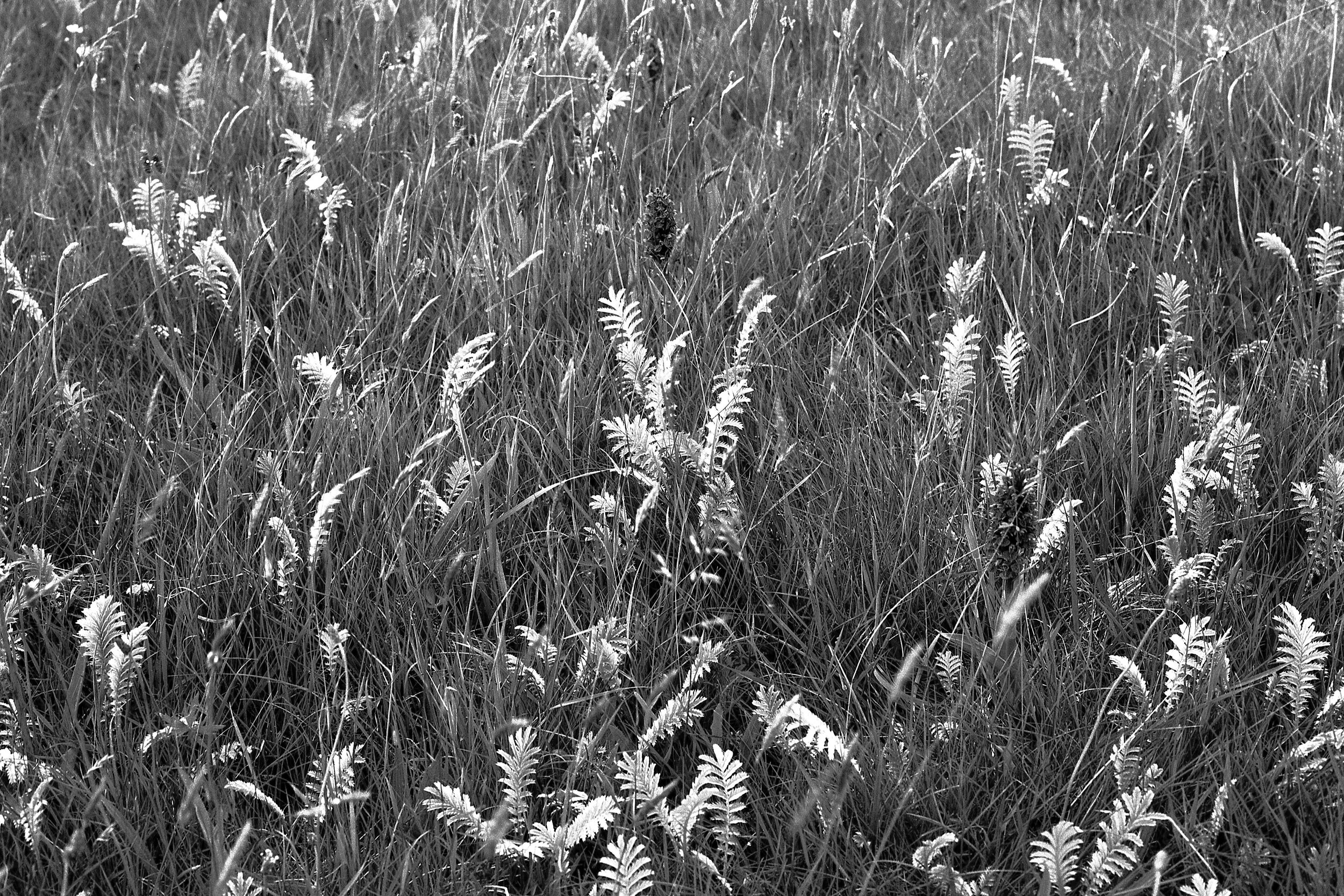
Two Orchids, Lindisfarne, Summer 2019.

Two Orchids, Lindisfarne, Summer 2019.

Obelisk, Lindisfarne, 2019. The end of a 90 mile walk and a welcome sight.

Obelisk, Lindisfarne, 2019. The end of a 90 mile walk and a welcome sight.

Shingle Street, Suffolk. 2019: a truly atmospheric stretch of coastline. The cunningly placed human interest in the photograph is Mrs Barker.

Shingle Street, Suffolk. 2019: a truly atmospheric stretch of coastline. The cunningly placed human interest in the photograph is Mrs Barker.

*Pushkin Press, 2019, trans. Anthea Bell.

** (The Lankavatara Sutra, Counterpoint Press, 2012; translation and commentary by Red Pine.) Actually, the text reads: “Samsara is like an illusion or dream but karma is relentless. As I understand it, in Buddhist terminology, ‘samsara’ is the cycle of birth and death; and ‘karma’ is the law of cause and effect which is the driving force behind samsara - but I changed these terms so as to access the meaning a little bit more clearly.

IN PRAISE OF OLDER PHOTOBOOKS

You can pay a lot of money for a book of photographs by even a minor name.  £50 or so for a new one would be quite common and if it’s out of print then even a secondhand copy could be a lot more.  I paid about £50 if I remember rightly for Dave Heath’s   “Multitude, Solitude”  When I had my great book giveaway a couple of years ago I saw it on resale in the charity shop I had given it to for over a £100.  Now it is going on Amazon for £195 used and £378 new. 

So, a while ago, I decided to set myself a limit of £20 in order to bring a little discipline into this whole process.*  And, as ever, that discipline has its rewards.

41kcmh8pvqL._SX362_BO1%2C204%2C203%2C200_.jpg

This book is one of them.  I picked it up for £9 in a secondhand shop before Christmas.  I have no idea who Jenifer Roberts is, or was, and can find out nothing about her on the net.  Published in 1992, in many ways it’s a standard kind of book containing landscapes and portraits from the author’s travels around the world.  They are classical, perhaps even a little out of fashion now but there is nothing wrong with that.  The landscapes can certainly hold their own with the classic ‘Land’ by Fay Godwin which would probably be seen as the benchmark for this kind of work.  Plus she does quote Virgil: “To the spirit of the place and to earth/ the first of the gods….”

What makes the book unusual (apart from the Virgil) is the author’s openness in setting out her general technical approach both to taking the photos in the first place and then to developing and printing them.  And the great lesson is this: the whole process is very, very simple.  That is not to say for a moment that it is easy.  It’s just a great relief in the kaleidoscope of digital imagery tools to have someone set out fundamental rules very clearly.  For example, she says that when you produce your prints there are only two main variables: one is how dark or light you want the print to be, and the other is how much contrast you want.  To be honest, I had never thought of it that simply.  In fact, now I look at the controls in my software, Lightroom, I see that Exposure and Contrast come first.  Unfortunately, they are followed by Highlights, Shadows, Whites, Blacks, Clarity, Vibrance, Saturation, more Highlights, Lights, Darks, Shadows and Point Curve.  And those are just the tonal controls. Like many, I suspect, I have arrived at my own system largely through intuition.

In the darkroom, beyond those two main variables, the author darkens and lightens tones locally in the print – and that is about it in general terms because grain and sharpness have been taken care of in developing the negative.  A tonal change which you can make in a second onscreen now would have taken her a few hours through from execution to dried print in the darkroom.  She writes that It could take her a week or two to perfect a print.

Then, as you go through the book, for each picture she tells you how she how she saw it when she clicked the shutter – which generally means how she judged the exposure and whether or not she used a filter on the lens – and how she enhanced that in the darkroom.  It takes a lot of confidence and a lot of goodwill to be that open.  It’s really helpful.

41fdJDVgoLL._AC_UY218_ML3_.jpg

I also picked up this one, at the same time for £8.50.  It’s a 1979 publication and that ‘2’ in the title suggests that maybe it’s one of a series.  It contains the thoughts of eight photographers about photography in general and their darkroom technique in particular.  Some of them are pretty well known: Lisette Model, Aaron Siskind, Charles Harbutt, Cole Weston.  It’s fascinating – not least because the tone is so even: it’s just a kind of sensible chat.  It reminds me of the Paris Review series of interviews with well-known authors that I used to devour years ago.  You learnt a lot from the references and asides and methods.

This idea, that there are authorities, whom it is worth listening to, is a bit passé these days.  They are probably still there somewhere but everyone is shouting so loud.  The older, cheaper books take you back to a time when voices were not so raised.

“ In order to maintain the rigorous standards of honesty to which this blog aspires I have to confess that I offered a seller on ebay £25 for Charles Harbutt’s “Travelog” for which he was asking £40. He obviously didn’t share my views on rampant consumerism in the photobook market and turned me down.

GREAT JOURNEYS, SHAME ABOUT THE PHOTOS

serveimage.jpg

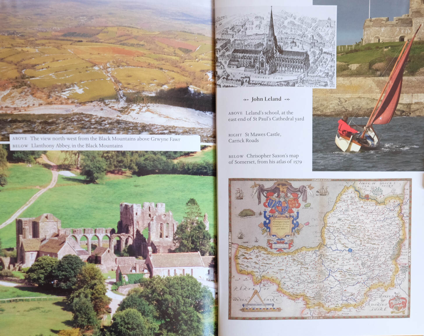
I’ve spent a good part of the summer walking across Northumberland and cycling around East Anglia so Nicholas Crane’s Great British Journeys (Weidenfield and Nicholson, 2008) was a good companion for some of that time.  It takes eight British travel narratives from the 12th to the 20th century and retraces the steps those writers took.  It’s a good read: NC seems like an accomplished navigator and researcher and his inquisitiveness inspired me to nose around on my own relatively minor travels.  There is one thing that lets the book down though and it is a very common fault – the photographs.

It is nothing to do with the quality of the photographs themselves.  They aren’t in fact particularly interesting which is a bit surprising since the book came out of a television series: you’d think that professional camera people would have been able to provide better outtakes.  But that is by the by.  The real issue is the way that the photos have been wedged into the book.

There are 250 pages or so of text and the photographs have been divided into three chunks which have been inserted apparently randomly at pages 90, 138 and 170.  They are of the shiniest paper, are in several sizes and vary between landscape shots of spots mentioned in the narrative and landscape shots featuring the author.  Then there are the stock photos of old maps mentioned in the narratives scattered into this sequence. The identifying text is placed wherever seems to have been most convenient and – my particular bugbear – appears to be in more than one font. some photos are laid over others and some text obscures the images. White background appears randomly.

Bit of a dog’s breakfast

Bit of a dog’s breakfast

This hurts my eyes.

This hurts my eyes.

This isn’t that unusual but it is pretty surprising in a book drawn from a documentary television series – a format which has now existed for well over half a century and which is essentially the marriage of words and images.  Yet it is often done so badly: in nature programmes, travel programmes, history programmes, word and image wrestle for domination. The result is often what could have been a radio programme but with images tacked on for TV; or a series of images on television so overcooked that the soundtrack becomes mere embellishment.

Personally, I don’t think the book needed any photos – its historical nature precludes them. (Line drawings or something like on the cover would have been great.) If it had to have shots of the modern-day sites then I would have used high quality stills, probably in black and white to excite the imagination, and inserted into the text where it deserves them.  Several centuries after the Chinese were affirming when they merged image and verse that the image was the host and the words inscribed on it were the guest we still seem to be struggling with the very basics of marrying the two.

JOHN BERGER: WORDS AND IMAGES

 The Marriage Of Text And Photo

It was a bit of a blow when John Berger (Ways of Seeing), Robert Pirsig (Zen And The Art Of Motorcycle Maintenance) and Leonard Cohen all died within a  year. I’m not much into hero worship but certain people are kind of constant presences in your life and so these three were for me.  I even wrote a haiku.

John Robert Leonard

Berger Pirsig and Cohen -

all in the twelve months

I was quite pleased that this does stick to the traditional 5/7/5 syllabic pattern – though some days I do think there is a vague note of E J Thribb (from Private Eye) about it.

300x.jpg

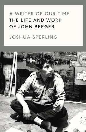
I read a biography of LC last year and wished I hadn’t: I’d never quite realised what a rackety life he had.  So it was with some trepidation that I picked up Joshua Sperling’s ‘A Writer Of Our Time: The Life And Works Of John Berger’ recently. It turned out to be more an examination of JB’s thought than an autobiography – though nonetheless it turns out that he, too, was something of a lady’s man.  What is it about these guys and women, for heaven’s sake?

JB is best known doubtless for ‘Ways of Seeing’ (both TV series and book) and possibly for donating half of his prize money to the Black Panthers when he won the Booker prize in 1972.  It caused quite a row.

He’s a fascinating figure: a challenging and visionary polymath, but also verbose, dogmatic and contrarian. Youtube clips like this one show him at his charismatic and charming best.   He is sometimes grouped with Susan Sontag and Roland Barthes as part of a triumvirate of authority on photographic theory (though they are all best sampled in small doses, I find).

Of particular interest to me are his thoughts on marrying photography and text - which is essentially what this website is about.  Rare is the day I don’t write a haiku of some sort and I did go through a period of trying to combine these with photographs.  Here’s an example.

dreams.jpg


I had in mind the lovely Chinese and Japanese paintings and brushwork you see which often carries text.  The Chinese refer to the artwork as the host and the text as the guest.  Often the characters are not particularly legible and so the meaning of the text is secondary.  The problem with doing this digitally is that the text comes out far too clear and the fonts are too definitive to sit with an image.  It would be like  branding a puppy.

In 1967 Berger published, with photographer Jean Mohr,  A Fortunate Man, a book of text and photographs about the life of a country doctor.  This was an experimental attempt to match text and image creatively in book form.  Berger made the distinction between the private photograph which remains part of a private narrative for the person or family or group to which it belongs and therefore needs no particular explanation; and the public photograph which requires a context before it can make any contribution to understanding.  A Fortunate Man was his attempt to work through this idea not simply by creating a straight line of narrative around the photography but by embedding it in a radial structure of words in which neither word nor image repeats the other (as so often happens in conventional news/documentary/photobook forms).  He had had some experience of this in his work on television arts programmes and he went on to develop it in two further books (A Seventh Man and A Way Of Telling). 

We might see the text/image dilemma as physiological.  A photograph will be round your brain’s neural circuits and will have had its effect before a paragraph of text has even got its boots on.  If you are given, say, a two-page spread with words on one side and images on the other your eye always leaps to the latter.  But when it is done well, the text might be seen as slowing down the image by lengthening the viewer’s cursory glance and the image promotes the words by creating an interest in them.  That has presumably been a central issue for all news media since the invention of photography.  What about when you want to get away though from such a straight form of communication though?  What if the relationship of word and image were to be more irregular, non-linear or poetic even?

You would think that digital technology might have helped but in my experience it has simply reinforced the difficulties.  The template I use for this website makes it very difficult to insert text between the images on the photograph pages.  In software such as MS Publisher text boxes and image boxes are treated quite separately and you are restricted to a narrow range of fonts and picture formats.

These blog posts are themselves an attempt to put word and image together – though I don’t feel that I have yet reached the transcendental moment when each might inform the other in a less conventional way. I am working on it though and John Berger is a great help.

To end, here’s a photograph I produced recently which maybe could take some words?

209998002.jpg

Maybe these? 

walking the streets

at every footfall

the city unfolds

ANSEL ADAMS' AUTOBIOGRAPHY

Little, Brown and Co, 1996

Little, Brown and Co, 1996

Go on.  Who would you say was the most popular photographer of the 20th century?  Not based on statistical evidence of sales or exhibitions or whatever – just straight out profile in the popular imagination.  I’d say it has to be Ansel Adams (1902-1984).  Cartier-Bresson might give him a run for his money but in the end I think the Frenchman is more admired by other photographers while Adams is more popular at large.

Having just read his autobiography, which I picked up locally secondhand, I can see that his personality might have had something to do with it.  He comes over as a very attractive, affable, chatty, kind of chap – very opinionated but with tremendous energy and enthusiasm. He loved a drink and good company. He didn’t take any prisoners, mind you.  Here he is in a letter to William Mortenson dismissing Pictorialist photography and celebrating Realism:  “How soon photography achieves the position of a great social and aesthetic instrument of expression depends on how soon you and your co-workers of shallow vision negotiate oblivion.” Boof!

You might now see him as part of the Romantic movement which in photography died out as a serious form in the 1970s, post-Minor White. I’ve never seen any of his prints in the flesh but even on screen you can see how he managed to squeeze every drop of tonality out of his negatives.  I guess it would have been pretty extreme – and technically difficult – at the time but in these days of Photoshop and High Dynamic Range they look pretty middle of the road, tonally speaking. You can see a good range of his images here. They are striking or overwrought depending on your taste.

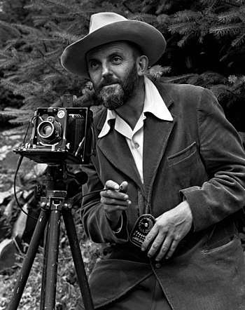
Ansel in the 1950s (by J Malcolm Greany) looking rather dapper, light meter at the ready.

Ansel in the 1950s (by J Malcolm Greany) looking rather dapper, light meter at the ready.

His bottom line, always and ever, is that photography is a creative art and that to see or use it as anything else sells it short – though he himself of course had to take on commercial commissions to survive. He didn’t get on with Edward Steichen who in the late 1940s sidelined Ansel’s friend Beaumont Newhall and became Director of the Department of Photography at the Museum of Modern Art.  “Everything we feared” writes Ansel to Beaumont, “the complete engulfing of photography as you and I see it ….into a vast picture archive.”

Steichen’s hugely popular Family Of Man exhibition – whose aim was to show “the essential oneness of mankind” – was the last straw for Ansel (even though one of his own photos was in it!)  He thought it was more suited to the United Nations than to MoMA. 

That jibe about “a vast picture archive” went to the heart of his philosophy.  For him it wasn’t so much about the subject of your photograph as the way you produced it and the communication of feeling that represented.  You had to control the whole process from visualising the photograph to developing the negative, choosing the paper, making the print and displaying it.  That could be a long process and sometimes he took several weeks working on a print to get it just right – and then over the years he would develop that further.

You might say now that for many, it is precisely the subject of a photograph rather than image quality which is its main interest.  That’s why The Family of Man was so popular.  But maybe Ansel had a point, too, because you could also say that there are limited subjects but limitless ways to capture them photographically.     

Environmentalist, pianist, inveterate letter-writer and very liberal in many of his social views, Ansel Adam’s autobiography makes a good (if meandering) read.  You go back to your own photography with renewed vigour.  Enthusiasm is such an attractive quality in a person.

JUST A MOMENT

Just how creative is photography? 

The consensus these days seems to be that the battle for photography’s status is won.  There it is hanging on the walls of major museums and art galleries – end of discussion.  But that ignores the distinction so commonly made between ‘art as photography’ (which is what artists do) and photography as art (which is what photographers do).  The clear suggestion is that one is more creative than the other.  It also omits all the other photographies: scientific, technical, medical, forensic, family, evidential, social and so on.  I thought a more interesting way of looking at it was to turn the telescope round and point it not at photography but at creativity.

serveimage.jpg

To do that I read two autobiographies by people who might generally be considered creative: Philip Glass’s ‘Words Without Music’ (Faber and Faber, 2015); and Patti Smith’s ‘Just Kids’ (Bloomsbury 2012).  I read them because they came floating up to me from the shelves of my local secondhand bookshop.  So – pretty random, which is the best way.  My question was: do these creative people see life any differently from anyone else?

Philip Glass seems to have come straight out of the stalls, looking neither to right nor to left but with one goal only: to write music.  He did whatever it took to survive financially: removal work, taxi-driving (which one time nearly cost him his life), plumbing and house maintenance.  He brought up a family and he kept a roof over their heads but he only started to earn money from the music when he was in his forties.  On the way he took care to cultivate good artistic company, to develop his technical skills, to work at composition every day and – it seems, to enjoy it as he went along.  The self-belief seems to have been unshakeable right from the start.

Patti Smith, from a later generation, tried a few things: poetry, a bit of acting, drawing and then rock and roll.  To her, artistic practice was mystical and the practitioners were mystics.  She was determined to become An Artist, and that is what she did – almost by sheer force of will.  She seems not to have had Philip Glass’s self-belief but she was practical, held down jobs and kept going.  While her friend and lover, Robert Mapplethorpe, seemed to climb to the top, she floated.  Contacts were essential-  but then, when aren’t they?

serveimage (2).jpg

What the two of them seem to have in common is practicality.  They kept producing work, they were ready when the chance came, they kept the wolf from the door, they moved in the right company and they would not be deflected.  Both of them seem in thrall to the idea that Artists are Different, that they are a kind of nobility, that to be an artist is “to see what others cannot” as Patti Smith puts it.  Hmmmm…yes, well.

Nearer the mark, perhaps, is the idea that Philip Glass cites from Krishnamurti, that creativity is not so much a characteristic as a moment, a kind of unrepeatable spontaneity.  That is what both he and Patti Smith exhibit.  They never seem to quite know what is coming next but have great confidence that something will come.

That’s an idea which transfers well to photography.  When I peer through the viewfinder I like to think that I am in the same position as the sculptor wrestling with form, the poet with words and the musician with sound. But creativity is not the unique preserve of the fine arts. I am also in the same position as the mechanic grappling with spanners, the cakemaker with recipes and the mathematician with numbers.  Creativity is a world where thought is momentarily suspended and memory no longer functions.  That, presumably, is why time passes so quickly.

When Robert Mapplethorpe photographed Patti Smith for the much-lauded cover of her first LP ‘Horses’ he went through numerous attempts.  The light keeps changing, his light meter malfunctions, first its jacket on and then jacket off – then all of a sudden he says:

“I got it.”

“How do you know” she asks.

“I just know.”

It came from nowhere, as these things do. You can’t predict them and you can’t repeat them. All you can do is to make your preparations and then be open to them - whatever the activity and whatever its status. For photography, you have to think about the photograph you are taking, of course, but if you are still thinking about it when you snap the shutter then you may get something technically good - but not much more than that.

BERENICE ABBOTT: HOW MANY PAGES MAKE A LIFE?

“Berenice Abbott: A Life In Photography” by Julia Van Haaften

9780393292787_198.jpeg

At a guess, I’d say that most people know of Berenice Abbott either from her documentation of the changing face of New York or from her connection to the  archive of Eugene Atget, the Parisian “Balzac of the camera”.  The basic facts of her life are simple enough.  She came from nowhere, creatively speaking, to a perhaps lucky gig as Man Ray’s studio assistant and from there to her own portrait photography practice in 1920s Paris.  She went back to the US before WW2 and set out to photograph the changing face of New York.  From there in the 1950s she moved on to scientific photography.  She was technically skilled and innovative but her big problem was that she had a genius for putting people’s backs up.  Too many movers and shakers clearly saw her as humourless and difficult.  Her persistence eventually paid off however and she began to earn serious money from her back catalogue from the 1970s onwards.  Stylistically speaking she moved away from the early influence of the surrealists to a straight, naturalistic photography.

Blossom Restaurant, 103, Bowery, Manhatten, 1935. Berenice Abbott.

Blossom Restaurant, 103, Bowery, Manhatten, 1935. Berenice Abbott.

The one photo that always popped into my mind when her name came up would have been this one , Blossom Restaurant, 103 Bowery, Manhattan.  The chap coming out was a piece of serendipity apparently but to me the most interesting thing is the enormous range of dishes set out on the menu in the restaurant window: did they do all of those every day, I wonder? It gives you an idea of the superb detail she caught with her large format camera in so many of the images.

You won’t find out the answer to that menu question in Julia Van Haaften’s recent biography,  Berenice Abbott: A Life In Photography (W.W. Norton and Co. 2018) but it is possibly one of the few details missing from this monumental book.  As a work of research it is pretty astounding.  Want to know what Berenice ate for lunch on 29th November  1928?  It’s in here at page 129.  The company she kept in Paris in the 1920s is assiduously recorded and you get sentences like this: “McAlmon enjoyed substantial financial freedom from his six-year marriage to Winifred Ellerman, called Bryher, the British shipbuilding heiress and lover of the poet H.D. – Hilda Doolittle, whose former partner had been the poet Ezra Pound.”  Got that?  It’s a sort of third-person diary so there is ample to fascinate the devoted B.A. fan. 

For the undecided, (e.g. me) it was a harder read because there is no real assessment of events, no glance at the horizon from time to time.  Was she wasting time with the Atget archive and inviting critics to see her as in thrall to him?  And why did she sell a half share in the archive to gallery owner Julian Levy for $1000 when she had paid $10,000 for the whole thing only a few years previously?  At times she seems to have had little money but more than once there is reference to her fine clothes and to her cars.  It doesn’t seem to stack up.  The bigger picture disappears in the detail. 

As for the photography – hmmmm……  There are some pretty impressive photos, no doubt about it, as you would expect in a body of work spanning half a century or so.  As a straight photographic record of people and place it’s hugely interesting and some of her photos seem now to create 1930s  New York as much as recording it.   I don’t think photography can go beyond that: it isn’t transcendental after all.  The work is one thing but the life is another. I’m not sure the life itself justifies 500 pages but this is bound to be the definitive biography for a good long while.

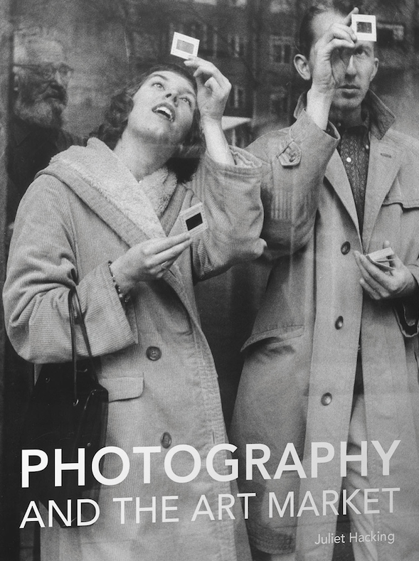
PHOTOGRAPHY AND THE ART MARKET BY JULIET HACKING

How The Market Makes Art and Art Makes The Market

PhArtM.png

Here is an interesting book.* For £30 you get a handsome 266 hardback pages by the Programme Director of the MA in Contemporary Art at Sotheby’s Institute of Art.  She was previously Head of the Photography Department at Sotheby’s auction house and therefore has much experience of the book’s subject – how the art market for photography functions.

The book is divided into two sections.  The first is aimed at potential collectors and deals with how to navigate the market for art photography.  It starts off at worm’s eye level but soon enough rises to the aspirational.  If you were thinking of starting off a photograph collection then it would be pretty essential reading.  There is detailed advice on establishing authenticity, researching value, analysing auction reports, and recognising pitfalls.  Some of this works on a pretty big scale.  For example, there is what Dr Hacking describes as ‘rebranding an alternative investment portfolio as a curated collection.’ Here is what you do.  You promote a Fund (that is, you interest both private individuals and institutions with the right kind of money) and go scouting for reliably valuable photographs, hoovering up whole collections along the way and attracting more investors as you go.  With a wave of the wand, Investment Portfolio becomes Collection in its own right when you start persuading influential people to talk it up, you sponsor serious exhibitions in which it features, you promote academic conferences which highlight it and you even publish catalogues dedicated to your Collection. Having maximised your brand you then “bring it to the market” and if your timing and technique are right you should have generated such a frenzy that you will make many times what you have spent in putting the brand together.  The author says that the knack for “successful monetisation” is to “conjure up aura”.  

It is Dr Hacking’s main theme that the market is crucial to the making of Art (as opposed to art) and the second half of the book addresses that theme: how photography (or some photography anyway) became Art and therefore became very  valuable.  Dr Hacking’s argument is that there has always been, from the very beginning of photographic history, a distinction drawn between Art-as-photography and photography-as-art.  Few would argue with that. The former is what artists do and the latter is what photographers do.  There is overlap and there are grey areas: for example, in Sotheby’s, Robert Mapplethorpe has been sold as an artist in London but as a photographer in New York.  Traditionally the reverse has been more true, however: those who are big in photography may be unheard of in contemporary Art and vice versa.

Dr Hacking’s survey of the market history of photography makes clear that until well into the second half of the twentieth century it was difficult to get any sort of a decent price for a photo.  But as the value of older art went into the stratosphere, photography helped fill the market gap that was left.  Between 1975 and 1991, for example, photography prices increased by some 680%.  Then when contemporary art began to take off at the beginning of this century photography had to try and hang onto its coat-tails.  By the 21st century six figures for a photograph was no longer exceptional but 99% of all sold photography still falls outside of the contemporary art market and therefore the really, really big prices.

So, if there are these fairly simple economic arguments about supply and demand then how is it, we might ask, that the market can impute cultural value?  Surely, the price paid is a result of that very cultural value and not a determinant of it?

What enables an image to arc across the photography/Art electrodes is a complex institutional circuit, according to Dr Hacking, the wiring of which encompasses critics, dealers, writers, specialists and institutions.  In essence, Art photography is whatever this coterie decides it to be – its nose being guided by artistic pedigrees, track records, market history and personal opinion.  This does seem a curious argument.  It must lead ineluctably to the conclusion that there is no intrinsic quality in the picture itself which makes it Art.   Good, bad or indifferent – it makes no odds.  It is simply the opinions and prices which trail in their wake.  Taking the example of Andreas Gursky’s Rhin II – sold for over £3 million several years ago which was then a world record price for a photograph – you might well conclude that it is indeed a pretty mediocre image.  But the rub is that everything points to its being a very safe investment vehicle.

Like all circuits, the one described by this book might be seen as ending at its own starting point.  What underpins it, that cultural value is determined by price and price is determined by cultural value, may well be true within the walls of the auction house, but it is not necessarily so outside them. It is also an argument which has an interesting parallel with banking until 2008: that was another world in which a group of people considered themselves to be too expert by half - and look where that ended.

Towards the end of this book the author says that we should be asking not why Rhin II is so valuable but how it has come to be so.  Indeed we should, because this Foucauldian question inevitably leads us onto the issue of discourse.  Viewed from this angle we can see that the book is not so much a commentary on that discourse as part of the discourse itself.  The first half is after all a scholarly explanation of how the market functions and the second half is a scholarly account of the history of art photography based on an examination of historical values.  By its very nature it is an account for participants of all kinds and its advice will influence behaviour.

Perhaps surprisingly, there is no comparison in the book between the photographic commodity market and any other enthusiast-based commodity market.   For example, in the historic vehicle market (where Art is not in issue) prices in the last fifty years have also gone through the roof.  If a graph of comparison showed significant similarities in its peaks and troughs with those of the photography market then we might well conclude that it was overall macro-economic factors that affected value as much as judgments about Art.   Put bluntly, the quality of what is being bought doesn’t matter so long as the commodity can deliver a return.  One of Lawrence of Arabia’s series of old Broughs, for example, is always going to maintain value even if that marque’s rear cylinder did overheat with monotonous regularity.

The book is a good read.  The prose is clear, the annotation copious and the author’s pedigree impeccable.  If you want to be a collector you had better read it.  Even if you don’t, its market-based view of photographic history is, I think, a first and, whether you agree with it or not, it is very interesting food for thought. 

*Photography And The Art Market by Juliet Hacking (Lund Humphries, 2018)    

MORE SHADOWS, LESS LIGHT

Back To Tanizaki

The Tanizaki book that I wrote about a couple of posts below continues to smoke around my brain.  I see a link with something that Barthes says in La Chambre Claire: “I  have always had the impression that in any photograph, colour is a coating applied after the event to the original truth of black and white.”

You might think that the opposite was true: that black and white is a style applied to a world of colour.  Don’t you see colour all around you after all?

Yet when I get up each morning for my meditation session something curious happens.  Here in northern Europe at around 6.30 am in winter it is dark.  I settle into meditation and the world that I see through my half-open eyes is monochrome. 

My rudimentary understanding of the physiology of sight is that in low light levels the eye makes use of rod cells – which do not perceive colour, only black and white.   The greyscale in between those two extremes is the rod cells’ version of colour, known as “ghosting in”.  As the meditative minutes pass, the sun comes up and, even on a rainy day, light levels rise.  Cone cells then come into play and replace the monochrome of the rod cells with colour.  The same happens in reverse in the evening but artificial illumination masks it.  For that reason it is much clearer in the countryside than urban areas.  So we see in monochrome or colour depending on the amount of light available.

The decline of black and white photography might be seen as coinciding with the increasing use of electric light.  Since we are drenching the world in colour that is what we replicate photographically.  In older buildings the subtlety of shadow has profound effects.  In churches, castles, old houses, old farm buildings the eye seems often to revert to the monochrome world.  Other senses are brought into play then.  It is a more complete world because it does not rely on acute vision alone.

Seen in this way, colour photography is not a technological advance producing a more accurate view of the world.  It is a regime whose account of the world is a construction.  Your saturation slider therefore has its Faustian aspect: you can have fun - but the price you pay is dazzling.   Tanizaki’s lament for the shadows of his youth and Barthes’ insight into the nature of photography lead us inexorably to this conclusion.

IN PRAISE OF SHADOWS

Japanese Aesthetics And Photography

Cover of Penguin Vintage Classics Edition: ISBN 9780099283577

Cover of Penguin Vintage Classics Edition: ISBN 9780099283577

This much admired work was written in 1933 by Japanese novelist Junichiro Tanizaki as a hymn of praise to traditional Japanese aesthetics and might still be profitably read by the 21st century photographer.

Tanizaki’s theme is the importance of shadow in aesthetic appreciation and its disappearance under the glare of modern electric lighting.  The flicker of candlelight, the half-light from the shoji (the traditional paper screen), the dim glow of coals from the stove, glistening black lacquer – all have been destroyed by modern lighting.   There was a moment of trance, he wrote, when he raised that lacquered bowl of dark soup to his lips, “a kind of silent music evoked by the combination of lacquerware and the light of a candle flickering in the dark.”   Japanese cooking he says is “inseparable from darkness” and the beauty of a Japanese room depends on the interplay of dark and light shadow.  He evokes the experience of tasting a yokan, a traditional Japanese confection:  “You take its cool, smooth substance into your mouth and it is as if the very darkness of the room were melting.”

It is a beautiful essay and to read it is to imagine a tonal world that is very different from the one we inhabit now.  Look around our towns and cities: lighting is a kind of fetish.  It is not there to aid progress round the streets anymore nor to illuminate destinations.  Its purpose is to repel shadow – metaphorically, perhaps, to blot out what we do not wish to consider in our own psyche.

In photography, is it any coincidence that the subtle depiction of black and white shades which was once our photographic world has all but disappeared before the emergence of the backlit digital image?  Digital display – the adverts, the computer screens, the photographic projection in all its forms - has obliterated the pale washes of the analogue world. Is this not the photographic consequence of what Tanizaki was writing about in 1933?  Have we not created in digital display a harsh coating which in fact obscures the very quality we are trying to reveal in our photographs?


PHOTOGRAPHY AS FINE ART

Human Communication, Economic Unit, or Plaything of the Cognoscenti?

Something I read in last winter’s edition of Source has been niggling at me so I need to give it a run round the park.

Richard West interviewed Diarmuid Costello and Juliet Hacking about what they understood by the term  “art photography”.  The former saw it as a means of human communication – just like other forms of art.  The latter had a different view.  She said that art photography is whatever institutions deem it to be.  This, I thought, was refreshingly plain speaking.  Since she was a specialist in the photography department of Sothebys and is currently writing a book about art photography and the market she  knows, we may conclude, what she is talking about.

Her argument is that the institutional network will determine what is or is not art photography.  That includes galleries, auction houses, museums, critics and so on.   Their view is not random.  Partly it will be based on the pedigree of any given artist – where they studied, who has collected their work, where they have exhibited, what prizes they have won and so on.  The critical distinction seems to be between the photographic world and the art world.  Being successful in the former does not give any status in the latter.  And status in the latter is never absolute: it is constantly shifting.  Much like the fashion world, some people are in and some people aren’t.

What I find interesting about this view is that it suggests that art photography has no intrinsic quality to distinguish it from non-art photography.  Prices, pedigree, critical success and so on may all be indicators but come in the photograph's wake.  What about the work itself?  Is there absolutely nothing that can be pointed to in a photograph that makes it even good rather than indifferent (because “good” must be the first rung on the ladder to “art”)?  Nothing at all?  In the distant days when you eagerly awaited the return of your holiday snaps and you proudly showed them around, one or two would be pronounced “good ones” and even within the circle of family and friends that would usually be agreed upon.  That suggests to me that there is such a thing as Quality in a photograph.  While there may be argument about what it actually is, everyone seems to agree in practice that such a thing does exist.  There is that spontaneous reaction to it as proof.  And if you reply that art knows nothing of good or bad then you are avoiding the question.

The other interesting thing about Juliet Hacking’s view is that it could be expressed in another way: that there is in fact no such thing as art photography in any objective sense. If there is no such thing as quality how could there be? It is the product not of a creative person but of commentators.  It is a purely subjective category based largely on economics and a brahminical caste. 

I’m very much looking forward to reading her book when it comes out.  It sounds as though it will be outspoken, well-informed and iconoclastic.  Where do I order my copy?  


TOLSTOY'S RESURRECTION

Tolstoy Writes A Photo

In Tolstoy’s novel ‘Resurrection’ a photograph features as a literary device.  The basic plot is that the well-born Nekhlyudov, as a young man, seduces a maid, Katusha, in his aunts’ household.  She becomes pregnant, is dismissed and spirals downward in society and into prostitution.  Ten years later Nekhlyudov is doing jury service at a murder trial and is horrified to see that the defendant is Katusha.  He is overcome with remorse since he sees his own acts as the source of her downfall; and all the more so when she is mistakenly convicted and sentenced to hard labour.  He decides that he must devote himself to saving her and visits her several times in prison while she awaits transportation to Siberia.  It is during one of those visits that he passes her a photograph of them both in a family group taken at his aunts’ estate before the seduction.    The photo is a minor device that Tolstoy uses to telescope the action, to summarise what has happened over the past 250 pages.  It reminds us of Katusha’s precipitous fall and the invulnerability that Nekhlyudov’s social position confers on him.  Yet it is the way the photo functions between the two characters which is most interesting.  Nekhlyudov must see it as some sort of talisman, something which will raise her spirits.  What a mistake!  When he has gone, Katusha looks fondly at this bent and yellowing reminder of happy times but unsurprisingly her thoughts turn bitter when she considers her present fate and she hides the photo away.   A single photograph provokes smiles, then frowns then anger.  She knows that it was only a decade earlier but it seems to her to be another lifetime.  In these minor details Tolstoy seems to isolate two essential elements of the photograph in daily life: it can collapse time and it can provoke great emotion.   We are in Barthian territory here, only a good half-century earlier.  This is the power of the photo as personal artefact as opposed to its power as dream.

VERBS AND PHOTOBOOKS

Leafing, Reading, Studying?

There is no obvious verb for what you do with a photobook.  Although they usually mimick the physical form of a book of writing you can’t really say that you read them.  So what do you do?  Leafing through is too unengaged.  Studying is too academic.  Browsing sounds like passing time.  The photobook is a strange beast.  To corral photos between covers, eternally arranged in an unalterable sequence of numbered pages seems to consign them to a strange and unnatural fate.  With prose, whether fiction or non-fiction, it works because the sentence, the paragraph, the chapter or indeed the whole work are all linear by nature.  Once you have started you have to keep going along the lines to the end in order to get the full sense.  The same is not true of photographs.  They are much faster through your brain so if you are not disciplined you can be through a photobook in no time at all, and it all seems very unsatisfactory.  My method is to use a display stand such as a small easel.  Having taken a first tilt through the book I then prop it up on the stand and display a page or two a day.  I may follow its sequence or I may not.  Freed from their pen the photos seem to live and breathe more freely.       

LEARNING TO FISH

The Joys Of The Well-Stocked Photolibrary

I am just coming to the end of an MA in Photographic History which I have been taking part-time at De Montfort University in Leicester.  A couple of years ago I was looking around for a way of extending my photographic activities.  I thought about a degree in photography but found the prospectuses offputting.  I made a deal with myself: if I could find one that I understood from beginning to end then I would apply for the course.  I never found one.  But in searching I did come across the MA.  It seemed to address the question that I asked myself every time I took a photograph: what am I doing when I press the shutter button?  What is a photograph?  The MA course looks at that question from many angles: technical, historical, ethnographic, theoretical, anthropological and so on.  Then it teaches you the research methods to come up with your own answer.  It has hugely deepened my understanding of the subject and of  photographic practices even though I am in many ways still only scratching the surface.  Best of all about the course though was that it gave me the chance to browse at will in a well-stocked photographic library.  I have spent hours in that library not only pursuing my researches but also pulling books down almost at random, just because the title appealed to me or the author’s name was vaguely familiar.  Often I branched out into other sections of the library too: design, visual culture, website design, art history, optics, you name it. As I come to the end of the course I can’t help thinking of that quote from Tolstoy: “If you give a man a fish you feed him for a day but if you teach him to fish you feed him for life.” 


MENTAL MODELS

Are We Making It All Up?

“Mental models, our conceptual models of the way objects work, or people behave, result from our tendency to form explanations of things…….  Mental models are often constructed from fragmentary evidence with but a poor understanding of what is happening and with a kind of naïve psychology that postulates causes, mechanisms and relationships even where there are none”  (Donald Norman:  The Design of Everyday Things.)

If someone throws a ball and you catch it then you see that as a linear sequence of cause and effect.  Someone throws the ball.  I see it fly through the air.  I move to catch it.  Boom, got it!  But science says, apparently, that it’s not quite so simple.   In the brain’s neural pathways, our visual system makes primary use of the dorsal stream for fast actions and the slower, ventral stream to recognise objects.  So the dorsal stream makes sure that you catch the ball before the ventral stream has seen that it was coming.  If you apply that to photography it seems that it may be possible to press the shutter button a nanosecond before you have seen what you intend to photograph.  That would not by any means be limited to action shots, would it?.  And it may account for that small stab of surprise and then recognition that we get from time to time when we see how one of our photos has come out.

ERIC HOBSBAWM: FRACTURED TIMES

High Art, The Horse, And Photography

Reading Fractured Times by Eric Hobsbawm I find him putting into words something that has often smoked around my brain.  This is the idea that the traditional methods of judging art simply cannot be applied to modern cultural output.  He makes a characteristically striking comparison between traditional bourgeois High Art and the horse.  Once that animal had a very central and useful role in society but that has been displaced by the internal combustion engine.  The horse lives on now only as a luxury for the rich.  Similarly the traditional handmade arts have been made redundant by technological change.  The defining characteristics of creativity now are mass production and mass demand.    What distinguishes this modern creation is its multiplicity – the endless stream of sound, image and text.  Where once the single work would be the unit of attention or critique, what developed in the twentieth century and on was simply endless commentary on that endless production.  It is possible to talk about a photograph in the same way as a painting say, but to what end?  The single work is a thing of the past.  EH does not suggest for a moment that popular culture has no value.  He simply says that it is to Art what the motor car is to the horse.  It creates what he calls an entirely new landscape of the mind.  (This seems to be a remarkably accurate description of the effect of photography.)  In a wonderful phrase EH says that cultural commentators are unwilling to admit this general truth “because no class of people is enthusiastic about writing its own obituary”.  Cracking!