To summarise: I am trying to find a way to marry text and photograph in an equal partnership. Image then will not simply be an illustration drawn from the text and the writing will not simply be a description of what’s in the image. Neither will be subordinate to the other.
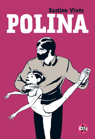
Pursuing this I recently read my first graphic novel, Polina by Bastien Vivès. Though chosen largely at random, it might, I thought, give me some clues about how the two could balance one another out. The story is slight - about a young Russian dancer who undergoes conflicting teaching but eventually finds fame and fortune.
If you divide a standard work of prose fiction into dialogue, narration and description then in a graphic novel you can dispense with the last of those because the pictures do description for you. In Polina the author also uses no narration – which in other styles can appear in different fonts and different frames to distinguish it. So we are left with just image and dialogue – see below right.
The pared-down artwork is easy on the eye but I find the convention of the speech bubble has two drawbacks. First it reminds me of all the comics that I used to read as a boy; and second, it partly obscures the image. I suppose you could read it as part of that imagery but I don’t. The interesting fact, though, is that words and image do achieve some kind of parity. They play roughly equal parts in the storytelling.
Next I turned to Incidental Inventions by well-known novelist Elena Ferrante. This is a collection of short prose pieces on a given theme each of which carries an accompanying illustration. The artwork, though beautiful, is very much the junior partner here – doubtless because the star of the show is the author and not the illustrator Every piece is set out in the same format – first the picture then the words; and the picture is an imaginative interpretation of the text’s theme (see below). I couldn’t help feeling that the quality of both writing and art were not well served by the straitjacket of this layout.
I wrote about this topic in September and June but I still can’t see a way forward at the moment. My recent experiences have not been encouraging. I sent in a couple of Shahai (Photo + Short Verse) to a local competition; and I used the Shahai form as the centre of an application for an artistic mentoring programme. Neither of these got anywhere. It may just be quality of course, but the art world has categories. Writing is writing and image is image. Mixing the two up leaves you in a bit of a no man’s land.
I console myself with the thought that if I knew how it was all going to turn out there wouldn’t be much point in doing it.


