Be honest. It’s not often that you get to talk to a tiler about the Bezold effect, is it? This tiler was putting up some tiles in the bathroom which were of a subtle shade that we had spent some time choosing. Now, up on the wall, they seemed pretty dark.
“Don’t worry” says the tiler, “Grouting makes all the difference.” He didn’t actually use the word ‘Bezold’ but he knew what he was talking about. Once that soft white grout had slipped into the gaps the shade lit up very noticeably.
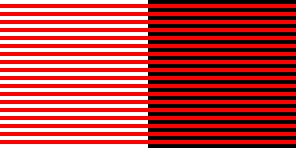
I dashed for my bookshelves and the tome about optical illusions. I’ll give neither title nor author of this book since it’s truly slapdash effort. While doing a bit of digging for this blogpost, for example, I noticed that the author has lifted whole chunks of text straight out of Wikipedia. (At least I change them around a bit….. ) But the visual illusions in the book are interesting nonetheless. The Bezold effect, for example, concerns the way in which a colour’s tone is changed by those around it. Like so.
The white surround makes the red look lighter and the black makes it look darker. Now this jogged my memory. My next stop – prompted, I admit, by Wikipedia -was White’s Illusion which is not dissimilar.
Here the basic black and white grid has been overlaid by two sets of grey rectangles of the same shade. Yet the grey between the blacks looks darker than that between the whites. This is even though, unlike the Bezold effect above, the former has white at each side; and the latter has black on each side. Curious, eh?
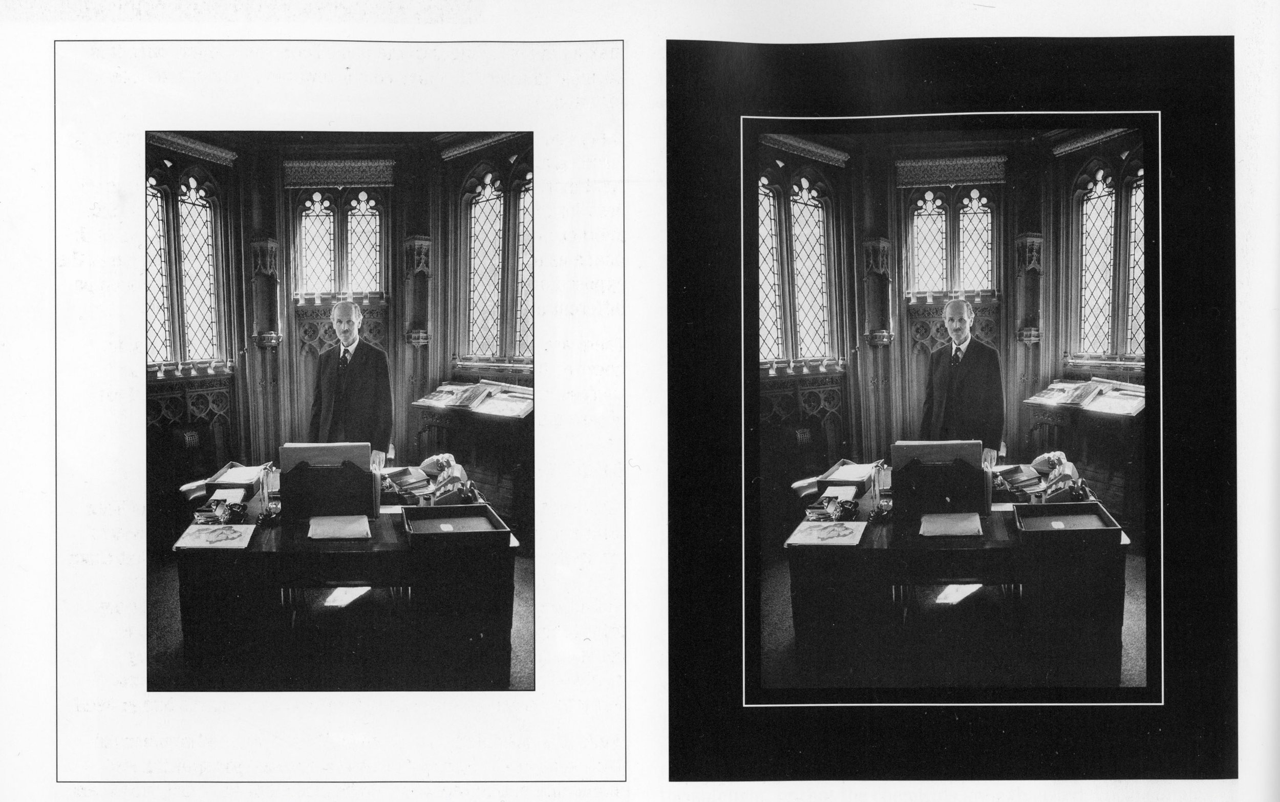
Now this is of some importance to anyone (okay…..me) who is mounting and framing black and white photos. The bit of my memory that these illusions had jogged was an example in the excellent Larry Bartlett’s Black and White Photographic Printing Workshop (Fountain Press; 1996)*. Take the two photos below. Which of the prints do you prefer: the darker or the lighter?
Okay, you’ve probably guessed that it’s a trick question. The prints are exactly the same. The one on the right looks darker than that on the left simply because of the shade of the mount. It may be that the two different slimline borders may mitigate that effect, I’m not sure.
I will be bearing this in mind in the future. It has always been my habit to mount my prints on some sort of ivory shade of mountboard because it seems to give the print more light. Now I know why. But I had never thought of using a darker mount deliberately to darken the print. I was so inspired by this idea that I went straight to the Photographs page of this blog and converted all my Cow Parsley images to darker mounts. See what you think.
*The original price of this book was £24.95 and I picked it up secondhand for £3.99. It’s odd that the price of film cameras is increasing everyday and so is that of darkroom kit. But pukka instructions on how to develop and print properly from the days when there was no alternative are still available at bargain basement prices. What does that tell us? I have a handful on my bookshelves now and they are a treasure trove of knowledge and experience which I refer to constantly.


