CRUISING

Can A Motorway Be Beautiful?

In the late 1950s when I was about eight years old one of my schoolmates invited me to his birthday party.  We were all to meet in town and then, as a birthday treat, we were going to pile into his dad’s brand new Austin A40 for a spin on the M1 motorway. None of us had ever been on a motorway before: the first section of the country’s first motorway had just been opened and its futuristic styles seemed to proclaim exciting times ahead.

Innocent days.  We raced along this empty piece of blacktop at dizzyingly high speeds - at times exceeding 50mph!  I had no idea where we were or where the motorway went but I was deeply impressed by the ride.  I got more experience of the country’s developing road system when my parents bought a car and our visits to my grandparents in County Durham now took us up the M1 and the A1 rather than British Railway’s east coast line.  Eventually the tedium of bypasses and bottlenecks took over and my adolescent self stopped paying much attention to these new road routes.

I rediscovered my interest though in a long motorcycling career when I got older.  Motorcyclists tend to sneer at motorways but I found – and still find – an empty motorway to be very atmospheric. There is some sort of latent potential in it.  I was once in Glasgow late on a Sunday afternoon and I had to get back to London.  I decided to do it in one hit straight down the M6 and then the M1. It was one of the great rides of my life.  Inside your crash helmet you are the world.  You lean on the handlebars and at times it seems as if it is you who are still and the world which is moving.  There is nothing but the darkness, the rush of the wind, the boom of the silencers and the silvery chatter of the valvegear.

Since I lived near Hull for nearly 30 years I travelled the M62 very often and always enjoyed it once past Leeds heading eastwards.  The heavy cross-Pennine traffic dies away, the land flattens out, the skies get bigger and there’s this impression of leaving things behind and racing towards some greater spaciousness.

Imagine my pleasure then when I picked up a recent issue of The Modernist Magazine  – Number 30 with its theme of Infrastructure – and found amongst the trig pillars, dams, telecommunication transmitters, cooling towers and signalboxes a lovely photo-essay on the M62 motorway by Kevin Crooks.

I’m not a big fan of what we might generally call conventional Landscape Photography: it always seems to have something of the postcard about it.  I guess it might be seen as part of the Romantic tradition in its tendency to elevate the picturesque and the ideal over the real.  Kevin’s images of the M62 slicing through the Pennines though, centre on what is there rather than what we might wish were there.

M62--The-Transpennine-Motorway-Kevin-Crooks-_670.jpg

Civilisation requires order and a motorway is part of that.  Nature requires order of a different kind and the Pennines are part of that.  In these photographs the two sit together and we can contemplate them in a kind of peaceful coexistence. It is rare after all that we see motorway as a still rather than moving point.  When you are driving along one it is second after second, minute after minute and hour after hour of unbroken speed and concentration.  To look at the M62 from the perspective of these photos might be likened to contemplating the ocean after a near-drowning experience.

M62--The-Transpennine-Motorway-Kevin-Crooks--25_670.jpg

In The Modernist there is an accompanying essay by Kevin which gives some insights into what he was trying to express with this photographic series. .  As he points out, it is easy to see the negative aspects of motorway travel – the noise, pollution and congestion – but there is more than that. He was trying to bring out the grandeur of the setting, the beauty of the built form, the sensitivity of the road engineers to the environment and the changing weather patterns.  You can see the full series on his website http://kevincrooks.co.uk/  The magnificent setting of the motorway does of course help but in the end it is the melding of the manmade and the natural which gives the series its focal point.  Is it pure fancy to say that you come away with a renewed internal stillness? 

M62--The-Transpennine-Motorway-Kevin-Crooks--18_670.jpg

One day, doubtless, road travel of this kind will be history and these motorways will lie empty and still.  Future generations will wonder what to do with them as we now contemplate uses for derelict industrial land.  The Pennines will shrug.

This is a long way from 1959 and one newly opened stretch of the M1 but Kevin’s photographs remind us, I think, of how infrastructure of this kind is not purely utilitarian but has a drama of its own – part history, part technology and part human endeavour – which is easily overlooked. Still, I go back and think of my eight-year old self, holding my breath as the speedometer needle crept towards 50 miles an hour, the landscape flashed past, and the future approached. 

All photographs ©Kevin Crooks from the series “M62: The Trans-Pennine Motorway”.  I’m very grateful to him for letting me reproduce them here. The full series is also available from Kevin in book form with the images offset by lovely small pieces of text by John Davies.

The Modernist Magazine is a quarterly cornucopia of interesting architectural and design subjects. 


LI YUAN-CHIA: UNIQUE PHOTOGRAPHS

I worked in Hull for many years.  At lunchtime I would often leave my office and wander round the city.  The Art Gallery was only a few hundred yards away and I would go in from time to time.  Yet I have no memory at all of a 1998 exhibition of Li Yuan-chia’s work.  And for many years I had on my bookshelf a copy of Hunter Davies’ “A Walk Along The Wall” which contains a section about visiting the artist’s home and museum in Brampton, Cumbria.  I never got round to reading the book and eventually gave it away.

A while ago I made a note of Thoreau’s dictum: ‘Only that day dawns to which we are awake.’  It’s a particularly condensed epithet which suggests that in some sense we make our own world.  So somehow, when I hopped on the number 85 bus the other day and made my way to the Whitworth Art Gallery to see an exhibition of Li Yuan-chi’s photographs, a little bit of world was about to dawn to which I had not been awake in 1998.  That process is incomprehensible.

The exhibition is Unique Photographs and there are fourteen images all made in the last two years of the artist’s life.  Each is a black and white photograph which has been coloured in varying densities by a technique which involved using hand-tinting inks as washes.  Here is an example.

_-Ky7CD5.jpeg

 Each of the photographs is mounted on what is possibly white rag paper which is then mounted on black card which itself is itself mounted on black matte and then framed with what looked like wood with an ebony stain.  Since the images themselves are not very big (A4-ish in various formats) this gives them a certain presence though I think it would have been a kindness to paint the white wall on which they are hung in a more muted colour in order better to enter the world which they create.

To take a monochrome photo and to colour it might seem a bit perverse.  Isn’t the reduction of the world to black and white itself a creative statement?  Yet we could say that photography intercepts reality whereas painting reconstructs it.  So the addition of artistic method to photographic method here means that we have both: the reconstruction of an interception.  Hand tinting usually follows the forms of an original photograph but in these images it is less tethered in that way - as if we were being invited to consider colour and form to be entirely independent. Look at the leaves below, for example. From close to, the yellow wash does not follow the bulb’s form very closely either.

7sRQhbAc.jpeg

I find the result is beautifully atmospheric.  If black and white itself invites us into a different world then the addition of a wash introduces a dream-like quality in which all is recognisable but seems to be at a further remove.  This effect is heightened because the subjects of the photographs are all commonplace objects: stones, flowers, tools, objets trouvés, and at times LYC himself.  For me they are lovely objects of contemplation, each a reverie which hints at a reality that may be truer than the precision of digital colour.

Each image is untitled.  The curatorial comments draw on Daoist philosophy and quote from the writings of Li Chuan-yua’s friend, the artist Winifred Nicholson. They also seem to draw quite deeply from the curator’s imagination, for example: “The stones of the path are an exploding galaxy, the log a silvery interstellar craft.”  This is either an act of curatorial desperation or an inspired accompaniment to these very delphic images – I haven’t quite made my mind up. 

In any event, Li Yuan-chia is a day to which I am now very gratefully awake.


Both images: Li Yuan-chia (1929-1994), Untitled, c1993. Hand-coloured black and white photographs. Courtesy the Li Yuan-chia Foundation. You can find out more about Li Yuan-chia on the LYC Foundation Website. The Whitworth Gallery’s exhibition of the artist’s work (in Manchester, UK) lasts until 15th December.


WRESTLING WITH FOG

What’s Going On?

I go out.  I take a camera.  Something catches my eye.  I raise the camera and peer through the viewfinder.  Hold it right there!  What is going on at that moment?

This is not a conundrum confined to photography.  In any creative endeavour there is the moment when you pick up the pen or brush or sit down with your instrument.  Just at that instant how would you describe what is going on? 

Let’s ditch even the concept of creative endeavour.  What is going on at any given instant you care to name?  Just as you arrive home at the end of the day and close the door; just as you stare at the supermarket shelf and try to decide what to buy; just as you take that first sip of a cup of tea or coffee.

If you try to examine any given moment closely there seems to be a fog.  You have thoughts coursing through, you have sensations of touch, smell and so on, you have perceptions, you may have memory or imagination or mood at work.  You may try to block all that out with concentration – it’s a standard technique and may help.  You may try analysing the moment or you may try ignoring the whole cacophony. 

We all have this problem and we all have techniques for dealing with it: sport, alcohol, pastimes, study, the open air, whatever.  Photography is one of mine.

But analysis or blocking only works so far.  When I look through the viewfinder what I see either resonates or it doesn’t. It is intuitive. If I start thinking rationally at that point I am lost.  I have to function on another level – away from rational thought or analysis.  Maybe this is what Henri Cartier-Bresson meant when he talked about putting the head, heart and eye on the same axis.  Pressing the shutter button then becomes reactive rather than premeditated.  This photo, as an example, seems to have come from deep within that process.  I look at it now and see it not simply as framing a view that I noticed but as the reflection of a state of mind.

img065.jpg

 For about thirty years I have gone on retreat quite regularly, mostly in eastern spiritual traditions.  I’ve found they help me to look more closely and see more clearly.  Usually they major on meditation but this September I am attending a Japanese brushwork retreat which combines meditation and, well, brushwork.  According to the Zen master Hakuin (1688 - 1768)  brushwork is a practice with the intention of drawing 'lines of unfettered simplicity, to reveal nothing special, with no particular beauty, only an uncommon ease that transcends our understanding of space and time.' 

I am hoping that in exploring this tradition I will be able to learn something about the nature of creativity that I can apply to photography. Something that does not necessarily fix what is going on but which helps to work with it.

Something like this, if I am not mistaken.

Kaz Tanahashi: Untitled (1992) Zen Mountain Monastery Archives

Kaz Tanahashi: Untitled (1992) Zen Mountain Monastery Archives

 According to the Japanese philosopher Nishida Kitarō true creativity is not the product of conscious effort but rather the 'phenomenon of life itself'. True creativity arises from a state beyond thought, emotions, and expectations.

These sort of statements always sound a bit vacuous when quoted out of context but it’s the process of discovering how, if at all, they can be applied in practice that I find so central to daily life.


IT'S IN THE BAG


There’s nothing like a long-distance walk to clear the mind.  And a few years ago I discovered the wonder of getting my main bag transported from night stop to night stop so I didn’t have to shlep it.  So when I suggested to Mrs Barker that this year we should walk St Cuthbert’s Way – a 70-mile hike from Melrose in Scotland to Lindisfarne - she readily agreed since she is not one for carrying any more than is absolutely necessary.

 I had quite separately been coming to the conclusion that I needed to buy a decent camera bag and the prospect of this walk spurred me on.  The non-photo-geek might say -  WHAT?!  You need a special bag – just to carry a camera?  Hello??

In truth you don’t.  You can just throw your camera into any bag.  It will get battered though and you can spend a long time rummaging through everything else in the bag trying to find it.  For a long time I did use a standard rucksack into which I put a camera bag insert – a kind of padded rectangular thing with Velcro dividers which cost me about £10.  I still got fed up after a few years because it was always at the bottom of the bag and it took forever to get the camera out.

When I investigated the market I was surprised to find that there is an infinite number of camera bags available – truly hundreds of makes and models. If you look hard enough you can even pay over a thousand pounds for one. They are all essentially the same, some bigger and some smaller.  The smaller ones are basically just, well, bags; and the bigger ones usually have a separate entrance for your camera kit. It is the job of marketing departments to persuade you that they are all different and theirs is best.  What happens to all those billions of bags which are never bought?  Presumably they end up in some sort of camera bag graveyard eternally condemned to hang empty from the shoulder of an uncaring Destiny.

You can get the odd bargain on ebay or gumtree or wherever but you can also get a minger.  It is worth trying other options and for photography there are secondhand kit sites like Ffordes Photographic to check.  I got a decent one there for £70 (less than half the new price) and it really is in as new condition.

Taking the beautiful Hasselblad in the bag may have been a mistake.  It was partly for the sheer thrill of having it with me but it’s a thrill which weighs nearly 4lbs and at the end of a 15+ mile day up hill and down dale that is a significant weight.  On two days it was raining so heavily that I hardly dared  get it out of the bag. 

My plan was to shoot a tree a day. I’ve always found trees to be a difficult photographic subject so I thought it would be a good discipline. I shot one roll of film in the end – twelve frames – which in my opinion is quite enough for a six day holiday.  There are six tree shots on it but I wouldn’t be able to remember what the other ones were without looking at the notes I took. This is the excitement of film photography: it is a longer process which seems to work partly at a subconscious level. By the time you have developed and scanned/printed your film the images are an amalgam of memory, imagination and intention. With digital there is an immediacy which has a very different effect.

Anyway. Trees and fields are all well and good but I’m a fan of a good powerline too.  Like this.

img022.jpg

Magnificent beast, eh?  ( If you agree then try the Pylon Of The Month website or join the Pylon Appreciation Society We are perhaps not a very happy UK at the moment, but surely there is something fundamentally hopeful about a country where such enthusiasms exist?)


FIRE IN THE ENGINE ROOM

 When IT Goes AWOL.

Choice can easily result in paralysis.  Then again, paralysis can be good.

My nine-year old laptop was slowing down to snail’s pace.  I had done lavish research before I bought it and it was, at the time, a good one:  Intel i5, 500gb of hard drive and so on.  I felt I was going to have to buy a new one but every time I went anywhere near a shop the choice seemed overwhelming.  And it is a curious thing that whenever you replace a piece of kit these days – white goods, electronics, transport, whatever – what you get is never quite as good as what you had. 

Anyway, I ruled out anything from Apple and any of the comparable Microsoft machines on the grounds of cost and overengineering.  They seemed to be way more than I needed.  A modern equivalent of what I have got seemed to come in at £600+.  Still a lot of money – and particularly so since the hard drive capacity on these newer machines is often miniscule: presumably you are meant to use the cloud for storage these days.  I was paralysed into indecision.

Perhaps to create the impression in my own head that I was doing something I decided to get the current one serviced.  The guy I use for this suggested that I think about a solid state hard drive.  I thought these were external when used as upgrades but apparently not, so I decided to go for that option.  In the end I got an SSD, a service and my old hard drive back for external use all for £63!  Not bad at all and a good example of positive procrastination. As a result the laptop is a lot quicker and cooler to run and is probably now better than new.  

Disaster struck all the same and my misdemeanours came back to haunt me because my chosen photo software – Lightroom – stopped working.  I knew why.  It was a copy I had had installed when I was doing a photography course and was not strictly speaking legit. after the end of the studies.  Installing the new hard drive had disabled it and I didn’t have the code to reboot it.

Not only that.  Last year, Adobe decided to discontinue one-off open-ended licenses.  Now you have to subscribe for £10 a month - and for way more functionality than certainly I need.  They are trying to get you hooked, of course.  But I only ever do very basic processing of my photos.  (It’s meant to be photography and not digital image-making, after all.)  This was bad news.   The last copies of Lightroom 6 (the final one-off version) on the market seemed to have been hoovered up.  Undeterred, I set up an ebay alert and sat back.

It’s fashionable to diss Ebay but I find it amazing: an eternal circuit of goods and money in pursuit of one another. It’s a kind of perpetual motion. Surely someone will one day produce some sort of exhibition or photobook of ebay product photographs? It’s like the world atomised.

Anyway, back at the plot, I missed two chances of Lightroom 6 because they were snapped up within an hour or two of appearing on the site (An hour or two!  For obsolescent software!)  But finally I got one.  Even as I write, I am waiting for the DVD to slide through the letterbox.

I was well chuffed.  The episode, I mused, seemed to offer two lessons.  Firstly, it’s always worth exploring options before buying a replacement: even in the dark undergrowth of digital technology there may be a cheaper way lurking in the brushwood.  And secondly the corporate titans may not have got it entirely sewn up: you just need to look around a bit.  It’s always good to beat the system.  If the DVD solution hadn’t worked I was willing to go for a smaller, less mainstream product.  They wouldn’t get me!

I put these subversive thoughts to a group of photofriends recently.  I saw myself, red flag aloft, on the revolutionary train to an open source future (something like Tom Courtenay as Strelnikov in Doctor Zhivago). Anarchic slogans raced through my mind.

BENEATH THE PAVING STONES – THE BEACH! STICK IT TO THE MAN!  BETTER TO DIE STANDING THAN LIVE ON YOUR KNEES!  HAVE FEWER CHILDREN, BREED MORE PIGS! (Honestly. It’s a Chinese one.)

My friends weren’t convinced.  Peter, they said, Peter. Calm down. It’s only a tenner a month.  Just pay up and stop obsessing, eh?

Oh, well.  Fewer slogans, more colour - maybe that’s what we need. The guys below might agree.

Qingdao, China 2014 © PMB

Qingdao, China 2014 © PMB

JOHN BERGER: WORDS AND IMAGES

 The Marriage Of Text And Photo

It was a bit of a blow when John Berger (Ways of Seeing), Robert Pirsig (Zen And The Art Of Motorcycle Maintenance) and Leonard Cohen all died within a  year. I’m not much into hero worship but certain people are kind of constant presences in your life and so these three were for me.  I even wrote a haiku.

John Robert Leonard

Berger Pirsig and Cohen -

all in the twelve months

I was quite pleased that this does stick to the traditional 5/7/5 syllabic pattern – though some days I do think there is a vague note of E J Thribb (from Private Eye) about it.

300x.jpg

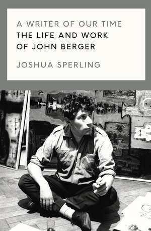
I read a biography of LC last year and wished I hadn’t: I’d never quite realised what a rackety life he had.  So it was with some trepidation that I picked up Joshua Sperling’s ‘A Writer Of Our Time: The Life And Works Of John Berger’ recently. It turned out to be more an examination of JB’s thought than an autobiography – though nonetheless it turns out that he, too, was something of a lady’s man.  What is it about these guys and women, for heaven’s sake?

JB is best known doubtless for ‘Ways of Seeing’ (both TV series and book) and possibly for donating half of his prize money to the Black Panthers when he won the Booker prize in 1972.  It caused quite a row.

He’s a fascinating figure: a challenging and visionary polymath, but also verbose, dogmatic and contrarian. Youtube clips like this one show him at his charismatic and charming best.   He is sometimes grouped with Susan Sontag and Roland Barthes as part of a triumvirate of authority on photographic theory (though they are all best sampled in small doses, I find).

Of particular interest to me are his thoughts on marrying photography and text - which is essentially what this website is about.  Rare is the day I don’t write a haiku of some sort and I did go through a period of trying to combine these with photographs.  Here’s an example.

dreams.jpg


I had in mind the lovely Chinese and Japanese paintings and brushwork you see which often carries text.  The Chinese refer to the artwork as the host and the text as the guest.  Often the characters are not particularly legible and so the meaning of the text is secondary.  The problem with doing this digitally is that the text comes out far too clear and the fonts are too definitive to sit with an image.  It would be like  branding a puppy.

In 1967 Berger published, with photographer Jean Mohr,  A Fortunate Man, a book of text and photographs about the life of a country doctor.  This was an experimental attempt to match text and image creatively in book form.  Berger made the distinction between the private photograph which remains part of a private narrative for the person or family or group to which it belongs and therefore needs no particular explanation; and the public photograph which requires a context before it can make any contribution to understanding.  A Fortunate Man was his attempt to work through this idea not simply by creating a straight line of narrative around the photography but by embedding it in a radial structure of words in which neither word nor image repeats the other (as so often happens in conventional news/documentary/photobook forms).  He had had some experience of this in his work on television arts programmes and he went on to develop it in two further books (A Seventh Man and A Way Of Telling). 

We might see the text/image dilemma as physiological.  A photograph will be round your brain’s neural circuits and will have had its effect before a paragraph of text has even got its boots on.  If you are given, say, a two-page spread with words on one side and images on the other your eye always leaps to the latter.  But when it is done well, the text might be seen as slowing down the image by lengthening the viewer’s cursory glance and the image promotes the words by creating an interest in them.  That has presumably been a central issue for all news media since the invention of photography.  What about when you want to get away though from such a straight form of communication though?  What if the relationship of word and image were to be more irregular, non-linear or poetic even?

You would think that digital technology might have helped but in my experience it has simply reinforced the difficulties.  The template I use for this website makes it very difficult to insert text between the images on the photograph pages.  In software such as MS Publisher text boxes and image boxes are treated quite separately and you are restricted to a narrow range of fonts and picture formats.

These blog posts are themselves an attempt to put word and image together – though I don’t feel that I have yet reached the transcendental moment when each might inform the other in a less conventional way. I am working on it though and John Berger is a great help.

To end, here’s a photograph I produced recently which maybe could take some words?

209998002.jpg

Maybe these? 

walking the streets

at every footfall

the city unfolds

THOSE CREATIVE JUICES (3)


Last month I did a couple of posts on The Little Game – which is a method of refocusing your practice if you feel it needs tightening up a bit.  I got it from The Online Photographer (for links to the actual TOP posts see April and May’s posts).  The idea was to categorise your back catalogue into the 25 most frequently occurring categories, including overlaps if necessary.  Then you prioritised them from 1-25.  You then take the top five and concentrate on them to the exclusion of everything else.  I had a go myself because I felt my practice had started to drift a bit and I needed a new direction.

I found I could easily get over 25 categories and so had to discipline myself to stick to that.  I didn’t prioritise them all because lower down the order there was no particular priority.  The top five then turned out to be:

1. Cityscape. This isn’t street photography. It’s more to do with the shapes of a city and how its inhabitants interact with it - some sort of environmental psychology. How our buildings shape us. Here’s one that popped in front of my lens recently.
Manchester 2019 ©PMB

Manchester 2019 ©PMB

2. People In Situ.  Okay, everyone’s in situ in a sense but it was meant to suggest people, well, doing stuff: working, playing, walking, talking and so on. I guess it’s a kind of mirror image of the first category. People in places rather than places round people.

Piccadilly Gardens. Manchester 2019 © PMB

Piccadilly Gardens. Manchester 2019 © PMB

Cow Parsley in autumn and winter is sooooo beautiful…. Also ferns. Unmissable.

Cow Parsley in autumn and winter is sooooo beautiful…. Also ferns. Unmissable.

3. Form.  Just that.  A few years ago I read On Growth And Form by D’Arcy Wentworth Thompson.  Okay, I didn’t actually read it - because it is almost unreadable – but I browsed it and tried to absorb it.  It concerns itself with the question of why the world takes the form that it does and was huge in its day (published 1917).  Photographically it gave rise to the series I now call The Decline Of Magic (which you can see on the Photographs page of this website) and also this kind of thing:  

_-18.jpg

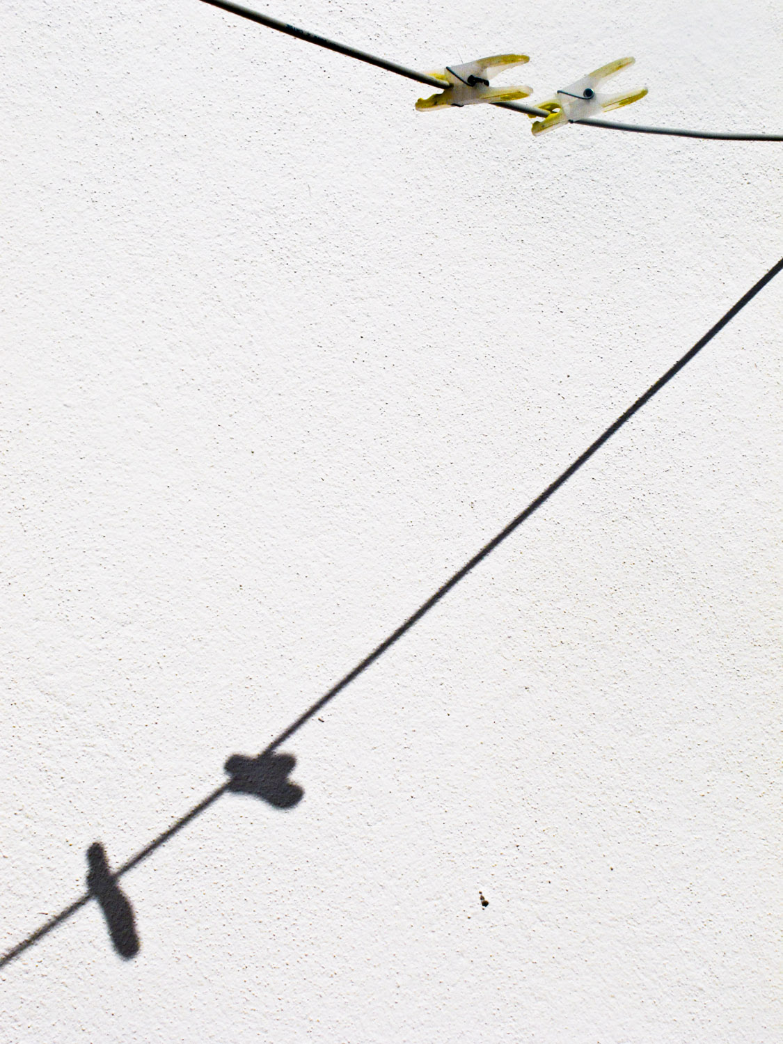
4. Spirit.  Broadly speaking this would be more contemplative.  It is what happens on those occasions when the hubbub dies away and you are able to look closely and see clearly. Then the very ordinary reveals its ineffability. Like the pegs below which I spotted dangling over my head one day.

5. Black and White. It isn’t a subject but it is a category.  I’ve flip flopped between colour and b and w for ages so I want to stick with the latter for a while.

Of the categories - obviously twenty aren’t going to make it. These are the ‘meh’ ones, maybe. Some of those that didn’t make my own personal cut were: abstraction; shadows; pattern; faces; Manchester; square (format); and so on.

Good exercise or useless?  I think this might be a question of how you approach it.  As a general rule in life I like to have a direction but I’m not so keen on goals.  Sticking to roughly the same route and seeing what comes up has always seemed more interesting than fixating on outcomes.  So the five above represent a direction for me and not a set of rules.  That seems to be within the spirit of the exercise.

The overlap of categories can confuse things too.  What if I see, for example, a great urban landscape with strong patterning?  Is it excluded on the grounds of pattern or included on the grounds of cityscape?  Well, these are only guidelines. In the end you have to rely on your instinct and not reasoning.

It is a few weeks since I came up with these categories and already they are shaping my eye. How?  That is probably for future blog posts but (at last) I feel that I now have a bit of a structure to hang things off.

If you tried it, I hope it bore fruit for you, as well. I’m sure it’s applicable in many other areas of endeavour. I go back to that passage in Zen And The Art Of Motorcycle Maintenance that I mentioned in May’s post on this theme. We can be paralysed by choice.

ANSEL ADAMS' AUTOBIOGRAPHY

Little, Brown and Co, 1996

Little, Brown and Co, 1996

Go on.  Who would you say was the most popular photographer of the 20th century?  Not based on statistical evidence of sales or exhibitions or whatever – just straight out profile in the popular imagination.  I’d say it has to be Ansel Adams (1902-1984).  Cartier-Bresson might give him a run for his money but in the end I think the Frenchman is more admired by other photographers while Adams is more popular at large.

Having just read his autobiography, which I picked up locally secondhand, I can see that his personality might have had something to do with it.  He comes over as a very attractive, affable, chatty, kind of chap – very opinionated but with tremendous energy and enthusiasm. He loved a drink and good company. He didn’t take any prisoners, mind you.  Here he is in a letter to William Mortenson dismissing Pictorialist photography and celebrating Realism:  “How soon photography achieves the position of a great social and aesthetic instrument of expression depends on how soon you and your co-workers of shallow vision negotiate oblivion.” Boof!

You might now see him as part of the Romantic movement which in photography died out as a serious form in the 1970s, post-Minor White. I’ve never seen any of his prints in the flesh but even on screen you can see how he managed to squeeze every drop of tonality out of his negatives.  I guess it would have been pretty extreme – and technically difficult – at the time but in these days of Photoshop and High Dynamic Range they look pretty middle of the road, tonally speaking. You can see a good range of his images here. They are striking or overwrought depending on your taste.

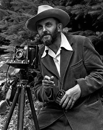
Ansel in the 1950s (by J Malcolm Greany) looking rather dapper, light meter at the ready.

Ansel in the 1950s (by J Malcolm Greany) looking rather dapper, light meter at the ready.

His bottom line, always and ever, is that photography is a creative art and that to see or use it as anything else sells it short – though he himself of course had to take on commercial commissions to survive. He didn’t get on with Edward Steichen who in the late 1940s sidelined Ansel’s friend Beaumont Newhall and became Director of the Department of Photography at the Museum of Modern Art.  “Everything we feared” writes Ansel to Beaumont, “the complete engulfing of photography as you and I see it ….into a vast picture archive.”

Steichen’s hugely popular Family Of Man exhibition – whose aim was to show “the essential oneness of mankind” – was the last straw for Ansel (even though one of his own photos was in it!)  He thought it was more suited to the United Nations than to MoMA. 

That jibe about “a vast picture archive” went to the heart of his philosophy.  For him it wasn’t so much about the subject of your photograph as the way you produced it and the communication of feeling that represented.  You had to control the whole process from visualising the photograph to developing the negative, choosing the paper, making the print and displaying it.  That could be a long process and sometimes he took several weeks working on a print to get it just right – and then over the years he would develop that further.

You might say now that for many, it is precisely the subject of a photograph rather than image quality which is its main interest.  That’s why The Family of Man was so popular.  But maybe Ansel had a point, too, because you could also say that there are limited subjects but limitless ways to capture them photographically.     

Environmentalist, pianist, inveterate letter-writer and very liberal in many of his social views, Ansel Adam’s autobiography makes a good (if meandering) read.  You go back to your own photography with renewed vigour.  Enthusiasm is such an attractive quality in a person.

THE BMW PRINCIPLE

 When Good Enough Is Best

Like this one, only black.

Like this one, only black.

Once, after I had been living abroad for a while, I came back to this country with some money in my pocket.  Since I was a keen motorcyclist I decided to spend some of it on the finest motorcycle that money could, at that time, buy: a 1000cc BMW.  I figured that it was probably the only time in my life that I would be able to afford to do such a thing ( – which regrettably enough turned out to be quite correct).  So I bought this magnificent machine and rode off into the sunset expecting motorcycling heaven.

But: the greater the expectation, the greater the potential disappointment.  No matter what machine you are on, the rain is still just as wet, traffic is just as heavy, and many routes are just as tedious. So it turned out to be: it took me and that machine quite a long time to overcome the blandishments of the BMW marketing department (and of my own colourful imagination).  Once I had done so things were fine.  I owned it for about 25 years and Mrs Barker and I had many fine adventures on it.

The lesson I drew from the episode is that, unless you know exactly what you are doing (and who ever does?) it is never a good move to buy the brightest and the best of any product line.  Mid-range, or second-hand, or doing without, or reframing the issue are all potential options.  What you have to ask yourself is not: is this the best?  The better question to ask for both mental and financial equilibrium should be: is this good enough?  You really don’t need any more than that. This is a principle that I most recently put into operation with a bit of photokit:  a scanner.

Since I have now been shooting film almost entirely for eighteen months or so I decided it would be a good idea to buy a scanner.  Locally around Manchester you pay somewhere between £20-£27 for developing and scanning one roll of 35mm film (36 shots) or one roll of 120 medium format (12 shots).  So that gets expensive.  There again, so does buying a scanner if you are not careful.

Secondhand is a possibility when buying electronic equipment but personally I hesitate over that option: you never quite know what you are getting.  New top of the range scanners cost tens of thousands of pounds but they are for professional use.  For the non-professional prices start at about £50 or so and top out somewhere over £1000.  I did my research on the net.  A Canon 1900 (£190) was neck and neck with an Epson V600 (£260) for quality. But – the top of the range Epsons (£550 +) were, according to various reviews, EVEN BETTER!  This is when I decided to employ my BMW principle.  I went for the Canon.  That turned out to be out of stock everywhere so I went for the Epson V600 from First Call Photographic whom I have used in the past and found reliable. 

The cognoscenti are a bit sniffy about the quality of scans on a flatbed scanner.  I tried to keep an open mind. Here is a comparison between the same negative scanned by my local lab and then scanned on the Epson.  I’ve tried to keep roughly the same settings in Lightroom but they can’t be exactly the same because the input from the two scans don’t match one another exactly.

© PMB. From my last visit to Paris: what used to be the Printemps store and now being redeveloped. Scanned at the lab.

© PMB. From my last visit to Paris: what used to be the Printemps store and now being redeveloped. Scanned at the lab.

Scanned on the Epson V600

Scanned on the Epson V600

 There doesn’t seem to be a lot in it.  The bottom right quarter on the lab scan looks a bit sharper but the backs of the mannequins at the top seem to have slightly more tonal range on the Epson scan.  This is a first attempt.  If I have understood the scanning process correctly you have an extra step with extra opportunities when you scan the image yourself.  This is that when the negative is first scanned and you preview it you can adjust it and are given a histogram to do so  – which shows the full tonal range of the proposed scan.  When you employ a lab you simply have to take whatever tonal settings they give you.  I think that’s right, anyway.

I could have gone for the more expensive scanner for double the price – but wouldn’t I just have got the BMW effect?  My conclusion? This is good enough.

SECOND THOUGHTS

 On Photography And Conscience

I may have done something terrible.  Since I am a second-born child however I am largely unburdened by conscience and so don’t really mind owning up to it.

(Point of Information: it is generally accepted by psychologists, I understand, that conscience in first-born children develops earlier and more pronouncedly than in second-borns.  My source for this is Mrs Barker – who studied psychology to degree level and based her final year dissertation on this very topic.  You have to admit that makes her a pretty impressive authority.  Since she is an elder child however and I am a younger one you can see how the argument might be deployed in her favour….. though of course she would never do that.)

My conscience is clear, then, but I must confide in my blog, nonetheless, just as the heartless villain in a gothic horror story must scratch out a confession to their diary……

 My series of photographs, Working Hands, as keen readers of this blog may remember, was exhibited recently at Beverley Treasure House.  In colour.  The first few images in the series had been exhibited there before as part of an annual competition.  Although I had shot them in colour I exhibited them on that earlier occasion in monochrome because I preferred them that way.  When it came to pursuing the series, a couple of the next set looked very fine in colour: these were of Liz The Baker and Annabel The Milliner.  My head was turned, I am afraid, and I abandoned the monochrome option and pursued the series in colour from then.

Fiona The Rush Weaver. I always had a soft spot for this photo which I took at Driffield Agricultural Show a few years ago. Fiona is from Wales and can be found on facebook as Peggy Spoons, if you fancy one of those hats.

Fiona The Rush Weaver. I always had a soft spot for this photo which I took at Driffield Agricultural Show a few years ago. Fiona is from Wales and can be found on facebook as Peggy Spoons, if you fancy one of those hats.

Just before the exhibition opened I had the chance for a free portfolio review (a short interview where someone of experience comments on a series of your images).  Just before I went in I was showing Working Hands to someone else whose opinion I value and she said that they looked as if each image had been taken by a different photographer.  The actual reviewer said they all looked the same (- and not in a good way….!).  I had to admit that I thought the first opinion was closer to the mark.

A few days ago all this came back to me.  I decided to go back to the series and convert it all into monochrome to see if I get them to look more like a visual series.  This is terrible because it stands the photographic process on its head.  You see a photograph in a certain way – you visualise it – when you take it.  You shouldn’t really go messing so fundamentally with it after the event.  BUT - you can see the results here (or just by going to the Photographs page of this website) and in the two photos above and below. I think the series is way better now.  The distractions of colour have disappeared and the subject is clearer.  I even managed to get a satisfactory sequence because posture and gesture stand out more.  I wish I had done this for the exhibition now.

When I was training as a lawyer it was once said to me that you really want to be making your first court appearance somewhere like Carlisle County Court rather than the Royal Courts of Justice in The Strand.  That way, you can make all your embarrassing mistakes in relative anonymity.  That’s kind of how I felt about my first solo exhibition – you really don’t want it at the National Portrait Gallery, for example.  I am deeply grateful to the Treasure House for their help, support, expertise and finance – but also for the chance to make my mistake in relative privacy. 

I’ve learnt my lesson though: never let your conscience get in the way of your art!

Roy The Bonsai Grower. This was Manchester Bonsai Society’s annual show in Lymm, Cheshire. I think it was Roy who told me you can’t go on holiday when you have bonsais because you have to water the trees twice a day, 365 days a year…..

Roy The Bonsai Grower. This was Manchester Bonsai Society’s annual show in Lymm, Cheshire. I think it was Roy who told me you can’t go on holiday when you have bonsais because you have to water the trees twice a day, 365 days a year…..

THOSE CREATIVE JUICES (2)

Have You Got Your 25?

Xiangdao, China, 2014. © PMB No idea what these young women were doing - it looked like a college cadet force - they went on to practise unarmed combat and bandage imaginary wounds. Categories? Military; patterns; uniformity; people in action; black…

Xiangdao, China, 2014. © PMB No idea what these young women were doing - it looked like a college cadet force - they went on to practise unarmed combat and bandage imaginary wounds. Categories? Military; patterns; uniformity; people in action; black and white?

Right.  So we are continuing from the last blog post, The Little Game (from The Online Photographer), and at this point we have tried to put together a list of the 25 most frequently recurring categories in our photographic practice.  The next step is here: you put the list in order of priority.  At the top goes whatever you think is most important and so on downwards.

This takes a bit of thinking about.  If you generally go out and shoot whatever is in front of you – that is, you  prefer not to preconceive subjects but to take whatever comes – well then, I think that one of your categories should be ‘Spontaneity’.  But even within that you may find recurring themes that give you further categories.  So the first part of the exercise is kind of retrospective. I found that I tried to approach the second part analytically but then it morphed into something more intuitive.  It didn’t seem possible to take all twenty-five and put them into a straight table – partly because there were overlaps and partly because some just weren’t that important in the scheme of things.  So the lower half of my list was pretty indefinite but the upper half certainly had significant order.

Now you go to the third and final part of the game.  This is that you take the top five categories and you concentrate on those to the exclusion of all others.  You might say that you don’t want to do that – but remember, I undertook this because I was a bit blocked and I needed a way of getting round that.  If you are not in the remotest bit blocked then you won’t need to.  Or the reverse may be true: you suffer from a kind of photographic incontinence – you take photos of anything without thought or purpose.  This could help with that, too.

In his commentary on part 3 of the game, Mike Johnston characterises anything outside the top five priorities as distractions.  For those looking to sort the wheat from the chaff doubtless that is true.  For Blockies like me I see another possibility.

In Zen and The Art of Motorcycle Maintenance the narrator, Phaedrus, talks about a time he was teaching creative writing.  He asked his students to write about their home town.  One of them comes to him later and says she is finding it impossible.  He tells her to write about one street in her home town.  She comes back later: still impossible.  He tells her to write about one building on one street in her home town.  But she is still blocked – she can’t get a word down.  So he tells her to write about one brick in one building in one street in her home town.  She comes to see him a day or two later.  Guess what?  She can’t stop writing.

The lesson, it seems, is that too many possibilities will paralyse.  Focus is a discipline and discipline is essential.  Otherwise, it’s just playing tennis with the net down (not my phrase.)

Well, I got my five – which I will share when I’ve had a bit of think about them.

That’s enough for today.

Huayang Buddhist Temple, Mount Laoshan, China, 2014. © PMB. A propos of nothing - does that stray thread on the monk’s habit annoy you? Or does it simply point to the imperfection of all things? I’ve never quite made my mind up but decided to leave …

Huayang Buddhist Temple, Mount Laoshan, China, 2014. © PMB. A propos of nothing - does that stray thread on the monk’s habit annoy you? Or does it simply point to the imperfection of all things? I’ve never quite made my mind up but decided to leave it, so lean towards the latter…..

THOSE CREATIVE JUICES

 Ah, the heartache that this flesh is heir to!

 It’s fine this photography business when the creative juices are flowing - but what do you do when they congeal? I’ve had this nasty feeling that my own juices were at least thickening over the past year or so but managed to displace that with all the interminable business that comes with moving house.  Why take photos when the loft needs boarding out?

But I can no longer dissemble.  On the Photographs page of this website is the work that I have been doing over the last two or three years.  It’s largely finished now and I have been feeling a bit stale and that I really need to move on to something new.  But what?

Fortunately, help was at hand.  I’ve been a keen reader of The Online Photographer website for a number of years.  It’s a must, in my view, for all those wishing to improve their photographic bandwidth.  The chap who writes it, Mike Johnston, has spent a lifetime in photography and photographic journalism so knows what he is writing about and knows how to write about it.  Many of the people who comment on his posts are pretty knowledgeable too.  I’ve picked up all manner of useful and interesting info there and, as chance would have it, the site came good again this time.

 So the question is: how to overcome Photographer’s Block? 

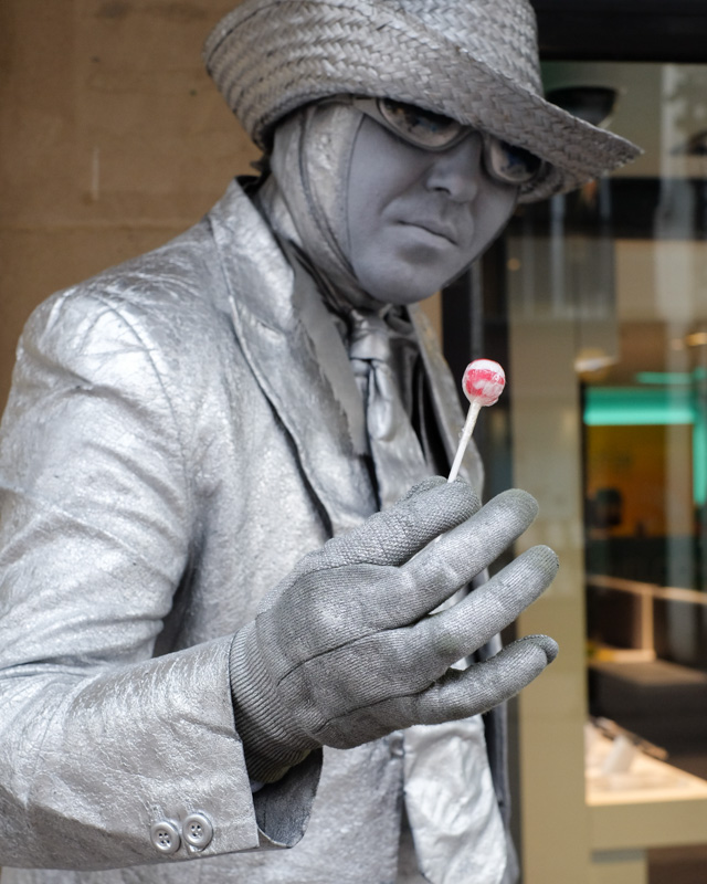
Digital etiquette requires I think that I should not steal Mike’s thunder.  However, if you look here you will see the first of three posts about what he calls “A Little Game”.  He explains this fully but the idea is to have a good look at the work you have done and then to make a list of at least 25 categories that you often shoot.  The categories, if I have understood him right, do not have to be subject matter.  For example this photo below could be: portrait, colour, square format and/or street performance.

DSCF0920.jpg

I set to with this task and found that 25 only took about ten minutes!  So I went back and kept going.  The next step in The Little Game is here.  But that and part three are for next month.  And don’t cheat and go looking ahead.  The whole exercise is best not rushed.  (Also - there’s nothing like a cliffhanger, eh?)

BLACK HOLES

When Is A Photo Not A Photo?

fMRI brain scan: © Getty Images

fMRI brain scan: © Getty Images

You might be forgiven for thinking that the image to the right is a photograph.  Strictly speaking it is, in the sense that it is the replication of visual data by digital photographic means.  That is why the credit that goes with it often calls it a photograph.  But there is potential for confusion here.  The image is in fact of an fMRI scan – functional magnetic resonance imaging.  It shows digitally a vertical section of the brain with certain structural details but the coloured areas have been created from coded data and show, I understand, greater or lesser brain activity compared to a notional baseline.  Clearly, no brain is this colour in reality - and only a post-mortem dissection could reveal such a section anyway.  What the image shows is a set of data in visual form to make it more easily comprehensible. It could be reproduced in tables or as a graph but then who would look? 

The boundary between a true photograph and digital images of other kinds is becoming more and more blurred. I thought of this again when the recent image of a black hole produced by Event Horizon Telescope was shown in the press recently (below).  Obviously, this is not a photograph of a black hole, since a black hole is invisible.  It is pretty amazing, though. The magazine New Scientist describes it as “a tinted representation of colourless radio frequency photons”.  A 21st century hand-tint!  Apparently it is culled from five petabytes of data (one petabyte is a million gigabytes.)  The technology of reducing that to one image is mind-spinning. 

Image of a black hole: EHT Collaboration

Image of a black hole: EHT Collaboration

The whole field of infographics (data in visual forms) seems to be a growth area: I’ve seen several courses advertised to help you use data visualisation in various ways: as visual storytelling, as hand-drawing and as infographics. The reliability of the results presumably depends on the methodology of turning the data into an image, though. That is where doubt creeps in. If you were unfortunate enough to find yourself in court and charged with an offence which you denied – how happy would you be for an fMRI scan of your brain to be used by the prosecution as evidence that you were lying? No, me neither - but how would you challenge it?

Ooops, I seem to be back on my digital hobbyhorse here…..  I’m just saying though: great pictures, but they are just as much imagination as science.


A QUESTION OF PROPORTION

How Big Should A Photo Be?

Two recent exhibitions brought out my inner Glenda Slagg recently.  (Glenda Slagg is the legendary Private Eye spoof columnist who invariably expresses wildly conflicting opinions in one article and always in gloriously demotic journalese – typically “Doncha just love….?” or “Doncha just hate….?”)

King of Siam Mongkut of Siam Presenting Lenten Robes at Wat Pho Temple, Friday 13th October, 1865. (John Thomson, © Wellcome Foundation.)

King of Siam Mongkut of Siam Presenting Lenten Robes at Wat Pho Temple, Friday 13th October, 1865. (John Thomson, © Wellcome Foundation.)

First up was Siam Through The Lens Of John Thomson* at Leicester’s New Walk Gallery. John Thomson was a Scottish photographer who travelled and photographed widely in the Far East and China before returning to this country to document the social condition of the urban poor.  His work is often cited as early photojournalism.  His images of China and the Far East have been digitised and enlarged and are now a travelling exhibition. In Leicester only the photos from Siam and a few from Cambodia were on show – about 45 in all.

Thomson used the wet collodion process to produce his photographs and these gave glass negatives which were eight inches by ten inches.  They would then be contact printed (ie not enlarged) and in his time were mainly reproduced in books with prose descriptions of his travels. So he was producing book-size prints.

The digitisation in 2009 at high resolution made it possible to enlarge the images to many times their original size. (I must start taking a tape measure with me to these exhibitions – I had to estimate but some of these were well up to four or five feet on their long edge.)  The exhibition notes said that this gave greater detail, which of course it does.  But you could give greater detail by enlarging small crops, too.  The problem with enlarging the whole print is that you tend to lose its overall effect because you can’t take it in as one composition. (The photo above is a good example.  Details of, say, the palanquin might be best seen in a small separate crop.)

It also gives mounting problems.  These images had been printed onto foamboard which was then framed in white frames under glass with spacers to deepen the framing.  This seems a bit pointless when the image is so big: the frame can’t do the job of isolating it.  Add in highly academic wall notes and what you had in fact was a very interesting ethnographic exhibition which largely excluded any true photographic excitement.  In Glenda terms, I came away thinking: “Big photos, eh?  Don’t ya just hate’em?”

Von, the Sheffield Star newspaper seller, at BSC River Don works, Sheffield. (Martin Jenkinson, 1982)

Von, the Sheffield Star newspaper seller, at BSC River Don works, Sheffield. (Martin Jenkinson, 1982)

I hopped off the return train to Manchester at Sheffield to catch the Martin Jenkinson exhibition ”Who We Are” at Weston Park Museum in Sheffield.  Martin Jenkinson was a Sheffield-based press and trade union photographer whose subject was daily life in the city and around but who also recorded the politics of protest towards the end of the twentieth century.  There were ninety or so mostly black and white images around A4 size classically mounted and then framed in black.  They are a bit of a walk down memory lane for someone of my age and I found myself particularly drawn to the quieter images (such as the newspaper seller to the right) which seem to draw out the grandeur of the local and specific when the political action has moved on.  There were also plenty of objects from the photographer’s life: seventy-odd press passes, teeshirts, contact sheets, notebooks, protest badges and so on.  It all helps to bring out the person behind the images.

But I did find myself peering a bit at the photographs.  They needed to be, well, a bit bigger, I thought. Or as Glenda might say: “Small photos, eh?  Don’t ya just hate’em?” The best known one, of the miner inspecting police lines during the pit strike of the eighties, was printed more like A2 size and came off a lot better for it.  The smaller print has its place but possibly not in modern photojournalism exhibitions.

All in all, though, it was A Grand Day Out: Spring in the air and plenty of sunshine; a fine train journey across the Peak District; two fine exhibitions; and a jolly good picnic in the park.  Does life have more to offer?

*The exhibition seems to be divided into two parts: the China imaages and the Siam images. The Leicester exhbition has now ended but you can keep up with future venues here

INTERNATIONAL POLITICS AND MY WARDROBE

 Getting Some Perspective

When I was a young chap and had pretensions to elegance I one day bought myself a very fine suit. It had half-lined trousers which I always thought was a mark of distinction. Though I say it myself, it drew admiring glances and comments and so, when I went to live in Afghanistan in the late 1970s I took it with me.

A funny thing about Kabul in those days, perhaps even now, I don’t know, was that you could buy Harris Tweed and other very good cloths there.  They seemed to be roll ends that had been sent for clearance.  So what you did was to buy a length of your cloth of choice and then take it to one of the tailors in town.  You gave them a jacket and/or trousers to copy – which they did, by hand, to the millimetre.

The chap in the photo here was recommended to me and I started off with a sports jacket - which he made beautifully. Most of the sewing was done by young boys who sat cross-legged on a platform to one side of the shop (though I always assumed they must have some kind of a sewing machine somewhere).

Afghan 3-2.jpg

 So then I decided to get a couple of suits made using my very fine one as a template.  I delivered suit and cloth to him one morning, he took some brief measurements (which he marked down in the book there) and told me to come back in a couple of weeks for a fitting.

This is where international history intervened.  A few days after my visit to the tailor the Soviet Union occupied Afghanistan.  The sky was dark with Soviet transport planes, the Afghan army was neutralised and Soviet troops appeared on the streets of Kabul.  When I went back to for my fitting there was a Soviet tank backed right up to the frontage of the tailor’s shop. Both the tailor’s and all the other shops were shut and the street was deserted.  Calamity!  Not only had I lost my cloth – I had also lost my finest suit.  I trailed home, despondent at this tragic turn.

The Afghans, I had learnt through my reading, are no strangers to invasions, from the armies of Alexander the Great, to the Moghuls and the British.  The country has been incorporated into  various empires and has been and remains the home of numerous peoples.  All of this must give a certain perspective on life from which I should perhaps have learnt a lesson.   

I cruised past the shop once or twice in the following days but there was no change: Big Tank, No Tailor.  Several weeks later someone told me the shop was open again.  Down I went and it was true – the tank had disappeared and the tailor was back at work.  I went in and there was moment’s silence.  It’s not easy to ask someone how they feel about their country’s being invaded so I just said: “What happened?”

He shrugged his shoulders.  “I took a rest” he said with a smile.

JUST A MOMENT

Just how creative is photography? 

The consensus these days seems to be that the battle for photography’s status is won.  There it is hanging on the walls of major museums and art galleries – end of discussion.  But that ignores the distinction so commonly made between ‘art as photography’ (which is what artists do) and photography as art (which is what photographers do).  The clear suggestion is that one is more creative than the other.  It also omits all the other photographies: scientific, technical, medical, forensic, family, evidential, social and so on.  I thought a more interesting way of looking at it was to turn the telescope round and point it not at photography but at creativity.

serveimage.jpg

To do that I read two autobiographies by people who might generally be considered creative: Philip Glass’s ‘Words Without Music’ (Faber and Faber, 2015); and Patti Smith’s ‘Just Kids’ (Bloomsbury 2012).  I read them because they came floating up to me from the shelves of my local secondhand bookshop.  So – pretty random, which is the best way.  My question was: do these creative people see life any differently from anyone else?

Philip Glass seems to have come straight out of the stalls, looking neither to right nor to left but with one goal only: to write music.  He did whatever it took to survive financially: removal work, taxi-driving (which one time nearly cost him his life), plumbing and house maintenance.  He brought up a family and he kept a roof over their heads but he only started to earn money from the music when he was in his forties.  On the way he took care to cultivate good artistic company, to develop his technical skills, to work at composition every day and – it seems, to enjoy it as he went along.  The self-belief seems to have been unshakeable right from the start.

Patti Smith, from a later generation, tried a few things: poetry, a bit of acting, drawing and then rock and roll.  To her, artistic practice was mystical and the practitioners were mystics.  She was determined to become An Artist, and that is what she did – almost by sheer force of will.  She seems not to have had Philip Glass’s self-belief but she was practical, held down jobs and kept going.  While her friend and lover, Robert Mapplethorpe, seemed to climb to the top, she floated.  Contacts were essential-  but then, when aren’t they?

serveimage (2).jpg

What the two of them seem to have in common is practicality.  They kept producing work, they were ready when the chance came, they kept the wolf from the door, they moved in the right company and they would not be deflected.  Both of them seem in thrall to the idea that Artists are Different, that they are a kind of nobility, that to be an artist is “to see what others cannot” as Patti Smith puts it.  Hmmmm…yes, well.

Nearer the mark, perhaps, is the idea that Philip Glass cites from Krishnamurti, that creativity is not so much a characteristic as a moment, a kind of unrepeatable spontaneity.  That is what both he and Patti Smith exhibit.  They never seem to quite know what is coming next but have great confidence that something will come.

That’s an idea which transfers well to photography.  When I peer through the viewfinder I like to think that I am in the same position as the sculptor wrestling with form, the poet with words and the musician with sound. But creativity is not the unique preserve of the fine arts. I am also in the same position as the mechanic grappling with spanners, the cakemaker with recipes and the mathematician with numbers.  Creativity is a world where thought is momentarily suspended and memory no longer functions.  That, presumably, is why time passes so quickly.

When Robert Mapplethorpe photographed Patti Smith for the much-lauded cover of her first LP ‘Horses’ he went through numerous attempts.  The light keeps changing, his light meter malfunctions, first its jacket on and then jacket off – then all of a sudden he says:

“I got it.”

“How do you know” she asks.

“I just know.”

It came from nowhere, as these things do. You can’t predict them and you can’t repeat them. All you can do is to make your preparations and then be open to them - whatever the activity and whatever its status. For photography, you have to think about the photograph you are taking, of course, but if you are still thinking about it when you snap the shutter then you may get something technically good - but not much more than that.

FEELING THE COLLAR OF DIGITAL IMAGES

Basil.jpg

Now this is curious.

Take a look at the photograph opposite and assess what you see.  If you’ve been reading the newspapers in the past few days you may recognise it – so you can’t play in this game.

It looks like a fairly standard, relaxed kind of photo of a middle-aged man with a thoughtful expression on his face. It’s taken under some kind of lighting and there is no background.  The top of his head is cropped away - but not much to say beyond that. 

Well, the photo is © the Metropolitan Police so that’s a huge clue. It’s a mugshot of the final suspect in the 2015 Hatton Garden jewellery raid.  This is Michael Seed (aka Basil – the Best Alarm Specialist In London) who was sentenced to 10 years in jail last week for his part in the robbery. The perpetrators were so old and used such traditional techniques – drilling and alarm disconnection - that they were known as the Diamond Wheezers.

Yet this is a very unusual mugshot.  Partly it’s the subject’s demeanour: he doesn’t look like someone who has just had his door flattened in a police raid or who has just suffered the indignities of arrest.  He looks pretty composed. It’s also the format of the photo.  The mugshot is conventionally square or portrait format.  It is cropped close and the subject is often looking tough or shocked or dishevelled.  By its nature it criminalises - which is why juries are often not allowed to see it. But not Basil’s: his looks more like a social worker’s identity badge.  He isn’t even looking straight at the camera – he is looking up to the left.  It is possible, of course, that the newspapers cropped it into this format rather than the police but the expression and lighting remain the same.

A couple of years ago I looked pretty closely at the use of digital photography as legal evidence and found that that legal systems generally are struggling to get to grips with the whole range of digital images: still, moving, CGI and so on.  That is largely because the law is an overwhelmingly verbal practice and few lawyers are sufficiently literate visually to understand the significance of the digital image and to grasp its rhetorical potential.

3000.jpg

Look at this press shot of the scene of the Hatton Garden crime, for example.  Look at the digital sheen it has.  It has entirely abandoned the conventions of forensic photography where objectivity and neutrality take precedence.   The source of the photo is given as Alamy/Getty Images.  That too strikes me as odd.  Traditionally, the provenance of crime scene photographs has been the state because the agents of the state (the police and prosecution) were the ones with access to that scene.  Yet Alamy and Getty Images are commercial organisations.  The crime scene photo now seems to be a commercial tool rather than an evidential one.  

The unconventional mugshot of Basil is not the result of digital technology in any direct sense but it shows the ease with which digitality can subvert convention.  A digital image is easily and infinitely malleable while an analogue one is not. So digital starts off by mimicking a convention and ends up by creating a new one. Ironic, then, that Basil’s mugshot should emerge from such a spectacularly analogue crime.


THE DARK ARTS

One New Year’s Resolution Fulfilled

Salford 10001.jpg

And so to the darkrooms of the University of Salford, (as promised in my Happy New Year post in January) for a two day course in the basics of darkroom developing and printing. Having gone back to film over the last 18 months or so I thought this was a natural progression: I hadn’t been able to see a way forward with digital and this looked like it might be a fruitful route.

After a happy and absorbing twelve or so hours a number of thoughts occur to me.

1.  This is an entirely different process from that of producing digital images. (Cries of “duh!” – but stay with me.)   It is so different that the suspicion I have had in my head for some time now – that they cannot both reasonably be called photography – is hardening into certainty. Older photographers may have consigned their enlargers and printing trays to some dusty corner of the loft with relief but for every advance there is a retreat somewhere and sometimes you don’t notice until it is too late.  That’s not to suggest that one process is superior to the other: just that they are very different.  This is A Big Subject and you have my promise that I will develop it dazzingly in a forthcoming blogpost.

2.  The mere process of producing a negative, contact prints, several test strips and a full-size print or two brings about a familiarity with a photograph which a memory card and software program simply don’t.  By the end of the darkroom process you are not looking at the photograph you thought you were looking at when you started. 

3.  You probably can’t (well, so far, I can’t anyway) distinguish a darkroom hardcopy print from a digital one.  I went to see a Lartigue exhibition a year or two ago and some of the prints were modern darkroom-produced from his own negatives; and others were produced from the same negatives but through scanning and digital printing.  I saw no difference and the young man overseeing the exhibition said he couldn’t either (notwithstanding the fact that the digital ones were very significantly cheaper).  That’s a bit of a disappointment because I thought I would be tapping into a rich vein of print aesthetics from day one.  I still have hopes, however.

4.  Darkroom printing is one of those activities in which time simply comes to a halt because you become so absorbed. (The darkness seems to contribute to this effect.  Space takes on a different quality.) This puts it on a level with only two other practices in my life; motorcycle mechanics and writing.  Since I gave up the former a couple of years ago I maybe do have a little capacity now for further escape from the time/space continuum.

5.  You don’t actually need much space for the activities in the dark bit.  You do need significant kit though: enlarger, trays, chemicals and so on. You can pick it up on ebay at no great cost but the practicalities of preparing the chemical solutions, storing them, watching their sell-by dates and using them at set temperatures and so on makes me wary.

The obvious solution is to pay to use a darkroom where all of that is set up for you. Even then, I suspect that the highs are higher and the lows are lower than the digital process.  That makes it look addictive to me – and like all addictions, first somewhere inside you have to want to become addicted.

Salford 20003.jpg

P.S. These two appreciating classics are my first darkroom printed images. On-screen two things are immediately apparent. First is that the backlighting of the screen lifts the highlights a little - so, for example, the chap’s head here has lost the highlight detail - in fact it has blown it -compared to the print in my hand. The other is that the overall tone has changed to create a harder, brighter image in both cases.

P.P.S.  The other interesting thing about the course was more general.  We went out on the first morning to shoot a roll of film in half an hour or so.  Obviously, in that time you just shoot whatever you bump into: buildings, environment, people and so on without much intention.  Yet when you have printed your contact sheet you find that you have several interesting images at least.  Where, then, does that leave intention in your general photographic life?  When you squint through the viewfinder and line your image up – what is your intention?  And is it a help or a hindrance?  That is something that I hope to be in a better position to comment on later in the year……..(mysterious, eh?)

MARTIN PARR: RETURN TO MANCHESTER

Would you invite Martin Parr to photograph your wedding?  No, nor would I.  So why invite him to photograph your city? 

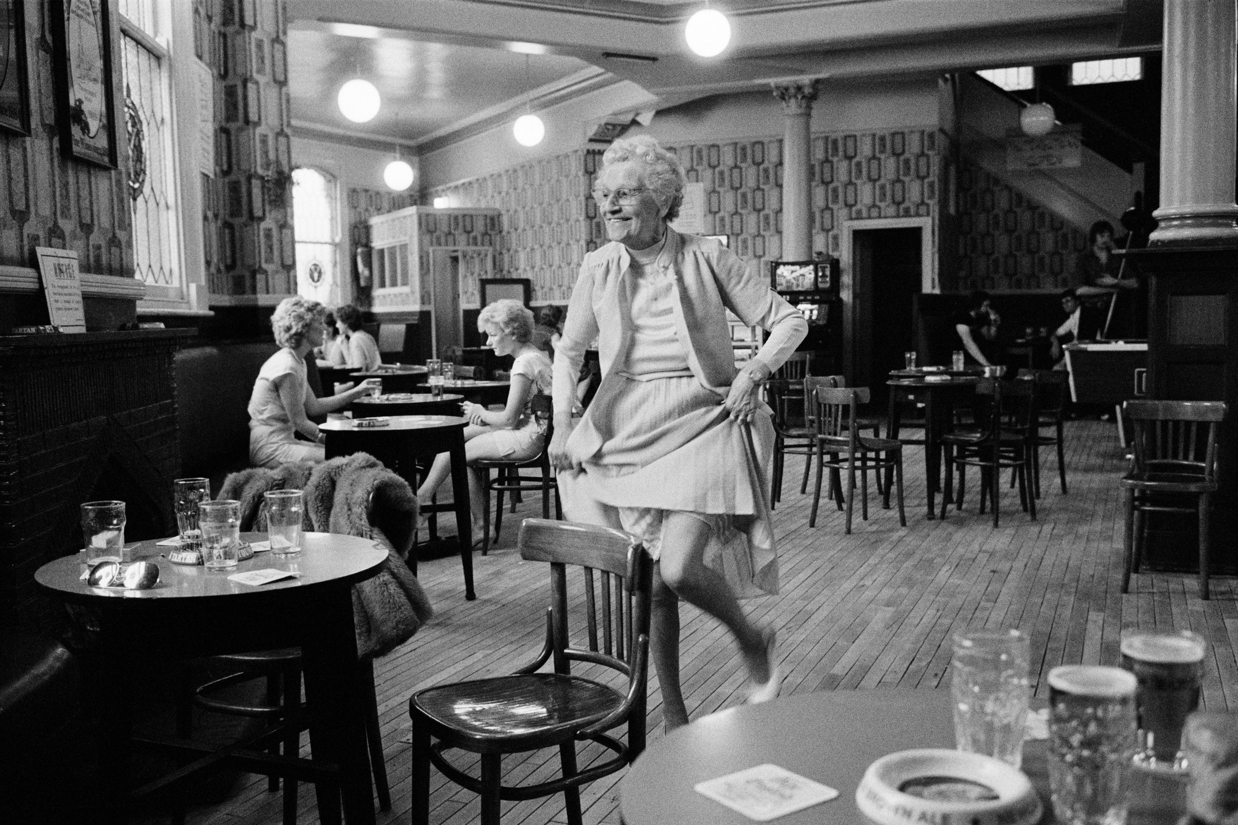
Yates’ Wine Lodge, Ashton-under-Lyne, 1983

Yates’ Wine Lodge, Ashton-under-Lyne, 1983

Manchester Art Gallery’s reasoning seems to have been that he has done several photoseries on Manchester since his days as a student at the city’s polytechnic and it was about time for another.  That’s doubtless interesting for Mancunians – but is it interesting for anyone else?  Perhaps to forestall that question there are copies of appreciative press reviews at the door of the exhibition.  He’s a controversial photographer so it’s almost as if the gallery were trying to get its retaliation in first.  And it’s true, there is plenty of interest here – though perhaps not always in the way that the gallery intended.

The exhibition is arranged chronologically from Parr’s early black and white mounted and framed prints through to apparently randomly assorted sizes of 1980s colour film prints up to about 4 feet by 5 feet (judged by eye).  All of these are in one room and then the next space has the 2018 digital prints again from the very large to smaller than A4, unframed unmounted and pinned to the wall.  There are about 450 in all – so a minute’s study of each would have you in there for nearly 8 hours.

In concept then the exhibition is definitely a game of two halves as the photographs above and below show.  The work from the 20th century is social documentary.  There is a series on Yates’ Wine Lodges, on The Osmonds fans,  a very humane one on Prestwich Mental Hospital,  one about a street about to be demolished, and a bit of an iffy one on the weather.  All those are black and white and are all good examples of Parr’s ability to choose an apparently mundane subject and get under its skin.  In the 1980s he turned to colour and you can see his signature style emerging in a series he was commissioned to do about retail activities in Salford, Point Of Sale.  Some see that style as wry, witty and observant and others see it as mocking, class-based and voyeuristic. But so far, so interesting.

When we move into the rooms dedicated to the Manchester 2018 part of the exhibition things change.  The photographer roved endlessly over Greater Manchester this summer, taking thousands of photographs in about 20 days.  In the face of this deluge the curators seem – understandably - to have struggled.  There are around 300 images chosen for display and some 240 of those are in a giant grid on two walls.  It is difficult to get a good view of many of these because they are so high up or low down.  It is almost as though the decision was taken simply to impress with the sheer quantity of imagery rather than its quality. 

21st birthday party at the Royal Nawaab restaurant, Levenshulme, Manchester, 2018.

21st birthday party at the Royal Nawaab restaurant, Levenshulme, Manchester, 2018.

The result is photographic only in the technical sense: it’s more a digital carpet bombing of the city; or perhaps a replaying of the Borges short story On Exactitude In Science where cartographers made a map the same size as the territory itself depicted.   After all, if my maths is right, the full 10,000 images printed at A3  would cover about 1.25 square kilometres – which is a sizeable part of central Manchester. 

In contrast, I recently went to a retrospective exhibition of quite a well-known press photographer.  He had worked for 50 years and that lifetime of images had been edited down to 97 photographs.  Here we have 300 from just a few weeks.  That is doubtless interesting for Mancunians wanting to spot faces and places but, unlike the older images, it does not really qualify as social documentary. A documentarian uses distillation to produce a rounded picture of their subject.  In the age of digital reproduction that judicious process gives way to a stream of images in danger of bursting its banks.

More striking, perhaps, is what does not appear.  Modern Manchester, on the evidence of this exhibition, functions without any public services.  I looked hard but failed to find any images of: the NHS, ambulance crews, police, fire and rescue, refuse collection or disposal, public transport, classrooms, libraries or museums.   Maybe they were left on the cutting-room floor; maybe they were never taken.  Either way, it’s important.  We all know the daily reality now – but in 50 years’ time these photos will be historical evidence. 

All of these snapshots show a city that may have changed on the surface but remains much the same underneath.  There are yoga sessions and sporting events, textile workshops and barbers’ shops, street parties and Irish festivals.  Either you take to the snapshot style or you don’t.  It’s not really an art which hides an art and so perhaps it is better seen as anthropology with a camera, a kind of one-man Mass Observation for the 21st century. 

A more authentically modern exercise have might have been to ask Mancunians to take their own photos and then to have displayed those.  Would that not have reflected more accurately the true developments in photography over the last twenty years or so?  The results would surely have reproduced Martin Parr’s off-the-cuff style well, after all, and virtually any photograph will have an impact if it is blown up to double or treble poster size and pinned to a gallery wall.  Why not let the people speak on the walls of their own city’s gallery?  

In the round, the exhibition seems to be part of the repackaging of Manchester.  Out with the black and white Yates’ Wine Lodges and mullets and in with Graphene and Salford Quays. In that sense, the photographs are part of the very process that they purport to portray.  Ostensibly, they show a city confident enough to turn a famously candid photographer’s camera on itself and no holds barred.  Yet the result is oddly fudged – not affectionate but not acid either- maybe because the sharp edge that Parr has displayed elsewhere would not have worked here.

A day or two after I visited the exhibition a nagging connection surfaced more clearly in my brain and I realised that these images put me in mind of Donald McGill’s saucy seaside postcards: more cartoon, then, than portrait.

 (Martin Parr: Return To Manchester at Manchester Art Gallery until 22 April.

 All images © Martin Parr / Magnum Photos / Rocket Gallery)

BERENICE ABBOTT: HOW MANY PAGES MAKE A LIFE?

“Berenice Abbott: A Life In Photography” by Julia Van Haaften

9780393292787_198.jpeg

At a guess, I’d say that most people know of Berenice Abbott either from her documentation of the changing face of New York or from her connection to the  archive of Eugene Atget, the Parisian “Balzac of the camera”.  The basic facts of her life are simple enough.  She came from nowhere, creatively speaking, to a perhaps lucky gig as Man Ray’s studio assistant and from there to her own portrait photography practice in 1920s Paris.  She went back to the US before WW2 and set out to photograph the changing face of New York.  From there in the 1950s she moved on to scientific photography.  She was technically skilled and innovative but her big problem was that she had a genius for putting people’s backs up.  Too many movers and shakers clearly saw her as humourless and difficult.  Her persistence eventually paid off however and she began to earn serious money from her back catalogue from the 1970s onwards.  Stylistically speaking she moved away from the early influence of the surrealists to a straight, naturalistic photography.

Blossom Restaurant, 103, Bowery, Manhatten, 1935. Berenice Abbott.

Blossom Restaurant, 103, Bowery, Manhatten, 1935. Berenice Abbott.

The one photo that always popped into my mind when her name came up would have been this one , Blossom Restaurant, 103 Bowery, Manhattan.  The chap coming out was a piece of serendipity apparently but to me the most interesting thing is the enormous range of dishes set out on the menu in the restaurant window: did they do all of those every day, I wonder? It gives you an idea of the superb detail she caught with her large format camera in so many of the images.

You won’t find out the answer to that menu question in Julia Van Haaften’s recent biography,  Berenice Abbott: A Life In Photography (W.W. Norton and Co. 2018) but it is possibly one of the few details missing from this monumental book.  As a work of research it is pretty astounding.  Want to know what Berenice ate for lunch on 29th November  1928?  It’s in here at page 129.  The company she kept in Paris in the 1920s is assiduously recorded and you get sentences like this: “McAlmon enjoyed substantial financial freedom from his six-year marriage to Winifred Ellerman, called Bryher, the British shipbuilding heiress and lover of the poet H.D. – Hilda Doolittle, whose former partner had been the poet Ezra Pound.”  Got that?  It’s a sort of third-person diary so there is ample to fascinate the devoted B.A. fan. 

For the undecided, (e.g. me) it was a harder read because there is no real assessment of events, no glance at the horizon from time to time.  Was she wasting time with the Atget archive and inviting critics to see her as in thrall to him?  And why did she sell a half share in the archive to gallery owner Julian Levy for $1000 when she had paid $10,000 for the whole thing only a few years previously?  At times she seems to have had little money but more than once there is reference to her fine clothes and to her cars.  It doesn’t seem to stack up.  The bigger picture disappears in the detail. 

As for the photography – hmmmm……  There are some pretty impressive photos, no doubt about it, as you would expect in a body of work spanning half a century or so.  As a straight photographic record of people and place it’s hugely interesting and some of her photos seem now to create 1930s  New York as much as recording it.   I don’t think photography can go beyond that: it isn’t transcendental after all.  The work is one thing but the life is another. I’m not sure the life itself justifies 500 pages but this is bound to be the definitive biography for a good long while.