PELE: ART, LIFE, FOOTBALL

Can The Bicycle Kick Be A Work Of Art?

Pele Alt Text,

Photograph copyright Luiz Paulo Machado

For those interested in the uses to which photography may be put, the current exhibition Pele: Art, Life, Football at the National Football Museum is fascinating.  It is a celebration of the career of the Brazilian footballer, Pele, through a variety of media which straddle the worlds of art and sport.  On the artistic side there are about twenty-five paintings, mixed media collages, and prints on canvas and linen – nearly all based (I’m guessing) on photographic originals.  Then there are the non-artistic exhibits such as medals, trophies, newsreel footage and so on which may perhaps be of more interest to the football fan.  So it is an exhibition (art) within an exhibition (football).  Or that is the way it seems at the NFM.  Perhaps when it was first shown in a London gallery in 2015 it looked like the reverse.

Then there are the photographs – some fifteen silver gelatin and giclee prints.  Which side of the sport/art line do they fall?  To my mind there is a slightly uneasy tussle going on here.  Downstairs at the NFM the celebration of both sporting achievement and personalities is strictly digital through wall-mounted screens in grids that zoom in on particular stars and show them both in stills and footage and include text of quotes lionising the individual footballer within  the display.   These are classic digital displays splicing data bundles of text, collage, and moving and still image to emphasise athleticism and reputation. 

But upstairs in the Pele exhibition motion picture is separated entirely from still image and text is separate again.   The moving pictures are placed firmly in the sporting display category and physically separated in a small cinema mock-up at one end of the exhibition.

 The still photographs are interspersed with the other artwork but they stand a little awkwardly there.  They are displayed in the same way  – mounted and framed and hung on the wall with accompanying title and text about the print.  They can certainly hold their own in simple terms of display since they are as big and impressive as the artworks (although, surprisingly, almost none of them are credited to a named photographer).  And they hold their own in price as well, coming in at around £3-5000 which is in the same range as their non-photographic neighbours. 

But that is not the point.  Seeing these old news photographs here in this way is more like seeing your next door neighbour at a celebrity event in the pages of Vogue magazine.  They don’t look comfortable and they don’t have their normal clothes on.  They are drinking cocktails when they should really be leaning against the bar with a pint and a roll-up.  They are out of place – not because they are photographs but because of the ambiguity of the context.  After all, given the age of some of these images, it is quite possible that fish and chips were once eaten off them.   The bicycle kick motif that runs through several of the artworks is pretty well known but you really don’t have to pay that much for it.  You could once get it on your mastercard if you wanted and maybe you still can.

Bicycle Kick.png

Pele was perhaps the first footballer – even before George Best – to be made a superstar through photographic imagery.  The exhibition itself makes this clear The earlier photography is black and white from the era before anyone had ever thought of football as “the beautiful game”.   These early images don’t support that contention of beauty.  The camera angles are a bit too low, the images too grainy and the action too jerky.  But you can see how the advent of colour and technological improvement in lenses and cameras changed the game’s aesthetic.  There is one photograph on display entitled “Unstoppable!” which shows Pele in front of an array of defenders apparently packed into a tiny space in an unavailing attempt to stop him.  My guess is that the defenders were in fact more spaced out than that and probably watching other attacking players too but the telephoto lens has drawn them all into that tiny area which makes it look as though they are all needed to stop one man – Pele.  Similarly the film footage goes from one or two touchline cameras to higher, multi-camera views which give a much better idea of a game’s flow and strategy and sets up hero roles within that.

So for the student of photographic culture the exhibition may lead to two conclusions.  The first is that the status of photography out there in the wider world remains as uncertain as ever: from The Sporting Pink to chip wrapping to credit card to gallery wall, it can be whatever you want it to be - forgotten image, sporting memorabilia or work of art.  And secondly it shows how developing photographic technology creates its own truth.  The Saturday afternoon working –class relaxation of the first half of the twentieth century, has become The Beautiful Game of the century’s later years.   The ‘muddied oafs’ of those early years, all dubbin and centre-partings, have become technicolor gods whose sporting achievements are embedded in endless data bundles served up for the adoration of mortals.  The king is dead, long live the king!

(Pele: Art, Life, Football continues until 4 March 2018 at the National Football Museum, Urbis Building, Cathedral Gardens, Manchester, M4 3BG)


JOHN STEZAKER AT THE WHITWORTH GALLERY

Through The Looking-Glass With Scalpel And Ruler

If you take two old photographs, cut them up carefully and splice them together what do you get – still two old photographs or now one brand new image?  This is the now-you-see-it, now-you-don’t world that you enter when you visit the Whitworth Gallery’s current exhibition of John Stezaker’s work.   The curatorial commentary is pretty sure what we are looking at: these, it says, are images waiting to be discovered again and new art is made from them.   Either way, it is of interest to any photographer because it invites speculation on the photographic medium itself. 

The exhibition is clustered into five main groups.  Most are based on old film publicity stills but one set  – and perhaps the most approachable to start with –  takes plates from old art or anatomy text books and slices through them, then juxtaposing the demi-images left so that it often seems to be something like the same body.  Like this.

Stezaker 1.jpg

(John Stezaker.  Fall VIII, 2010 © John Stezaker, courtesy The Approach, London. Photo: FXP Photography)

It is startling.  First you see one body and then you see two.  It is a through-the-looking- glass-world and it takes a certain visual effort to step into and out of it.  I spent some time in front of these particular images letting them promote a speculative frame of mind then moved on, diving deeper into the rabbit-hole.

The four other clusters are based on old movie publicity shots which of themselves are both strange and familiar.  The familiarity comes from the continuing use of the still in cinema advertising but the strangeness comes from their old-fashioned, black and white stiltedness.  Some of the publicity shots are head and shoulder studio images of the stars of the day.  My understanding is that the others are stills recreating scenes from the film and not out-takes from the film itself.  So already they are ripe for interpretation since they are recreations of already fictional narratives. 

The first cluster lays an old postcard of moving nature (mostly waterfalls) over a body or face reconfiguring that character perhaps as a tumult of natural energy, as in the image below.

Stezaker 2.jpg

(John Stezaker, Siren Song V, 2011 ©John Stezaker, courtesy The Approach, London.  Photo FXP Photography)

Another set takes five separate head-and-shoulder matinee idol shots and each splices other such images on top: profile to full frontal, side eye to frontal eye, side mouth to frontal mouth.   Like this.

Stezaker 3.jpg

(John Stezaker, Marriage (Film Portrait Collage) XXXII, 2007 ©John Stezaker, courtesy The Approach, London.  Photo: FXP Photography)

They are remarkably eye-catching.  You scan the image and its conventional parts make up a highly unconventional whole.  When you look at the detail it is standard but when you pan back there is a jolt.  That jolt is important because it is strong enough to make you look again and again and to try to figure out what we are looking at.

Further on, a triptych features a simple rectangular white cut-out on three publicity shots of a film starring Ida Lupino.  An old chap standing next to me peered hard at one of these and then turned to me.  I thought he was going to make an erudite remark but what he actually said was:  “I always fancied Ida Lupino when I was a lad.”  When I thought about it later his remark added a dimension: these photographs were living history to him whatever the metaphorical intent of the collage itself.  A little later I found myself too in self-congratulatory mode when I spotted a young Kenneth More in another of the shots – he himself a star from my youth.

We might look at these images in many ways, they are so suggestive.  We could see them as a subversion of the photographic medium itself, or indeed of the cinematic medium.  We could see them as a deconstruction of the photograph with suggestions of malleability, recycling and infinite meaning over time.  We might contemplate the sheer arbitrariness of form in the face of their spliced couplings (and triplings, too, since some use three images).  They also present themselves as light-hearted – or learned – wordless commentaries on the still and moving image and the relationship between the two.  I find my own thoughts tending to centre in this digital age on their highly analogue nature.  Digital splicing celebrates its invisibility while the splicing in these collages celebrates its visibility.  This tells us something about both media and their utter and irreconcilable difference.

I don’t think that you necessarily have to see these as brand new images.  In the end their exact form, since it is contingent on the component stills, is not central.  It is more the process and the thought behind it which spark off interesting ideas and contemplation.  For the practising photographer they might stand as a very useful way of thinking about the medium and its forms.  Even in the absence of that it would take a dull eye indeed not to linger over such unusual work.

(The John Stezaker Exhibition is on at The Whitworth Gallery, The University of Manchester, Oxford Road, Manchester, M15 6ER  until June 2018.)


GORDON PARKS: A CHOICE OF WEAPONS

When Photographs Have To Come Out Of Retirement

(Photograph by Gordon Parks: Courtesy of and copyright The Gordon Parks Foundation)

(Photograph by Gordon Parks: Courtesy of and copyright The Gordon Parks Foundation)

One of the really interesting facets of a photograph is how it changes with time.  A portrait becomes biography, a landscape becomes record, travel becomes ethnography and documentary becomes history.  We may take some reassurance from a photograph’s historical position because from the vantage point of the future, so to speak, we know what happened next.  The photograph produced on the cusp of the moment, the nearest thing we have to actuality other than our own experience, settles down into a comfortable middle age, its meaning agreed upon, and makes the odd promotional  appearance in anthologies and on websites.  But if truth be told, we only get to see the photographs that end up on the right side of history - or the ones we get to see are given a context which puts them there.

Where then does this leave Gordon Parks’ photography, a selection of which is currently exhibited in A Choice of Weapons at the Side Gallery in Newcastle?  Dating from the 1940s up to the 1970s it should be enjoying a happy retirement, safe in the knowledge that it has done its job as witness and cause.  And maybe 20 years ago it clearly would have been on the right side of history, the argument largely won.  But what about now in the era of a renewed white supremacy movement and all the events behind the Black Lives Matter campaign?

By any measure, Gordon Parks is a major figure in 20th century photography.  His  60 year career spanning fashion photography, the FSA, two decades at LIFE magazine and numerous awards might be summed up in his own words: “I chose my camera as a weapon against all the things I dislike about America – poverty, racism, discrimination.” 

The exhibition takes some thirty photographs and puts them into three groups: Segregation History, Agents of Change and the Fontenelle family.  You can’t entirely encapsulate six decades of work in such a small exhibition but what these photographs can do is show the power and direction of Parks’ work.  The celebrated image above entitled ‘American Gothic’ of Ella Watson in front of the American flag even now is pretty striking so it is little surprise that in 1942 his boss at the time thought it would get them both the sack.

 ‘Agents of Change’ includes figures who are still highly charged such as Martin Luther King and others who are now half-forgotten, such as Eldridge Cleaver and Stokely Carmichael.  But what the photography does is show the viewer the charisma of these people.  They still come off the print and speak to you of what they once represented, however you may view that.  The photograph of Eldridge Cleaver and his wife Kathleen, for example below: how would you describe it?  Threatening?  Touching?  It projects both mythic and human qualities that seem to encapsulate the Cleavers both as public figures and private people.  

Photograph by Gordon Parks: Courtesy of and copyright The Gordon Parks Foundation)

Photograph by Gordon Parks: Courtesy of and copyright The Gordon Parks Foundation)

The Black Muslims, the Black Panthers, Mohammad Ali – all the photographs have that same duality about them and seem to me to invite thinking viewers to reflect at the very least on the legacy of the photos’ subjects. 

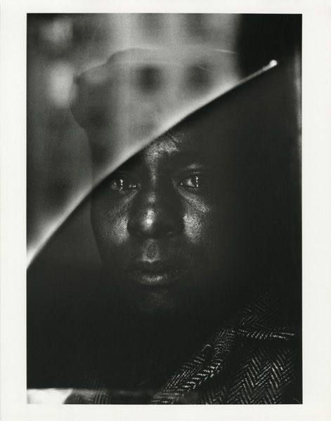
Then there is the series Cycle of Despair, prints from a 16-page LIFE magazine feature investigating the causes of rioting in US cities in the 1960s.  The exhibition features a twenty-minute documentary narrated by Parks himself about the making of the series and it is harrowing.  Given this assignment, Parks chose to concentrate on one family, in one tenement, in one city: the Fontenelle family, Norman, Bessie and their eight children who lived in grinding poverty in Harlem, New York.  The magazine spread is set out in the exhibition.  On one level it is an unrelenting sociological and journalistic investigation and on another level it is the depiction of wider human tragedy.  It is about the Fontenelles but you may see it as having been also about the plight of black people and of poor people more generally in the mid-twentieth century.  The two photographs of Norman Fontenelle give some idea.  The earlier one, much more abstract in the print on the wall than on the magazine page, seems, as you stand close to it, to take an almost abstract pattern and to pull it back into the world as you realise with a start that it is a human face: it hovers, a human being who almost isn’t.

(Photograph by Gordon Parks: Courtesy of and copyright The Gordon Parks Foundation)

(Photograph by Gordon Parks: Courtesy of and copyright The Gordon Parks Foundation)

The second, shows him in hospital after his wife has poured scalding water over his face when he attacked her.  Unseeing, he faces the camera full on, abject and bewildered. 

This is a powerful, powerful exhibition.  If you want to search out his work and are not sure about the history of black political figures and movements in the second half of the twentieth century it would be worth reading up on them.  That photograph of Kathleen and Eldridge Cleaver in Algeria, for example.  She has a protective arm wrapped around his shoulder and is looking into the lens with some composure while his gaze is averted, staring away as though he is lost in thought.  Yet the poster above his head shows him in a rather different guise.  You can interpret these elements with more confidence if you know why the couple have fled to Algeria and understand some of the background to the photograph.

That brings us back to the question I raised at the beginning of this piece.  Where do these photographs sit now?  Are they enjoying a long and happy retirement confident of their place in history?    They started off as reportage.  Then as the twentieth century unfolded they seemed to have earned their retirement; they had become historical, like old battle photographs once the war is over.  But now as we lurch forward in the new century a third life is being thrust upon them and they have their boots back on.  It is forty years since the LIFE magazine article on the Fontenelles.  It is half a century since the Civil Rights Act, the Voting Rights Act and the Fair Housing Act seemed to enshrine some basic standards of equality.  It is nearly a decade since the USA voted in its first black president.  Yet what seemed to have been settled is now back in question.  The struggle, it seems, is never over.  You look around this exhibition and realise that these photographs are on the front line again and still have work to do. 

(Gordon Parks: A Choice Of Weapons.  Side Gallery, Newcastle, 21 Oct. - 17 Dec. 2017  http://www.amber-online.com/side-gallery/ )


JELENA BLAGOVIC: O NJOJ

Photography On A Theme

28_O_Njoj.jpg

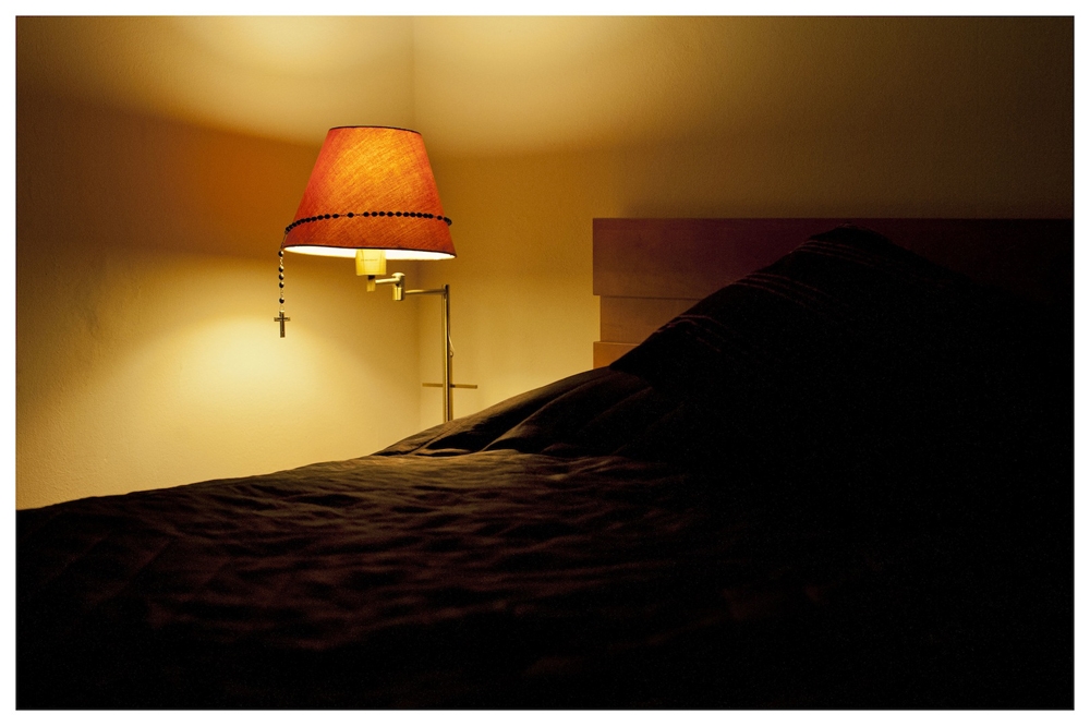
A third exhibition (see below for the first two) I visited in Dubrovnik was at the city’s Museum of Modern Art (http://ugdubrovnik.hr/en/?file=home)  where fifteen Croatian photographers* had work displayed on the theme of Emptiness.  At the entrance there was a quotation from the Tao Te Ching: “He who reveals himself does not shine.”  It wasn’t clear whether that quotation had been part of the theme but it set a tricky tone for this viewer certainly.  Since, by its nature, photography depicts things, how can it go about revealing nothingness?  Most of the photographers had taken the stance that emptiness is an absence: dark prints revealing little; empty factories and disused offices; the absence of humans; fields; and so on.  These were all accomplished and confident works which held their own on the gallery wall and repaid study.  Yet, on reflection, they seemed to me not to have grasped the nettle.  Why is the static and unused more empty than the moving and used?  The one series that did seem to have something to say about that was O Njoj (About Her) by Jelena Blagovic (which you can see here).  These were photographs of her mother’s home which made a very effective use of light and simplicity to create what Jelena called a “mnemonic landscape”.   This was the use, I felt, of something to suggest nothing.  There was both presence and absence as we see in the two photos above and below.

03_O_Njoj.jpg

(Both photos courtesy of Jelena Blagovic from the series About Her/O Njoj)

  Let us remind ourselves (since the curator had made use of Eastern philosophy) that the Sanskrit word for emptiness is shunyata.  It was once explained to me that the root of this word (shunya) was the Indian mathematical term for ‘zero’.  And the circle that represents zero is significant because it is a line around a central nothingness – it represents therefore both nothing and also everything.   This was an idea that I felt was hovering over Jelena’s series.

I often ask myself, when I have been looking at sets of photographs on a certain theme, whether, had I not known the theme in advance, I would have been able to guess it from the pictures.  Often I have to conclude that I would not.  The theme is more a riff than an organising principle.  In this case, however, the theme came through pretty clearly and that was a mark of the quality of both photography and curation in this exhibition.

(*The fifteen photographers:   Jelena Blagović, Boris Cvjetanović, Petar Dabac, Sandro Đukić, Marko Ercegović, Davor Konjikušić, Igor Kuduz, Antun Maračić, Ana Opalić, Marina Paulenka, Jasenko Rasol, Davor Sanvincenti, Sofija Silvia, Sandra Vitaljić and Borko Vukosav.  You can see more contemporary Croatian photography including some of these fifteen here )


WAR PHOTO LIMITED

The End Of Yugoslavia

Photograph by Darko Bandic, by courtesy of War Photo Ltd.

Photograph by Darko Bandic, by courtesy of War Photo Ltd.

I was in Croatia recently and took the opportunity to visit War Photo Limited in Dubrovnik – an organisation whose purpose is to ‘educate the public in the field of war photography’ (http://www.warphotoltd.com/).  There were several exhibition rooms but in the time I had I decided to zero in on the photos depicting the conflict which took place on the disintegration of the state of Yugoslavia in the early 1990s.  It struck me that this was one of the last wars – perhaps the last war – to be recorded largely on analogue media.    The result is that to this observer at least the photos look surprisingly historical and perhaps the reason for that is that they were taken by professional photographers.  There are searing and appalling photos but they all conform to the standards of the genre: they use colour, form, outline, framing and movement to create a dreadful impact on the viewer.  It is not therefore their content but their very style which creates their historical look.  The two photos shown above and below illustrate the point.

Photograph by Paul Lowe, by courtesy of War Photo Ltd.

Photograph by Paul Lowe, by courtesy of War Photo Ltd.

The advent of the mobile phone camera means that pictures of war are often taken now by witnesses, participants and increasingly by perpetrators and they bypass the conventions of the genre.  Many are unashamedly partisan.   And increasingly the professional photographer or reporter is seen to be parti pris.  Sophisticated modern viewers know that everyone – or everyone’s editor – has an axe to grind.  So the difficulty thrown up by conflict photography more and more is not so much obtaining the photograph as verifying it and this is compounded by the problem of volume – there are just so many pictures.  (For example, a statistic that I came across from another theatre recently is that the Independent International Commission of Inquiry on the Syrian Arab Republic had to conduct forensic analyses of 26,948 images taken in government detention facilities alone.) 

An interesting contrast comes just down the main street of old Dubrovnik, Stradun, where in the Sponza Palace is the Memorial Room Of The Defenders of Dubrovnik: (http://www.tzdubrovnik.hr/lang/en/get/muzeji/5705/memorial_room_of_dubrovnik_defenders.html). 

This takes the monochrome identity card photos of the 400 plus men killed defending Dubrovnik during the 1990s war and displays them enlarged in grid form along the walls of the room with other memorabilia.  Some of them were still in their teens.  This, too, uses volume to effect. Yet so much is left to the imagination that the display has just as shattering an impact as the War Photo Limited exhibition. For those of us lucky enough to have grown up in the peace of western Europe in the second half of the twentieth century it is very difficult to imagine oneself in the circumstances of war.  We have all figured, however, in identity photographs of one kind or another and it is that which seems to join us subconsciously to these fresh young faces.

(My thanks to War Photo Limited and the photographers for permission to reproduce the above photographs for this article.)

LEE PRICE: THE HOUSE OF KINGS AND QUEENS

On Being Gay In Sierra Leone

An impressive exhibition in Hull entitled The House of Kings and Queens by Lee Price*.  The exhibition documented life in what was effectively a safe house for gay and trans people in Freetown, Sierra Leone (a city with which Hull is twinned).  Although female gay sex is not illegal in the country and the law against male gay sex is seldom enforced, homophobia is widespread for cultural and religious reasons.  Life for those who are openly homosexual or non-mainstream is tough and the focus of the exhibition was the half-life to which the openly LGBTQ are condemned there.  The text accompanying the photographs spoke of the cloud of secrecy in which gay Sierra Leoneans have to live and sought to portray the sense of liberation which they feel in the house.  I felt that the photographs showed more of the secrecy and less of the liberation.  Many of them showed figures glimpsed through doorways or looking out of windows and throughout there was a suggestion of longing, of inside and outside, and of estrangement.  There was a sadness and a darkness which was emphasised by the deeper tones and slight underexposure of the printing.  Many of the subjects were shown involved in minor tasks, or standing/sitting/lying listlessly, which added to the sense of waste or disengagement.  Some photographs depict and some suggest. Many of the photos in this exhibition seemed to me to straddle difficult ground by doing both – like a sentence which seems clear on first reading but which carries undertones that may surface long after you have read it.  Although ostensibly about the plight of gay people they could be read more generally as speaking of the mental and physical isolation which seems to be such a defining characteristic of modern times.  

(*I haven't been able to trace a website for Lee but if you google his name and the exhibition title you can find out about him and how he came to make the series.)

AUGUST SANDER: PORTRAYING A NATION

Seeing It For Real

To Tate Liverpool for the August Sander exhibition, Portraying A Nation.  Sander set out to do just that- to portray an entire nation – through an exhaustive photographic survey which placed the individual firmly within a social taxonomy determined by class, occupation and other factors.  It was an immense enterprise and I find it now, a hundred years later, rather an overwhelming one for the viewer.  You can still get what seems to be the whole series of photographs in several volumes but what we can make of such a thing almost a hundred years after its inception?  Thinking has changed so much and, since the second world war, political, economic, and philosophical trends have been to emphasise individuality rather than submerge it. Is the interest of Sander’s work therefore purely historical or is it sociological – can it still be a mirror for us to look at ourselves?  The curators of the Tate exhibition seem to take the former view.  They see his photographs as being a history of the Weimar Republic:  “The faces of those he photographed show traces of this collective historical experience”.  I looked hard but I couldn’t see that.   The key to his work seems to me to lie more in the social sciences – the study of society and social relationships.  These are comparative portraits: each exists in relation to the others.  So a commentary which explored then contemporary ideas in sociology, psychology and ethnography might have opened the photographs up more for the visitor rather than a timeline of the rise of the Nazi party and the second world war.  Zero in on those faces: are they really so historical? Is the photograph below a historical relic - or something rather more modern?  

This is a fascinating exhibition: it is like looking at a jigsaw puzzle just as the picture is emerging from the disparate pieces – a picture which we would be hard put to assemble today.     

Bohemians: Willi Bongard and Gottfried Brockmann.  © August Sander Archive, Cologne.

Bohemians: Willi Bongard and Gottfried Brockmann. © August Sander Archive, Cologne.

GRAFTERS

History or Photographs?

This fine exhibition seems to have flown under the radar of the photographic world.  It was first at the People’s History Museum in Manchester and now is at the Industrial Museum in Bradford and it takes as its subject the photographic representation of workers.    Curator Ian Beesley has divided the photos into eight roughly chronological types from the early criminal portrait,  images of Victorian science and technology, worker as accessory, worker as unit of scale, the WW2 worker hero, self-representation, the combined workforce photo and industrial landscapes.  Only 121 photos in all but they stand as some sort of tribute to millions of forgotten souls who laboured in anonymity and who,  even when being photographed, were largely doing the boss’s bidding.  It is hard to categorise the exhibition:  part ethnographic, part documentary, part straight historical record and part celebration.  Both the commentary and the accompanying poetry of Ian McMillan implicitly invite the viewer to see the images as a record of exploitation, hard lives, unsafe work, child labour, threadbare clothes and grinding poverty and quite rightly so.  But personally I prefer to see them more as celebration.  They were a class but every doffer, ligger, fettler, burler, slubber, corer, stamper, tipstretcher and quencher was also an individual.  Photographs may be evidence for historians but they are invitations to reverie and contemplation too.  We stare at the photos and the subjects stare back at us.  Who knows what they thought of it all?  We may have the vantage point of history but looking at these photographs we can make an imaginative leap and discard it if we wish.

PINNING THE BRITS DOWN

Photo Exhibition: Strange and familiar: The Barbican

I saw this exhibition at the Barbican last year and since I was flagging by the end then I thought I would pop into Manchester Art Gallery and have a look at the second half again.  The exhibition is curated by Martin Parr and is about the way the UK has been portrayed by foreign photographers (twenty-two in all) over the past seven decades or so.  The first half is mostly what you would expect: telephone boxes, British bobbies, milk bottles on doorsteps, bowler hats and so on.  It plays to a certain view of the UK in the fifties and sixties.  What is interesting about the more modern work though is that the instant recognisability has gone and what emerges is a process of homogenisation.  The Rinejke Dijkstra portraits of clubbing girls, the Bruce Gilden close-ups, the Hans van der Meer football landscapes and the Axel Hutte housing estates could all have been taken more or less anywhere in western Europe.  There is very little that is recognisably British.  The Hans Eijkelboom slideshow really drives the point home. 

That poses quite a difficult curatorial problem.  You choose photographers because they have something to say and say it well but then what emerges when you put them all together is something else.  So you are caught between the ethnographical and the artistic/documentary.  What you put on the wall as a picture has become data. This is one of the most fascinating characteristics of the photograph.  Just when you have decided what you are looking at it becomes something else.  You just can’t pin a photograph down.

WILDLIFE PHOTOGRAPHER OF THE YEAR

Tame Wildlife?

There is a certain kind of photograph where you feel, having looked at it closely, that you know the photographer a little.  I have visited several WPOTY exhibitions now and the photographs leave me with exactly the opposite feeling.  The photographers have obviously put a lot into them: time, effort,  equipment, travel, patience, persistence and ingenuity.  But there is nothing personal about the result.  With a small number of exceptions, they are technically superb yet clinical to the point of monotone.

I wonder why the text panels always tell you exactly what kit was used for each shot (including strobes, drones, speedlights and more this year – including a powered paraglider).  I wonder about the environmental impact of flying half way across the world to take these photos, as some photographers do.  I wonder why all but a handful of the photographers are from developed countries.  I wonder about the exhibition’s ambient music and the little dramatised texts that go with each shot. I think about colonial-era photography and the way that another kind of wild was pinned down by that.

The visitors’ book is a litany of superlatives.  This is a truly popular exhibition but to me it is not so much a celebration of nature as of technology.

PETER MITCHELL: PLANET YORKSHIRE

I just caught the tail end of the Peter Mitchell show at Impressions Gallery - Planet Yorkshire - before Christmas.  PM himself was there so I had a chat with him.  He's a very pleasant chap.  He told me that his house is jammed full of all his work from previous exhibitions. He is still photographing now, totally analogue, using medium format. I find his approach very appealing: a kind of vocation without ambition.   He's had the same printer for forty years.  The prints are pretty huge and often darkish so that you are squinting a bit.  He's going for an overall look.

Given the range of his work over the years an exhibition  giving a flavour of it all is bound to be a bit episodic, as this was, but the lost world of the seventies does look like another planet now and these photos seem not just to portray it but also to embody it.  Lovely show and great to get to chat to him.