MEDITATION


(An experiment with text and image)


Sometimes, floating away, I find myself in a beautiful city, not unlike Paris perhaps, where broad boulevards are dotted with attractive and civilised people chatting, strolling, sitting on benches and enjoying the sunshine.  Often they approach me and ask whether I have seen this or that cultural site or to alert me to a new and humane text which has been published or to the latest parkland blossoms flowering nearby.  Cool breezes temper the warmth and I am filled with a sense of well-being at the prospect of happy hours ahead.  I cannot help noticing however that crowds are gathering around monitors where flickering letters and numbers, supported by distant and indistinct announcements, seem to be about some form of lottery or game of chance.  These are not the final results it appears, but some sort of interim stages of a process whose beginning and end are no longer of consequence.  Yet each time I approach a monitor myself to see if I can decipher its display I find that another denizen of this charming though curious city has taken me by the elbow and is enquiring after my health, directing me to a particularly beautiful viewing spot or otherwise distracting me from those subtly glowing screens.

SHAHAI

My attempts to marry up photographs and words in a satisfactory way continue to frustrate me.  Some days I find myself thinking that maybe in their purest form neither has need of the other.  Certainly when I try to put mini-texts up with photos as I have described in previous posts the results generally fall flat.  So when I spotted a webinar run by the East Midlands branch of the RPS on the subject of Photography and Haiku I was onto it like a shot – as were 250 other attendees.*  I am clearly not on my own.

The session was led by Alan Summers and Karen Hoy who themselves offer many haiku/haiga/tanka courses via their website Call Of The Page.  Alan opened with the historical basis for modern experiments with photographs and haiku – which is the Japanese haiga.  He translated ‘haiga’ as ‘playful painting’ and set out its three main characteristics as: a painting or drawing; with a haiku; in calligraphic script, like this one below.  

Hakuin. Wren The haiku translation is: “it looks/like a nightingale/but it’s a wren” (Hakuin is making fun of his own limited artistic abilities.)

The characteristic that I have noted mostly of these haiga is a kind of informality.  It perhaps would not be correct to say that they are dashed off, but, as I know from a Japanese calligraphy course that I once attended, too much thought is frowned upon.  You take the brush and you dive in.  The haiku itself and brush painting are both traditional Japanese forms, of course, and this juxtaposition of the two in a haiga seems to have had no equivalent anywhere in the world.

 The modern, photographic version of the haiga is known as ‘shahai’.  Alan suggested that the digital equivalent of the traditional three constituents here would be: photo; haiku text; font.  So it’s a photograph onto which a haiku is superimposed in a digital font.  His advice was not to try to replicate the photo with the words but to find a more oblique relationship where each might heighten the impact of the other.  You can find examples here and here (this second one contains photos and paintings but it is only the former I am talking about).  I am not putting any examples up in this post because of what I am going to say next but it is worth looking at the links to get an idea of how these shahai look.

Now,  I can see that there is a superficial resemblance between the traditional Japanese version and the modern photographic one but I am not sure that it stands up to scrutiny as a kind of artistic lineage.  Firstly a photograph and a painting are two different things.  All that they really have in common is that they are visual representations of the world in some sort of a frame.  Secondly, a digital font is not the equivalent of calligraphy.  Calligraphy is a great art, very personal, and takes years to master.  A font is yours with a click of the mouse.  And lastly I suspect that the modern western haiku does no more than mimic its classical Japanese equivalent.  I am not an expert but I have taken an interest in haiku for many years and had one or two published.  My understanding of the traditional Japanese form is that it was highly circumscribed by its 5/7/5 syllabic form, its use of cutting words, and its seasonal references.   The modern western equivalent is much more free-form and the commentaries that I have read suggest to me that there is no real agreement about what is and is not permissible these days.

So I would say that the Shahai is a modern digital invention.  I would also say that it rarely works very well.  When I look at a haiga such as that below I see an ease of expression expression which contrasts markedly with the stiffness of the modern shahai equivalent.  

Winter Sky: Ion Codrescu/Elsa Colligan. A more modern example. The lettering and artwork seem to be as one. There is no sense of stress between them - to my eye anyway.

 The 26 letters of our alphabet in digital form have a kind of rigidity and the digital images have some sort of assertiveness which seem to work against one another both visually and imaginatively - irrespective of how good or bad the haiku or photo is.  The traditional Japanese haiga have both art and calligraphy in brushwork – and I have read that the ideograms are often difficult to decipher and so their contribution is as much visual as language-based.  I can imagine how something photographic might work with scratchings on a negative, or handwriting on a print perhaps.  But for me the digital version doesn’t really make it. It leaves too little to the imagination.

Obviously, I’ve got to have a go though. What about this? 

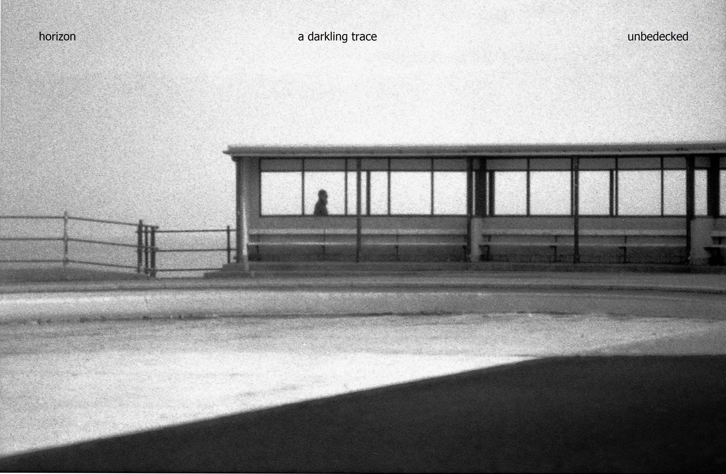
I was trying to get at the idea that life has tough moments for all beings. I think it helps that the image is black and white so the text is a little less obtrusive and can sit in its own space over to the left without taking over the picture

I’d say that the purpose of both haiku and photography is the same. They help us to focus on what is actually going on from moment to moment rather than what we think is going on. Perhaps a really good haiga or shahai can double that effect but I think it would take quite a bit of practice.

*I really dislike this word “attendee”.  The ending “ee”on a noun conventionally denotes a passive sense in a noun: for example a “payee” is someone who receives a payment.  The active meaning is denoted by “er”.  The payer pays the payee.  So someone who attends an event is, or should be, an attender not an attendee.  Language changes of course but that does not mean it is a free-for-all.  And don’t get me started on the current vogue for “multiple” instead of “many”.


OF BOOKS AND BACKGROUND HEDGES

            Language is a wonderful thing.  One theory is that it came into existence in early hominoid social groups as a more efficient means of communication than grooming.  I’ve no idea what the evidence is for that but it doesn’t take a lot of imagination to see how important language is in forming relationships and creating status, just as grooming may once have been.  Then what started out as a few grunts and groans ended up as War and Peace, or Hamlet.  Presumably, words just started pouring out, as they still do.  New ones turn up out of nowhere to fulfil a need and disused ones die off.

All the same, it’s not uncommon these days to find someone conjecturing that images will soon usurp language as our primary form of communication.  I think that is pretty unlikely: images cannot make statements and they know nothing of particles such as ‘not’, ‘when’ and ‘if’ and so cannot contain negatives, time, or conditionality.  They can of course arouse emotion - but but they cannot express it.  A photograph of an angry person does not tell you whether the photographer was angry. On the other hand, if I read the words of someone who is very angry I can easily surmise that they are angry (though I in turn may not be).

So the dividing line between words and images is pretty clear.  And when you put the two together you can get some powerful results - advertising and propaganda being two examples. But if you don’t really get it, then the result can be the sort of confusion I noticed in a newspaper piece recently.

Every week in the Guardian there is a Q and A session with a writer in which more or less the same questions are asked: the book that changed me; the last book that made me cry; the book I wished I’d written; and so on.  The writers are generally pretty knowledgeable and, as you’d expect, well-read.  A couple of weeks ago the interviewee was Vick Hope, a broadcaster and writer who this year is one of the judges for the Women’s Prize for fiction.  Her answers showed her also to be intelligent, well-read and knowledgeable.   The accompanying picture though baffled me.  To get the combined effect you can find them both on the Guardian’s website here: you need to see the two together to get the full effect and there is too much to reproduce here. (The quotation under the photo on the website didn’t feature in the hard copy, by the way.)

If you turned the magazine page round and squinted hard at the credits you found that the photo had in fact been shot for an airline company.  Vick Hope is beautifully turned out in an off-the-shoulder evening dress of some sort and she is wearing drop earrings and full make-up.  The foliage background is a bit strange but you can see how it might possibly make sense if you were promoting some sort of international travel.  Her stance is neutral except for the positioning of the right arm, which is rather model-like, and the curious upward tilt of the hand at the hip which has twisted the whole of the forearm up to the elbow and looks a bit uncomfortable.   What I can’t work out though is the connection between this photograph and the words below it about Vick Hope’s tastes in literature.  The two are miles apart – they aren’t even within waving distance.

This is not to say that a woman who dresses in a glamorous evening dress and drop earrings cannot be a perfectly serious literary figure.  Obviously, she can.  But for the purposes of the Guardian literary pages the picture adds nothing to the Q and A session.  There is no mention in the text of travel, parties, fashion, or even an interest in background  hedgerows.  Text and image are about two completely different things and you wonder why on earth they were ever paired together like this.  The photo does not supplement the text.  It illustrates nothing.  And the text tells us nothing about the photo.

This is not uncommon. There will be a press article about someone whose appearance is of little relevance to its contents. Yet the inevitable photograph appears next to the text, floating around like an unmoored barrage balloon. It makes me think of C S Lewis and his famous lecture on The Two Cultures. He argued that the many contemporary ills (this was 60 years ago) could be traced to the gap between the two worlds of science and the humanities. Scientists knew little of the humanities and humanists knew little of science. The same is true now of the visual world and the verbal world. Visual literacy is for specialists - and those specialists do not always have the best of intentions.

This is the great unexplored area.  Words are powerful.  Text is powerful.  Working together they are unstoppable; yet we are still at the grunt and groan stage in analysing the text/image relationship.  The ideas have not yet emerged which could throw a bridge across the waters dividing the two.

SUFFOLK AND SATURN

r+of+s.jpg

My second-hand book-buying habit having been curtailed by the lockdown, I have been going through my bookshelves taking the opportunity to re-read some of my favourites - such as WG Sebald’s The Rings Of Saturn.  I first read it shortly after it came out in English in the late 1990s and was so intrigued that, having reached the last page, I went back to the beginning and read it all through again straight away.  It’s a strange and melancholy novel. Ostensibly an account of the narrator’s walking tour of the East Anglian coast the narrative thread loops and wanders and doubles back and zigzags like a dream. 

And the author uses photographs.  He’s not the only one who has done that in fiction and there is much scholarly writing on the subject – both about him and other authors. What immediately struck me about the images in this novel though is how poorly reproduced they are. They are mostly nondescript and it’s hard to make out any detail at all.  Maybe the originals were badly printed; or maybe there was a budgeting issue for the publisher; or maybe this aspect was intended. There are no credits: apparently they are a mixture of found images, archival ones and others taken by the author.  There are no captions.  The photos are held fast in the text simply by the words all around them, a bit like cobbles set in concrete.

Much significance is attached to all of this by scholars as though the book represents some kind of photographic watershed.  Personally, I can’t see it.  The best I can manage by way of interpretation is that the photographs are generally as inscrutable as the text.  But I don’t really think that they serve any function beyond that and the book would have been just as remarkable, perhaps more so, without them.  Text requires one kind of imagination and image requires another so narrative studded with image is a bit of an imaginative minefield.

My personal walk with the book  doesn’t stop there though for on his journey the narrator visits Shingle Street.  Yes, I can almost hear the sharp intake of breath from regular readers of this blog since I published a photo of mine of that very place in the blogpost Force Majeure in March (below).  On holiday last summer in East Anglia I had noticed on an OS map this mysteriously named spot on the Suffolk coast and we cycled out there from our holiday campsite.  It was a beautiful day – which does help – and the place seemed deserted.  There is a short terrace of houses, a couple of Martello Towers, a long stretch of shingle beach and a lot of sky.  Here’s one of the Martello Towers. 

img238.jpg

It was blissful -  one of those places where there is such a sense of space that you sit down, look around, and the world seems to take on a slightly different, almost mythical, aspect. 

That’s not how WG Sebald’s narrator saw it though. He recounts rumours of wartime biological weapon experiments there and describes it as “ just one wretched row of humble houses and cottages where I have never encountered a single human being….”

Unreliable narrator?  Reliable holidaymaker?  Or the other way round?  Well, his narrator may not have spotted anyone but I eventually did.  The distant figure below approached briefly then disappeared along the shoreline leaving us alone with the waves, the shingle and the sky.

Shingle Street, Suffolk; July 2019.

Shingle Street, Suffolk; July 2019.

BOOKMAKING

DSCF7063.jpg

This fabulous array – if I may be so immodest – is the product of a couple of courses that I have been on recently at Hot Bed Press and The Portico Library.  The three thinner ones, bottom right, are all pretty simple combinations of paper and thin card cover which are stitched together in the middle.  The long thin one (bottom middle) is known as Japanese stab stitch and is the same simple construction but you can see how the stitching holds it together.  The bigger grey one and the smaller, thicker one at top left are both open spined so that you can see the decorative stitching which is holding them together.  Top right is a standard hard back with blocks of paper aligned inside (known as ‘signatures’)  The smallest one at top middle is a concertina book with lettering – which I will come back too.

There is a good hour’s worth of stiitching there so I thought I might as well show it off. You get a better idea of the concertina book (acting as support) too.

There is a good hour’s worth of stiitching there so I thought I might as well show it off. You get a better idea of the concertina book (acting as support) too.

This kind of bookmaking is not expensive and not too difficult if you are reasonably dexterous.  It is also very contemplative. The handling of simple objects such as paper and card, needle and thread, the coordination of hand and eye, and a steady pace all combine to lower the blood pressure significantly.

My personal interest, as regular readers will know, is in the use of this kind of book for the interaction of text and photograph.  In particular the larger open-spined book and the Japanese stab stitch make layout very simple because they have no signatures: they consist simply of page upon page all sewn together.  This means that layout is a cinch.  With the others layout is more complicated because sections are folded into sections so you have to work out the whole scheme before you start printing.

The other subject that I picked up some good tips on was paper weight.  Paper weight is expressed in ‘grams per square metre’ (gsm) and goes of course from the flimsiest paper to the thickest card.  Obviously there is an optimum range for a book which will combine the practicalities of folding with a reasonably long life.  There are also questions of shade, texture and grain.  Fortunately, at Hot Bed Press, I stumbled on the enormous G F Smith catalogue (also available online) with its seemingly infinite ranges of paper.  Each paper is annotated with shades, weights and so on but best of all, printer compatibility.  Two papers recommended for laserjet printing by our tutor from this range were Munken and Syklus.  (Impressed with that detail?  Just thought I’d let you know.)

So bit by bit I am edging crab-like towards the goal of producing a hand-made photobook combining text and image.  I just have to work out what to put in it now.

Just one last thing.  The rather eyecatching cover of the concertina book is in fact a woodblock letter print that I also made at Hot Bed Press.  We were supposed to be printing words but when I saw the letter outlines in such a large size I decided to ditch meaning and just go for shape.  This was the result.

DSCF7064.jpg

 I was pleased.  I thought it had a touch of the Soviet Constructivist about it.  I’ll probably frame it.

FURTHER ADVENTURES WITH WORD AND PHOTO

If you put an image and some words on a page it tends be the image that captures the attention first.  Common examples: newspaper photos with captions; advertising posters with their catchphrases and slogans; any painting with a title; cartoons. The text is often secondary.  This is particularly true of photographs: accompanying titles often seem very lame. All the effort has gone into the photograph and the text is a mere afterthought. If you are trying to combine word and photo more creatively (which seems to be the direction I am heading in) this is a serious technical problem.

Qingxiang Shi Tao, ‘Calligraphy and Painting’, 1696, detail.

Qingxiang Shi Tao, ‘Calligraphy and Painting’, 1696, detail.

I’m by no means any kind of expert on the art of the Japanese haiga or Chinese calligraphy but one solution to this problem used in both countries was to make the text in the same media as the image.  So a brush painting would be accompanied by text written with a brush.  The text might also be integrated with the image.  The picture to the right shows both solutions.

  I have read also that the characters are often indecipherable at least in part so that the text may surrender explicit meaning to visual effect.  Something like below, maybe, where the lines and circles of the text seem to mirror the shape of the fruit and the branches but hardly seem legible.

Otagaki Rengetsu; Dried Persimmons, 1868

Otagaki Rengetsu; Dried Persimmons, 1868

If you are going to put text with a photo creatively then none of these solutions is open to you – immediately anyway.  Text cannot be created in the original media whether film or digital; and it is hard to play with the 26 letters of the alphabet in the way that seems possible with ideograms.  Digital fonts preclude it – though there are digital freehand options available which might work with practice.  You can also scratch prints though the results that I have seen have rarely appealed to me.

So I am starting to experiment. My aim is to fuse word and photo so that the result goes beyond either. For the moment this is a digital project but I have plans to move beyond that.

I start with a photo of mine which has been haunting my psyche recently. 

img065.jpg

The following lines eventually appeared in my head to accompany it.

the horizon

a darkling trace

unbedecked

The question was how to marry them.  There are several possibilities below. 

Most obvious: start at the top left and stick to three lines

Most obvious: start at the top left and stick to three lines

Next: ditch the three line set-up and stretch the text right across the full width of the image.

Next: ditch the three line set-up and stretch the text right across the full width of the image.

With the text at bottom right you read the photo first and come to the text last unlike the first two. Font point is higher and there is greater tonal contrast in white on black.

With the text at bottom right you read the photo first and come to the text last unlike the first two. Font point is higher and there is greater tonal contrast in white on black.

These are all options which could be used with certain combinations of text and image. My main hesitation about them is that, inevitably, some of the photo is obscured. I might even go farther than that and say that the integrity of the photo is compromised. It becomes a hybrid.

So here is another possibility.

Instinctively, I prefer this set up. Both image and text have their own space and can be contemplated in their own right.

Instinctively, I prefer this set up. Both image and text have their own space and can be contemplated in their own right.

Another possibility. The experiment here was to get the text to mirror the diagonal running left/right in the image.

Another possibility. The experiment here was to get the text to mirror the diagonal running left/right in the image.

There are numerous other possibilities but if you think too hard the whole thing eventually disappears into its own socks. My general aim though is to get the impact of word and picture to be more simultaneous so as to even out their impact. I am attending a letterpress/bookmaking course at the wonderful Hot Bed Press before Christmas and that may give me further ideas……

GREAT JOURNEYS, SHAME ABOUT THE PHOTOS

serveimage.jpg

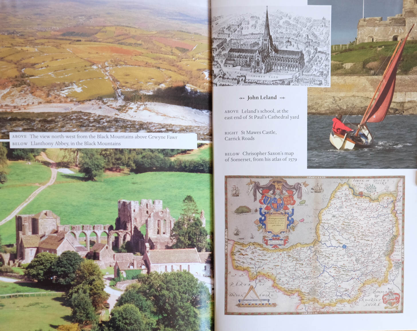
I’ve spent a good part of the summer walking across Northumberland and cycling around East Anglia so Nicholas Crane’s Great British Journeys (Weidenfield and Nicholson, 2008) was a good companion for some of that time.  It takes eight British travel narratives from the 12th to the 20th century and retraces the steps those writers took.  It’s a good read: NC seems like an accomplished navigator and researcher and his inquisitiveness inspired me to nose around on my own relatively minor travels.  There is one thing that lets the book down though and it is a very common fault – the photographs.

It is nothing to do with the quality of the photographs themselves.  They aren’t in fact particularly interesting which is a bit surprising since the book came out of a television series: you’d think that professional camera people would have been able to provide better outtakes.  But that is by the by.  The real issue is the way that the photos have been wedged into the book.

There are 250 pages or so of text and the photographs have been divided into three chunks which have been inserted apparently randomly at pages 90, 138 and 170.  They are of the shiniest paper, are in several sizes and vary between landscape shots of spots mentioned in the narrative and landscape shots featuring the author.  Then there are the stock photos of old maps mentioned in the narratives scattered into this sequence. The identifying text is placed wherever seems to have been most convenient and – my particular bugbear – appears to be in more than one font. some photos are laid over others and some text obscures the images. White background appears randomly.

Bit of a dog’s breakfast

Bit of a dog’s breakfast

This hurts my eyes.

This hurts my eyes.

This isn’t that unusual but it is pretty surprising in a book drawn from a documentary television series – a format which has now existed for well over half a century and which is essentially the marriage of words and images.  Yet it is often done so badly: in nature programmes, travel programmes, history programmes, word and image wrestle for domination. The result is often what could have been a radio programme but with images tacked on for TV; or a series of images on television so overcooked that the soundtrack becomes mere embellishment.

Personally, I don’t think the book needed any photos – its historical nature precludes them. (Line drawings or something like on the cover would have been great.) If it had to have shots of the modern-day sites then I would have used high quality stills, probably in black and white to excite the imagination, and inserted into the text where it deserves them.  Several centuries after the Chinese were affirming when they merged image and verse that the image was the host and the words inscribed on it were the guest we still seem to be struggling with the very basics of marrying the two.

JOHN BERGER: WORDS AND IMAGES

 The Marriage Of Text And Photo

It was a bit of a blow when John Berger (Ways of Seeing), Robert Pirsig (Zen And The Art Of Motorcycle Maintenance) and Leonard Cohen all died within a  year. I’m not much into hero worship but certain people are kind of constant presences in your life and so these three were for me.  I even wrote a haiku.

John Robert Leonard

Berger Pirsig and Cohen -

all in the twelve months

I was quite pleased that this does stick to the traditional 5/7/5 syllabic pattern – though some days I do think there is a vague note of E J Thribb (from Private Eye) about it.

300x.jpg

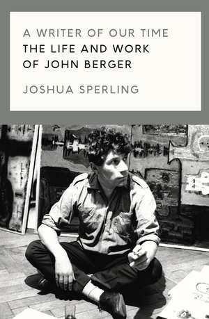
I read a biography of LC last year and wished I hadn’t: I’d never quite realised what a rackety life he had.  So it was with some trepidation that I picked up Joshua Sperling’s ‘A Writer Of Our Time: The Life And Works Of John Berger’ recently. It turned out to be more an examination of JB’s thought than an autobiography – though nonetheless it turns out that he, too, was something of a lady’s man.  What is it about these guys and women, for heaven’s sake?

JB is best known doubtless for ‘Ways of Seeing’ (both TV series and book) and possibly for donating half of his prize money to the Black Panthers when he won the Booker prize in 1972.  It caused quite a row.

He’s a fascinating figure: a challenging and visionary polymath, but also verbose, dogmatic and contrarian. Youtube clips like this one show him at his charismatic and charming best.   He is sometimes grouped with Susan Sontag and Roland Barthes as part of a triumvirate of authority on photographic theory (though they are all best sampled in small doses, I find).

Of particular interest to me are his thoughts on marrying photography and text - which is essentially what this website is about.  Rare is the day I don’t write a haiku of some sort and I did go through a period of trying to combine these with photographs.  Here’s an example.

dreams.jpg


I had in mind the lovely Chinese and Japanese paintings and brushwork you see which often carries text.  The Chinese refer to the artwork as the host and the text as the guest.  Often the characters are not particularly legible and so the meaning of the text is secondary.  The problem with doing this digitally is that the text comes out far too clear and the fonts are too definitive to sit with an image.  It would be like  branding a puppy.

In 1967 Berger published, with photographer Jean Mohr,  A Fortunate Man, a book of text and photographs about the life of a country doctor.  This was an experimental attempt to match text and image creatively in book form.  Berger made the distinction between the private photograph which remains part of a private narrative for the person or family or group to which it belongs and therefore needs no particular explanation; and the public photograph which requires a context before it can make any contribution to understanding.  A Fortunate Man was his attempt to work through this idea not simply by creating a straight line of narrative around the photography but by embedding it in a radial structure of words in which neither word nor image repeats the other (as so often happens in conventional news/documentary/photobook forms).  He had had some experience of this in his work on television arts programmes and he went on to develop it in two further books (A Seventh Man and A Way Of Telling). 

We might see the text/image dilemma as physiological.  A photograph will be round your brain’s neural circuits and will have had its effect before a paragraph of text has even got its boots on.  If you are given, say, a two-page spread with words on one side and images on the other your eye always leaps to the latter.  But when it is done well, the text might be seen as slowing down the image by lengthening the viewer’s cursory glance and the image promotes the words by creating an interest in them.  That has presumably been a central issue for all news media since the invention of photography.  What about when you want to get away though from such a straight form of communication though?  What if the relationship of word and image were to be more irregular, non-linear or poetic even?

You would think that digital technology might have helped but in my experience it has simply reinforced the difficulties.  The template I use for this website makes it very difficult to insert text between the images on the photograph pages.  In software such as MS Publisher text boxes and image boxes are treated quite separately and you are restricted to a narrow range of fonts and picture formats.

These blog posts are themselves an attempt to put word and image together – though I don’t feel that I have yet reached the transcendental moment when each might inform the other in a less conventional way. I am working on it though and John Berger is a great help.

To end, here’s a photograph I produced recently which maybe could take some words?

209998002.jpg

Maybe these? 

walking the streets

at every footfall

the city unfolds