SOMETHING HARD TO FIND

 What’s hard to find these days is something that’s hard to find.  I think it was Alan Bennett who wrote that and if he didn’t he certainly should have done.  Everything is so over-marketed. So when I spotted two little photo exhibitions locally putting their hands up at the back of the class, so to speak,  I made a point of going to see them.  They were Bury Art Museum‘s A Celebration of Life in the North 1970’s – 1980’s; and Capturing the Modern Backdrop: Shirley Baker Photographing Salford at the Working Class Movement Library  in Salford.  Ostensibly they had much the same focus but but turned out to counterpoint one another very interestingly.

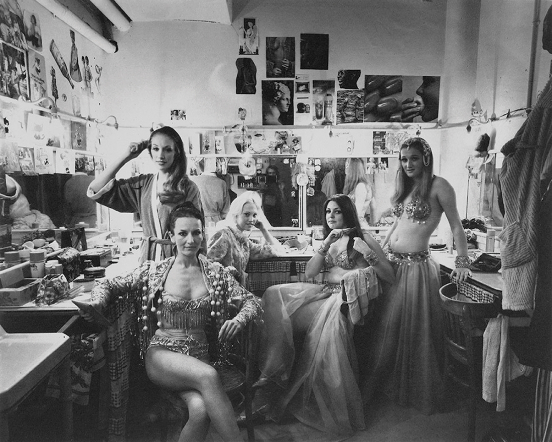
So first to Bury on Manchester’s wonderful tram system.  I love these trams and especially their distinctive toot-toot: they make me feel so cosmopolitan, so – dare I say it – European.  The Museum is nobbut a cockstride from the tram terminus and has a lovely atmosphere.  It’s local without being parochial, has a great café, and the person on reception has a beautiful Lancashire accent.  Upstairs British Culture Archive has selected 31 photographs in its collection from four photographers: Don Tonge, Chris Hunt, Luis Bustamente and Thomas Blower as, I guess, a representative sample of late 20th century images of northern England.

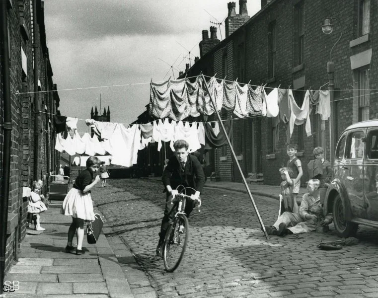
I contacted both British Culture Archive and Bury Museum for permission to show one or two photos from the show but haven’t been able to get a reply out of them. So my iphone shot of Don Tonge’s ‘Newspaper Seller, Manchester City Centre 1970s’ will have to do for the moment. Newspaper sellers have disappeared from the streets of course now and so have their “Late Night Final!” cries.

The British Culture Archive was founded by Paul Wright in 2017 “to document, highlight and preserve the changes in British culture and society through documentary photography”.  That’s a big project and 31 photographs can only give a flavour of the range that you can find on the BCA website (link above). I do wonder, incidentally, if archives like these are going to take over from social history books as a record of people and place.  Oral history would be a natural partner for these visual records and together the two might give a fuller narrative than a third-person historical account can do.

The exhibition had side displays of books, records, magazines and other memorabilia from the 70s and 80s but virtually no curatorial comment. Although I often find curators’ remarks distracting, in this case I missed them a bit. Why these pictures, I wondered, and why now? And precisely what did they illustrate about 1970s and 1980s Northern England? Also: just what is so northern about them - delightful though they are? After all, there are very similar series from other parts of the country: Roger Mayne’s Southam Street for example; or Oscar Marzaroli’s Glasgow archive; or Vanley Burke in Birmingham.  Then there all the Cafe Royal books. The UK is a small country and things don’t vary as much from corner to corner as we sometimes imagine. 

Nonetheless it is hard to resist the allure of this saunter down memory lane. The photos are charming, the display unfussy and there is plenty to delight the eye and interest the mind.

From Bury I caught a tram back to Victoria Station and then walked up into Salford which took a good 45 minutes or so because I wanted to go across Blackfriars Street and then along Chapel Street which is a small but atmospheric part of Manchester where to your left you can see the high-rise future coming into being while on the right the low-rise past disappears.  I eventually staggered into the cafe in  Salford Museum and Art Gallery to ask myself the question that I always ask there: how can such a beautiful café space have such a dreadful menu?  The café is light, spacious and has a fabulous bay window looking out over Peel Park.  It’s really lovely.  The best I could find on the menu was beans of toast but it was catering pack beans and possibly the worst bread I have ever tasted.

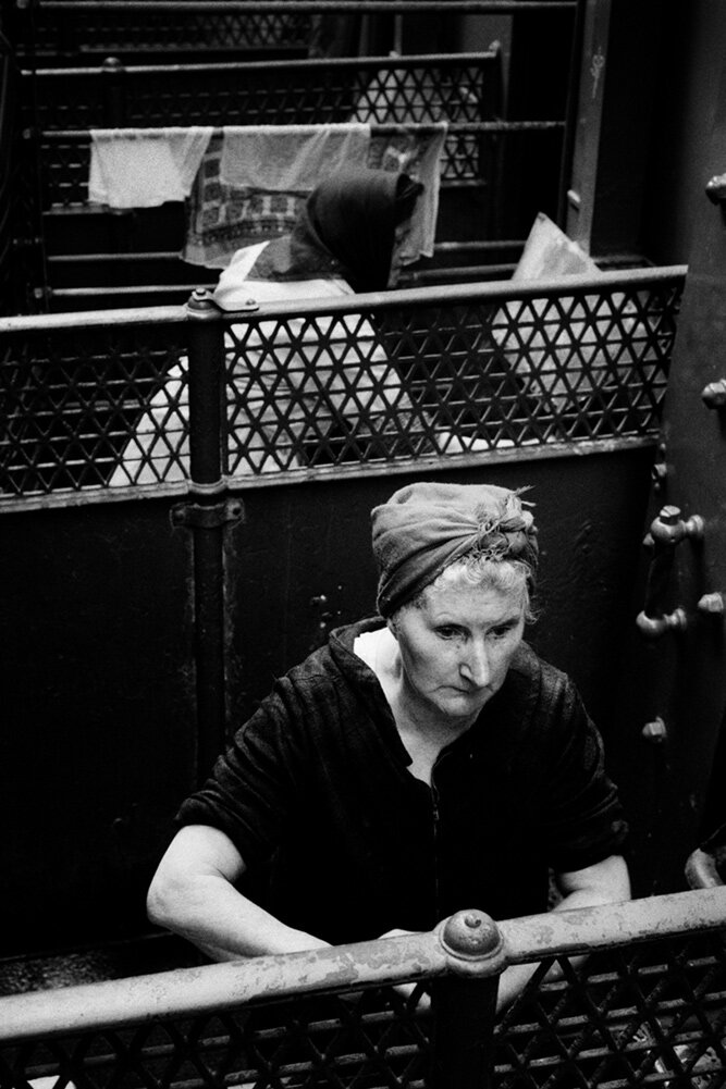
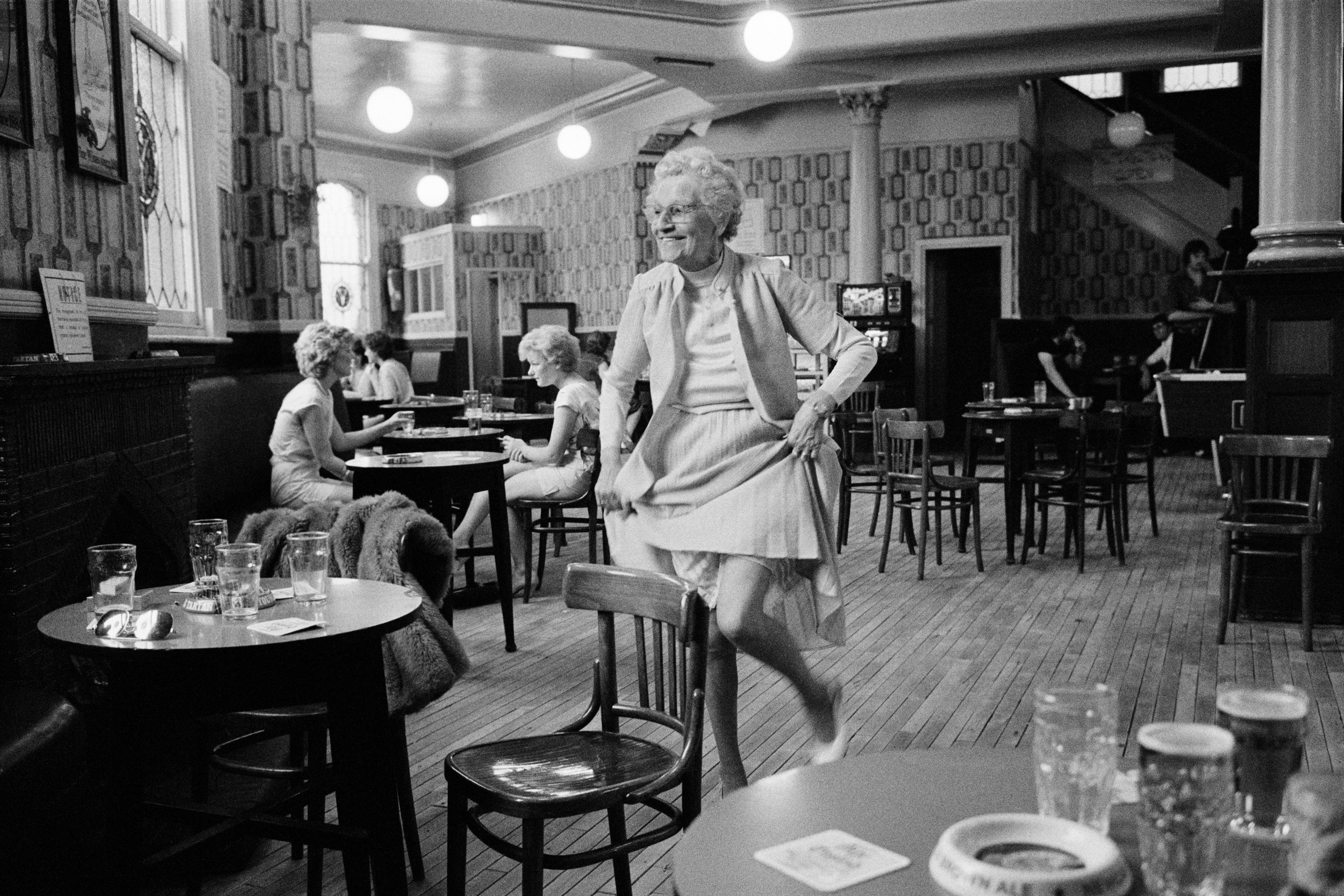
Over the road then and into the Working Class Movement Library – an ex-nurses’ home which houses a collection first put together by Edmund and Ruth Frow in the 1950s and now numbering around 33,000 books. The Shirley Baker exhibition was in one room and comprised 15 photographs (in the ubiquitous black frame, I am afraid, as were the ones in Bury).  A casual glance might have suggested that the photos were much the same as those in Bury but an article in a local history magazine displayed on a nearby table and a reinspection of the photos brought out some deeper features of the display.  Essentially, what the article said was that Shirley Baker was not simply a chronicler of the streets of Salford but had a very disciplined focus on the process of history – on the changing visual aspect of the city and its effect on its people.  The streetlife for example of children’s play and adult conversation which disappears as the tower blocks rise and the back to backs are demolished.   Looking round again I realised how accurate that comment was. This, for example……

…gives way to this……

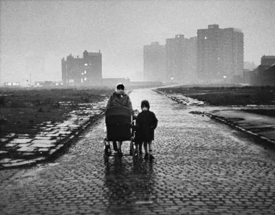
I couldn’t get a reply out of The Working Class Movement Library either. Both images © Estate of Shirley Baker

There were also interesting contemporaneous press reports and inquiries into the dire mismanagement of housing provision in the city.  Plus ça change, eh?

From there I got the bus back down into Manchester and the tram home. It was a Grand Day Out: some fine photos; interesting ideas to chew over after the visit; and a feeling that I had unearthed something for myself rather than having been the target of gallery marketing departments. 

The Bury Art Museum exhibition continues until 18 May and the Shirley Baker exhibition until 21 April.

WYNDHAM LEWIS: SWAGGER

A couple of years ago the IWM North had a Wyndham Lewis exhibition.  I went along out of curiosity and found his work to be quite striking.  A couple of weeks ago I picked up the exhibition catalogue secondhand for £3.49*. I really took to the 1932 self-portrait above.  It has a bit of a swagger to it and it’s fun to let the eye rove over it and pick out all the basic forms that he’s used.  Below is a photograph of Wyndham as an artillery officer in 1917.  Think of all those studio photographs you’ve seen from both world wars of expressionless men in uniform all doing their best to look ramrod straight and disciplined and military.   In comparison this shot is an absolute scream: the dangling cigarette, the sidelong pose, the provocative glance, the hooded eyes, the half-smile - a total subversion of the genre.  What’s remarkable though is that it projects exactly the same swagger as the self-portrait.  I always say that painting and the other visual arts have very little in common with photography but these two images seem to suggest otherwise.

* What is this bizarre retail convention of pricing articles a penny below a round sum? It should have died out years ago.  Who uses pennies any more, after all?

HAPPY NEW YEAR EVERYONE!

STAYING ALIVE

Image taken from The Week magazine on my iphone. It shows an installation of David Hockney’s The Arrival of Spring in Woldgate, East Yorkshire in 2011.

I was walking around Salford Quays a few months ago and I noticed a very large tent-type structure housing what it called a  ‘Van Gogh Immersive Experience’.  “Have you ever dreamt of stepping into a painting?” asked the hoardings. (For £25, if I remember correctly.) There were no queues – which didn’t surprise me – and I imagined that this attempt to turn the work of a great artist into some sort of digital sensurround was bound to fail.  Even these days of visual excess it seemed pretty tasteless to take great work in one medium – oil painting - and desecrate in another – digital projection.

Well, how wrong can you be?  There are, apparently, five of these things going great guns across the globe.  There are Hilma af Klint experiences, too, and in Paris there is one about the Mona Lisa.  There’s a Dali and a Frida Kahlo about to open. Suddenly, immersion is everywhere.  (And now I see where the Sebastiao Salgado exhibition ‘Amazonia’ which I found so noisy and wrote about in July got its forest-immersion ideas from.)   You can see why this format would be popular with the the galleries: no security problems because the artworks aren’t actually there; the digital medium can flash round the world in seconds, so no logisitical problems; and you can mount them in different places simultaneously.  Think of the revenue!

Those artists above are all dead, so they can’t complain.  But now David Hockney has taken the plunge with an immersive exhibition called ‘Bigger and Closer (Not Smaller & Further Away). There’s even a “specially-recorded voiceover”.  In the press releases about this he is reported as saying: “The audience will feel in this. They will feel in the forest.  They will feel on the cliff….”   The suggestion seems to be that this one is more legitimate because the artist is alive and participating.

I haven’t been to any of these “experiences” though I might go to one, if I get the chance, now that my interest has been piqued.  I’ll try to keep an open mind but I don’t think it is too hard to imagine what they will be like.  They will attempt to engage digitally with every human sense: vision, sound, smell even, possibly taste and doubtless touch one way or another.  Customers will pay to be overwhelmed. 

It’s the digital medium that’s the driver.  There is nothing to restrain it.  Anything is possible.  It’s like someone who humbly offers to help you with a job you have and then takes over completely and gets you sacked.  So it starts off as a kind of support technology to the arts and all of a sudden it has become the art itself.

I’ll reserve judgment.  But I think that my problem with all of this is that I already have an all-round immersive experience. It’s called ‘Being Alive’ and it’s unbeatable.

OVERKILL: SEBASTIAO SALGADO'S 'AMAZONIA'

Sebastiao Salgado needs no introduction.  He is photographic royalty.  If you need reminding of that then you can read a litany of his achievements on a large wall stencil at this touring exhibition currently showing at Manchester Science and Industry Museum. What’s more, if you did have any doubts about the quality of his photographic work then the exhibition’s promotional material will put you straight.  It is, we are told, “incredible”, “powerful”, “breathtaking” and “stunning”.  It is “beautiful and evocative” and “Visitors can’t fail to be inspired” (so if you do fail to be inspired that’s your problem, right?).  The press release, apparently without irony, calls it “a blockbuster”.

What, then, does the visitor get at this exhibition?  There are over 200 photographs which can be divided generally into landscape and portrait images.  The landscape photographs are unframed and vary from big to huge.  I didn’t have a tape measure with me but I’d estimate the biggest to be about 6 by 8 feet and the smaller ones to be about 5 by 4.  Those biggest ones are on the side walls and the rest are hung from the ceiling.  They are divided physically into sections in the exhibition: The Forest; The Mountains; and so on.  In the middle of the main exhibition area, in settings designed to represent indigenous housing, are smaller framed and mounted photographs which are portraits of several groups of local peoples and of their way of life.  These are mounted and framed in some sort of laminate.  All the images are black and white. 

Gallery View courtesy of Manchester Science and Industry Museum

The curator of the exhibition, Leila Wanick Salgado says in her notes that the purpose of hanging images at different heights and in different formats is to make the visitor feel enveloped in a forest.  The photographs are interspersed with written material which varies from the factual and informative to the campaigning or hectoring depending on your point of view. “It is the duty of all human beings across the planet to participate in its [Amazonia’s] protection”, we are admonished at one point.

Throughout the main exhibition is a soundtrack by Jean Michel Jarre “inspired by the authentic sounds of the forest”.  In addition, there are two separate soundtracks in side rooms.  The first, by Brazilian musician Rodolfo Stroeter, accompanies a slide show of portrait photographs.  The second is a symphonic poem by Villa Lobos and accompanies a slideshow of landscape images.  With the three soundtracks, at certain points in the exhibition you get what I think of as The Debenhams Experience where the music being played at one concession clashes badly with that being played at the concession next to it.

Finally, the visitor hacks his way through this sensory entanglement to the photographs themselves.  These are in Salgado’s hallmark style – powerful, contrasty images of a kind which has been widely admired throughout his career.  There is no doubt that he is a very accomplished photographer in what I would call the Transcendentalist tradition.  Whatever the titles and subjects of his various books and exhibitions, his underlying theme is of the inherent goodness of people and nature and their corruption by society and its institutions.  Roiling skies abound.

Mariua Archipelago, Rio Negro, Brazil, 2019, © Sebastiao Salgado.

There has been much discussion of his method over the years but the consensus now seems to be that he uses digital cameras to capture the images and then produces what is known as an internegative to swap them back into an analogue workflow for wet printing in a darkroom to get the traditional film look. 

 There is no denying that the landscape images in the exhibition are powerful but there is only so much a photographer, even of Salgado’s standing, can do with the river/jungle/sky troika.  The smaller,  mounted images in the centre of the exhibition speak with a quieter voice.  There are some lovely, unaffected portraits with background notes about the people and their culture.

I think the exhibition’s big problem is that the photographs are not allowed to speak for themselves.  They are badly hemmed in by the curation.  For example – why are the photographs printed so big?  It is very fashionable, of course, but photography is a reductive medium: you can, almost literally, hold the world in the palm of your hand.  The unspoken suggestion seems to be that the bigger the image the more impressive it must be.  But this gives the practical problem that the observer has to stand well back from such large images and in places the hanging arrangement hampers that.  One photo gets in the way of the sightlines for another.  Plus, on top of the 200 or so images you have three sets of music, two slideshows, a documentary of indigenous leaders, extensive wall annotations, no natural light and and occasional tannoy announcements from the museum.

As I was walking around the exhibition a scene jumped into my mind from the film Spinal Tap – the famous “eleven” scene where guitarist Nigel is explaining how the band’s amplifiers go “one louder” than all the other bands just for that “extra push over the cliff”.  It made me think - they could have called this exhibition “Amazonia – Eleven”. 

Just sometimes, photography is pure magic.  In a split second it can spark up  the mind’s electrodes and fire the imagination to great heights. This is the true power of the medium but it takes faith to let photography speak for itself and not heavy-handed curation.  There are doubtless those who will love the total immersive experience but it wasn’t for me.  These images need silence and meditation.  I came out desperate for a bit of peace and quiet.


“Amazonia” is at The Science and Industry Museum, Manchester until 14th August.


DEREK JARMAN PROTEST!

Derek Jarman gave me some help once.  It was thirty-odd years ago when I was going through a difficult patch.  It wasn’t depression but more a kind of permanent disorientation.  For many months I felt that I was being tossed about on a sea of events that I couldn’t  control and every day seemed to be an insurmountable challenge.  I knew I had to deal with it and one of the ways I set about it was to find some books by people who had dealt with their own challenges.  One was The Naked Civil Servant by Quentin Crisp; another was Death Plus Ten Years by Roger Cooper.  Then there was a volume of Derek Jarman’s diaries:   amusing, quixotic at times, wry, original and very humane.  All of this reading helped and eventually my mental state righted itself but Jarman’s voice floated around in my brain for quite some time afterwards as a kind of tone that I might emulate.   Then a few years ago I tried to take a look at his garden down near Dungeness but it was in private hands and public visits were discouraged**.  So I knew the chance to take a closer look at Manchester Art Gallery’s exhibition*: Derek Jarman Protest! was not to be missed (though I can’t help feeling the Gallery has missed a colon or dash out of that title).

If, before this exhibition, you had asked me who Derek Jarman was I’d have said he was a film-maker and writer.  I had no idea of the sheer range of his work nor of the talents he  had revealed right from his schooldays.  He was indeed a film-maker and writer but also a set designer, a producer of music videos, a painter, collagist, gardener and occasional performer.  The exhibition contains plentiful examples of all of this work and does a good job of packaging it into chunks and periods as of course it should, and analysing it and commenting on it.  But in the end he seems to be a bit uncontainable.

As I wandered round the exhibition I was musing on this fecundity and a sudden thought lodged itself.  I mean, look at these works below: 

Landscape 1991

Ich grete thee with songe.1987.

Dream of the rood. 1989.

Dead man’s eyes. 1987.

I thought of the Sickert exhibition (see last month’s blog) and it suddenly seemed very flat.  Then I  looked around me and thought: “Mmmmm….this is of an entirely different order.”  The shapes, the colours, the depth, the abstraction kept nudging me and then I had it:  he wasn’t an artist, he was a shaman - a charismatic individual, an ecstatic who dreams and enters spirit worlds and brings back images, shapes and myths.  That is what I seemed to be looking at - images from elsewhere.  The film clips were the same as the artworks above. They were all shot through with that shamanic ecstasy and charisma.  Of course, shamans can be dangerous because the world is not always ready for, or able to control,  what they bring back.  But their primary purpose is protective and I wondered: was his role in fact not provocative at all? Was he there to protect and prepare us for the great cultural changes that were coming?

Tilda Swinton as Queen Isabella in Edward II.

Don Giovanni: preliminary study for set design. 1968.

Untitled: statue fragments. 1982.

Nightlife -

Nightlife. 1982

 Well maybe I’ve gone out on a bit of a limb there. But a shaman is typically distinguished by an early traumatic episode or illness and the curator of this exhibition makes the point that Jarman’s sexuality was severely punished when he was at school and that marked him, and his work, for life.

He’s a strong taste, there’s no doubt about it.  His homosexuality is generally seen as central to all the work and doubtless that is right in its way.  But when I make the effort to look beyond that, beyond themes and explanations and meanings, I find in his work a rich source of imagery which resonates strongly in me without need of explanation.

I spent almost two hours in the exhibition – which is good going for me – but, after all, you don’t come across that many shamans in Manchester.  On the way out I noticed in the bookshop a volume of his sketchbooks for sale for £28.  As I often repeat in this blog I have a £20 limit on any photobook but I decided to take the plunge here, excusing myself on the grounds that although there were some photos in it,  it wasn’t really a photobook.  I have just started browsing through it and already have a number of ideas for my own notebooks.  So now Derek has helped me in my struggles for a second time.


*Derek Jarman Protest!  runs at Manchester Art Gallery until 10 April – by which time I really hope they’ve sorted out the punctuation in that title.

**Thanks to a campaign by ArtFund the cottage at Dungeness is now in safe hands and plans are afoot for a public programme including residencies and small tours.

NB: HOME in Manchester is running a season of Derek Jarman’s films in the next few weeks and that is a rare chance to get to see them.

All the photos (except the Sketchbooks volume) taken by me on an iphone. So far as I am aware copyright in the original works lies variously with the Estate of Derek Jarman, the Keith Collins Will Trust and the Amanda Wilkinson Gallery.

WHEN FOOTBALL WAS FOOTBALL

WHEN FOOTBALL WAS FOOTBALL

Sefton Samuels is a distinguished, Manchester-based photographer with a long career and many excellent photos under his belt, as you can see on his website. The last two photo exhibitions at the National Football Museum were excellent (see my review of its Pele exhibition in February 2018 below) so I had high hopes of this one - When Football Was Football* - featuring his work. Unfortunately, it doesn’t really do the photographer justice.

When Football Was Football captures a long-ball world of 3pm Saturday kick-offs, Bovril, affordable tickets, packed terraces and sideways northern drizzle……Samuels shot a bygone era that’s a world away from dreaded prawn sandwiches, £100m players and proposals for a superleague.”   So says the Museum in its blurb but that is a bit of a lazy pitch and it comes a bit too close to parody for my taste.

What you actually get is thirty-odd largely undistinguished photos on panels in the entrance area to the museum.  The curatorial effort is minimal and relies mainly on anecdotes and generalities.    To my eye,  what emerges mainly from the exhibition is that football in the 20th century was mainly a working-man’s sport; that players and managers were more accessible then than they are now; and that photographic style has changed the game’s image out of all recognition.

Take this photo, for example.  (I do rather like this one, actually).

  It’s a 1948 image which shows 19 of the 22 players on the pitch plus the referee.  Okay, it’s shot from the crowd, but you just don’t get that style of shot anymore.  It shows a team game, devoid of any real drama and with individual players largely unidentifiable.   In contrast, the modern footballing image, thanks to powerful lenses and digital capture, is a close-up of a dramatic moment featuring no more than one or two players.   The team game has gone and the heroic moment has taken its place.  It’s not the game that’s changed, it’s the portrayal of it. Technology creates truth: now it’s The Beautiful Game, then it was apparently all horizontal drizzle and packed terraces.

Footnote: I just thought that I would pop in the two images below. First is a Sefton Samuels shot of children playing football. I immediately thought it looked just like an L S Lowry painting (as did the photographer, apparently). So I went looking for which one and came up with Lowry’s painting ‘The Cricket Match.’ Am I right or am I right?

* “When Football Was Football”: The Photography of Sefton Samuels continues at the National Football Museum in Manchester until 31 December.

FORENSIC ARCHITECTURE: CLOUD STUDIES

Controversy dogs Forensic Architecture and that is not surprising.  It is a research agency which investigates human rights violations principally committed by states, police and military forces and corporations.  Its current exhibition at Manchester’s Whitworth Gallery, Cloud Studies, (part of the Manchester International Festival) consists of the details of nine such investigations.  And controversy almost torpedoed it right at the start. 

What happened was that an unequivocal statement of Forensic Architecture’s support for the Palestinian cause was placed at the entrance to the exhibition.  This was quickly followed by a complaint from UK Lawyers for Israel saying that the statement contained inflammatory language and portrayed Israel as an occupation force engaged in ethnic cleansing, apartheid and human and environmental destruction. The Whitworth removed the statement.  So Forensic Architecture closed the exhibition.  So then the Whitworth reinstated it with caveats.  So then the exhibition reopened.   There is a Guardian article interview which gives FA’s view of events here.  There is a statement by the Whitworth hereUKLFI’s version of events can be read here.   So you can make your own minds up.  I have no intention whatsoever of charging into these tangled thickets.  What really interests me about the exhibition is not what it says but the means by which it says it.  It’s that old bugbear of mine again: the digital medium.

Digital reconstruction of events lies at the heart of Forensic Architecture’s method. (Image © Forensic Architecture)

Digital reconstruction of events lies at the heart of Forensic Architecture’s method. (Image © Forensic Architecture)

The exhibition is in three rooms.  The first contains a large screen giving a twenty minute or so overview of the nine investigations.  The second and third rooms contain smaller screens with headphones each of which gives details of the cases investigated.  These include: Israeli actions in the Gaza Strip; ecocide in Indonesia; oil and gas pollution in Argentina; environmental racism in Louisiana; and the use of tear gas in Chile.  The link between all of these cases and the exhibition’s central image is the toxic cloud.  “Bomb clouds” FA says “are architecture in gaseous form”.  So the exhibition alleges serious crimes by states and corporations and the evidence is set out through cutting-edge digital techniques accompanied by both narration and the written word.

The digital techniques might be best placed under the general heading of data visualisation.  FA’s list includes 3D Modelling, Fieldwork, Geolocation, Fluid Dynamics, Image Complex (linking many partial images to create 3D models), Machine Learning, Open Source Intelligence, Remote Sensing and Synchronisation Software Development.   Eyal Weizmann, the Director of FA, has referred to it as “counter forensics”.  In essence, it uses this advanced technology to detect largely unnoticed evidence (which it terms “weak sensors”) to undermine otherwise plausible denials by parties – usually states or corporations – which have almost exclusive access to more conventional forms of evidence such as official witnesses, control of the scene of the crime or scientific knowledge. 

So far – so good.  But I think we run into a problem when we try to define precisely what it is that we are looking at.  The digital medium is a very, very slippery customer.  What is this mixture of image, word and sound?  Evidence?  Polemic?   Accusation?  Documentary?  Representation? As an example, there is a section of the opening overview in which rapid slides have a voiceover and  - on top of that - there is superimposed operatic music.  This is a digital cocktail of visual, word and sound with great emotive force but questionable evidential status.

A very busy screen.  To the left data visualisation.  In the middle real time still photograph.  To the right talking head.  Behind, it’s hard to say but a mixture of video and data overlay maybe.  All this was accompanied by a narrated commentary.  That’s a lot of information to take in.  (Screen grab from video sequence © forensic Architecture.)

A very busy screen. To the left data visualisation. In the middle real time still photograph. To the right talking head. Behind, it’s hard to say but a mixture of video and data overlay maybe. All this was accompanied by a narrated commentary. That’s a lot of information to take in. (Screen grab from video sequence © forensic Architecture.)

FA themselves say that their work is “for use in national and international courtrooms, parliamentary inquiries, citizen tribunals, community forums, academic institutions and the media. We also present our findings in galleries and museums when other sites of accountability are inaccessible.” Yet in a criminal courtroom (in common law jurisdictions at least) there is a very clear process: there is a prosecution and there is a defence; there is cross-examination and there is a jury.  That is completely different from, say, a gallery or a museum.  Can one evidential size possibly fit all of these fora?*

For me, at this point, confusion creeps in and at the heart of the confusion is the digital medium.    The original evidence in these cases is often captured by eyewitnesses on digital devices such as the mobile phone.  It is flashed around the world in seconds.  The resulting flood of information, verbal and visual, can then be reconstructed by digital techniques into highly rhetorical displays such as Cloud Studies.  The medium is so fast, so slick, so persuasive and so promiscuous.  Data bundles can be chopped, sliced, fried, roasted, boiled, and mashed to suit all tastes.  What starts off apparently as the case for the prosecution suddenly becomes an art exhibition.  This is uniquely a characteristic of digital media and would have been impossible with analogue techniques.

A triptych shown as evidence of Israeli spraying of toxic chemicals to damage Palestinian crops.  What I see to the right (ie main screen) is a data mock-up of the overall scene; in the middle  a real time video with the aircraft digitally blocked in red plus subtitle of video soundtrack; and left an aerial shot of the territory in question.  It is very persuasive - but precisely what is its status in an art gallery?   (Screen grab from video sequence© Forensic Architecture.)

A triptych shown as evidence of Israeli spraying of toxic chemicals to damage Palestinian crops. What I see to the right (ie main screen) is a data mock-up of the overall scene; in the middle a real time video with the aircraft digitally blocked in red plus subtitle of video soundtrack; and left an aerial shot of the territory in question. It is very persuasive - but precisely what is its status in an art gallery? (Screen grab from video sequence© Forensic Architecture.)

A 2015 UN Report proposed two useful phrases to describe this new digital tendency.    The first was ‘accountability regimes’ which it defined as ‘any system competent to assign innocence or guilt’.  The second was ‘advocacy spaces’ which it defined as ‘any forum in which narratives of innocence or guilt relating to particular events may be proposed’.  In other words, the flood of digital information is leaving the courtroom behind. Evidence is in the public realm instantaneously and the legal process limps in its wake. The problem is that a gallery turns itself into an advocacy space only without any of the procedures which due process provides.  This is the real problem with the statement at the entrance to the exhibition: it is a declaration of guilt and innocence before the presentation of the evidence in the exhibition itself.  For me, that turns the exhibition into polemic.

I’m uneasy about all of this.  I have great respect for what Forensic Architecture does and the skill with which it does it.  It assembles very persuasive cases against the states and corporations which usually hold all the evidential cards.  I also think the Whitworth is a great gallery but, in this case, both the Whitworth and the Festival seem to be presenting digital rhetoric as some sort of artistic statement.  The clue after all is in the organisation’s name: Forensic Architecture.  ‘Forensic’ means ‘used in courts of law’.  The gallery does not seem to have foreseen the obvious criticism: that the exhibition might be viewed as a platform for very serious and well-documented accusations of a criminal nature without any of the procedural safeguards to be expected when such allegations are made. So they had little defence when UKLFI made its complaint.

In a video interview with FA (here) the Director of the Whitworth, Alistair Hudson, says this is part of the gallery’s new direction – to present “art not as representation but art as operation”.  Art in pursuit of a cause?  I really hope he knows what he is doing.  The controversy and confusion which marked the opening of the exhibition are hardly reassuring.


*You can read more about FA’s explanation of its methods (and sign up for their newsletter) here

The exhibition continues at the Whitworth Gallery until October 17th.

THE HUNGARIAN CONNECTION

I attended a zoom lecture on Hungarian Photography a few days ago.  It was given by Colin Ford, a well-respected photography curator and academic who in 2011 curated an acclaimed Royal Academy exhibition entitled Eyewitness which was mostly about the five well-known Hungarian photographers from the 30s, 40s and 50s: Brassaï, Capa, Kertész, Moholy-Nagy and Munkácsi.   I went down and it was wonderful – just the kind of photography I like to look at: fleeting impressions in black and white shot à la sauvette as the French say - on the hoof.

Most of what he said in the lecture would be pretty well-known to anyone with a passing interest.  All the standard photos were there: Capa’s falling soldier; Kertesz’s underwater swimmer; Munkacsi’s boys at Lake Tanganikya and so on plus various anecdotes and tales about the photographers themselves.  There was even Capa’s endlessly repeated quote that if your photographs aren’t good enough then it’s because you aren’t close enough – which has always struck me, coming from a war photographer, as being a classic bit of Hemingway-esque bragodoccio.

Personally, I’ve always been a big fan of Andre Kertesz – largely for the simplicity of his style.   This one, for example

André Kertesz, Martinique, 1972

André Kertesz, Martinique, 1972

By the end of the talk, however, I found myself coming to the conclusion that in the end, perhaps there isn’t that much to say about any particular photograph – even renowned ones like these.  You might describe the circumstances in which one was taken – though that would be mostly hearsay.  You might try to analyse it as though it were a painting – a fool’s errand, in my view: photographs and paintings are two completely different things.  You might take a theoretical tack, or an anecdotal one but in the end a photo makes an emotional or psychological or cultural connection with you or it doesn’t and that is more or less it.  The words are like minnows round a whale.

Nuns, by the lesser known Hungarian photographer,  Ernö Vadas.  What can words do for this photo?  Just a feast for the eyes

Nuns, by the lesser known Hungarian photographer, Ernö Vadas. What can words do for this photo? Just a feast for the eyes

One interesting point that came up was thia: what is it about the Hungarians – or possibly the fact that all these five photographers were Jewish – that produced this talent?  There was a suggestion that they all struggled with English or other foreign languages and photography was an ideal medium for them to overcome that difficulty.  And Robert Capa did say: "while pursuing my studies my parents' means gave out, and I decided to become a photographer, which was the nearest thing to journalism for anyone who found himself without a language."  It is true that Hungarian is not an Indo-European language and its closest linguistic family members are Finnish and Estonian.  So maybe that does lead to a certain sense of isolation particularly in such a small country.  But why in the middle of the twentieth century only?  It’s not really like Greek philosphers or Italian artists – great flowerings over long periods of time.

This may be a teensy bit controversial but I do think that other factors are at play.  Firstly they are all male and white – which at the time was hardly a drawback and nor is it now.  Wouldn’t the work of Kati Horna measure up just as well?

Kati Horna;  Anarchist Funeral, Barcelona, 1937

Kati Horna; Anarchist Funeral, Barcelona, 1937

Next – at that time, several decades ago, they were photojournalists: it is only latterly the notion of artistic genius has attached itself to them; and not only them but many others.   Once reputations are established and serious money has changed hands, catalogues and biographies have been written and archives are established, a ratchet effect sets in and there is no going back: the escalator will go in one direction only.  All five of them were very talented photographers, of course, but their reputation has been established in exactly the same way over the years as many other non-Hungarians.  The photographs and their history haven’t changed over that time – it is simply that they have now been anointed by the art world on behalf of the shadowy economics supporting it.

In the end, I wonder if nationality is in fact terribly important.  Is there such a thing as French photography, or German photography or American photography?  Colin Ford felt that there is and that sometimes he could distinguish a Hungarian quality about a particular photo.  Perhaps knowledge and experience does make that possible - but I still wonder.

OSCAR MARZAROLI

I’ve been to Glasgow twice only and both visits were brief.  The first time I was picking up a party of 60 Mormons which I was to lead on a 7-day whistlestop tour of Edinburgh, The Lake District, Chester, Stratford, London and Paris. I was petrified some of them would get themselves lost on the Tube in London so I gave them a long briefing – how the Tube works, how you pay and so on.  At the end I asked for any questions and a voice piped up: “Say, Peter.  What’s a Toob?”

On my second visit I was leading a group of one (Mrs Barker – my nascent professional career as a travel guide having crashed and burned when the above American group missed their plane home).  We were on a significant birthday jaunt to The Outer Hebrides.  At Glasgow airport, a lady whom I assumed to be cabin crew, led us across the apron to the twin-engined Cessna, examined our boarding cards and did the safety routine.  Then she entered the cockpit, started the engines, taxied down the runway, flew us over and landed on the beach on the Isle of Harris.  Very cool.

So when I saw that Glasgow’s very excellent Street Level Photoworks were putting on what looked like an interesting exhibition by a photographer unknown to me, Oscar Marzaroli, I thought it was a good chance to kill two birds with one stone: see the exhibition and explore the city.  Alas, it was not to be.  Mother Nature intervened, we were locked down and it seems that Glasgow and I are destined to remain strangers for a little while longer.  I did however order a small book from Streetlevel “Oscar Marzaroli” to get a better idea of the work and which, at £15, came in well under my self-imposed limit of £20 for any book of photographs.

Obviously, for that price you are not going to get top quality reproduction but the book gives a good idea of the man and the work and I must declare myself drawn to both. This is just the kind of photography I like: somehow underplayed and unpretentious yet carrying a social and psychological impact that I started to feel only on second and third viewing.  The book mostly lets the photos speak for themselves – which is always a relief.  There is a scene-setting introduction with biographical details; an interview with Oscar from 1986; and the photos are interspersed with short observations from commentators over the years.

You can read Oscar’s biography on Streetlevel’s website here.  In short, he was the son of Italian parents who immigrated here in the 1930s when he was two years old.  Apparently, he moved back and forth between the countries during his childhood and never felt he belonged to either.  He became a documentary photographer and film-maker who spent much of his career capturing the changing Glasgow streetscene from the 1950s to 1980s.  This was a period of vertiginous decline for Glasgow – as indeed it was for many other British industrial cities: its population just about halved in the decades after the second world war.  Tenement blocks were demolished, communities were displaced, road systems invaded the city and industry disappeared.* It’s all there in the photographs which capture so much of this change.

But look – what’s this?

Women at work in the Communal Wash House (The Steamie), Townhead, 1968.

Women at work in the Communal Wash House (The Steamie), Townhead, 1968.

Lone Boy, Gorbals, 1963.

Lone Boy, Gorbals, 1963.

Yes, of course we know when these photographs were taken and where.  Both figures are physically in one place but psychologically look somewhere completely different. So don’t these two photos actually transcend time and place? Couldn’t they just as easily be characters from Dostoevsky, from Gorky, from Zola, from Flaubert - human types lifted from 19th century Nevsky Prospekt or the Marais and plumped down in late 20th century Scotland?

And what about this, below?

Expectation, Celtic End, Cup Final, Hampden Park 1963.

Expectation, Celtic End, Cup Final, Hampden Park 1963.

What better riposte could there be to the remark that there is no such thing as society? If that were so, this wouldn’t be a football crowd either - just people standing on terraces. (Unfortunately for Oscar, who was a great Glasgow Celtic fan, the victors that year were Rangers who won the replay 3-0 after a 1-1 draw first time round - before a crowd of 129,643. One hundred and twenty-nine thousand six hundred and forty-three souls. This section is only a tiny fraction of the whole…..)

There are many images of demolition and rebuilding (the construction of the Red Road flats, for instance, which were themselves demolished in 2015); of industrial skylines; of impoverished children at play; of dimly lit boozers; of the city’s artists and writers; of shipyards and markets, backstreets and courtyards. These are photographs of record but in that sense, though accomplished, they are probably no different from many others documenting the decline of the British industrial city.  They aren’t your high-contrast, grainy, poke-you-in-the-eye photographic tours de force.  It’s more the accumulated impact. They seem to be the backdrop to some vast and sprawling epic which has no beginning and no end.  As though, even while the form is changing before our very eyes, the substance remains the same. 

On the one hand you might look through these photographs, shake your head and say: “Aye, well……it’s all gone now.”  Well, it has and it hasn’t.  Maybe there are many more distractions these days – especially the hypercolour of the modern digital photograph.  But I imagine that if we were able to spirit Oscar back to today’s Glasgow, to hand him a camera and ask him to  get cracking then he would come up with something not dissimilar. The rituals of the street have changed sure enough: the rag and bone man, the milk deliveries, the funeral onlookers and the shiftworkers.  But in the end it’s all in the looking.

What catches your eye in this photo below?  The angle of their bodies? The sleet?  Or the posters for a then-unknown Winifred Ewing in a then-marginal SNP?  Context, people, history.

Sleet, Gorbals, April 1968.

Sleet, Gorbals, April 1968.

I wonder if Oscar’s background might account for some of this quality in his work.  His home life growing up must have been partly Italian and partly Scottish.  And presumably he was bilingual.  (They do say that to speak a second language is to have a second soul.)  Such a life must make you observant of difference and perhaps also tolerant of it.   It may not be so glamorous, but to turn your gaze again and again onto the same subjects will in the end, I believe, reveal rather more than a constant search for the new and spectacular. I understand that the plan is to extend the exhibition after lockdown and I will certainly be making every effort to go and see it. 

An era captured in a cracker of a Glasgow novel I once read, by Jeff Torrington: “Swing, Hammer, Swing.”

 You can learn a little more about Oscar in the following YouTube link, narrated by one of his daughters, Marie-Claire: https://www.youtube.com/watch?v=E1SIN2GuouQ

 All images Oscar Marzaroli, © The Marzaroli Collection, courtesy Street Level Photoworks


PHOTOGRAPHING THE ENGLISH NORTH: 1890-1990

This* is an exhibition at Bolton Museum and Art Gallery which lasts until the end of April. It’s solid, unpretentious and has something for everyone, photographically speaking: landscape, cityscape, coast, industry, portraiture and photojournalism. There are some fifty prints in a beautiful mezzanine room toplit through rooflights which you enter by a broad staircase.  Fifty is a good number: big enough for variety but small enough for you to give each one some attention.  Each image is mounted (sloppily in some cases) and framed, apart from three Leeds City Council Archive prints which are set on foamboard for some reason.  The hanging scheme seems to be geographical, starting with the north-east, down the coast, then inland to Yorkshire and over the Pennines to the north-west.  This is a bit confusing chronologically but never mind.

The theme, as set out by curator Dr Ian Glover of Bolton University is to examine the photographic representation of the north of England over the century 1890-1990.  That’s a big task for fifty  photographs.  All the names are here: Bill Brandt, Bert Hardy, Frank Meadow Sutcliffe, Martin Parr, Sirrka Lissa Konttinen, Fay Godwin, Humphrey Spender etc.  Naturally enough, many, many of the images are old friends, too. 

Bill Brandt: Durham Coalminers’ Houses. A well-known image but still carrying a lot of impact.

Bill Brandt: Durham Coalminers’ Houses. A well-known image but still carrying a lot of impact.

George Melly by Chambré Hardman © National Trust

George Melly by Chambré Hardman © National Trust

There are  surprising omissions as well: no Peter Mitchell or Don McPhee or Denis Thorpe or Martin Jenkinson or Dorothy Bohm or Shirley Baker. But there were others that I hadn’t seen before like the charming portrait of George Melly to the right which was one of a series of images in the exhibition of the Liverpool middle classes by Edward Chambré Hardman. I had been vaguely aware of Chambré Hardman’s existence from the National Trust stewardship of his old studio in the city. I thought these were a standout of this exhibition (including a rather Hitchcockian Archbishop and a truly surreal-looking portrait of a family named Woolley).

Chronologically the exhibition is tilted quite steeply towards the later 20th century.  There are only two photographers representing the first decades: Frank Meadow Sutcliffe and Thomas Shires (new to me; a Victorian photographer of Vanishing Bolton).  Nearly all of the rest (bar Hardman and Brandt) are post WW2.

Tow Path, Blackburn, Lancashire, 1984, © Michael Kenna. I love Michael Kenna’s work, too, but I wouldn’t have said it is particularly representative of the north of England. He is known more for his mystical, dreamlike style.

Tow Path, Blackburn, Lancashire, 1984, © Michael Kenna. I love Michael Kenna’s work, too, but I wouldn’t have said it is particularly representative of the north of England. He is known more for his mystical, dreamlike style.

In the booklet accompanying the exhibition the curator says: “I think it is important, at this time in our geographical, historical and demographic development, as we leave the European Union, to examine how the north of England has been represented by photographers.” (I am not entirely sure what he means by geographical development - or indeed demographic development.) That is very ambitious and I can’t say that, for me anyway, any themes emerged from the images themselves or from the rest of the curatorial essay.  How was the north in fact photographed – accurately, sympathetically, dramatically, distortedly….?   At one end of the scale you have Martin Parr as a kind of Donald McGill of the camera; and at the other you have serious social commentators like Bill Brandt.  In between, documentarists, landscapists and social reformers all have their say.  But you could get a very similar range of pictures for that period from Clydeside or Wales.  The image of the north of England, in the popular imagination anyway, is of coalmines and milltowns strung across a  mystical Pennine landscape but I’m not sure that in fact the north hangs together as easily as that. Huge parts of the region were never industrialised and aren’t Pennine: the Lake District, the East Riding, much of the North Riding and Northumberland. There is a significant east/west split as well.* So maybe we could say that photography has played a part in perpetuating a not inaccurate but not very inclusive view of the north.  That is perhaps why Hardman’s photographs stand out for me in this exhibition: a smiling bourgeoisie perhaps but an interesting departure from the standard northern themes. (One or two of the photos in the exhibition are of Cheshire, by the by.  Cheshire?  That’s not The North.) 

I thoroughly enjoyed the exhibition.  Good size, no nonsense, some knockout photos and a great venue. I followed it with fish and chips at Bolton’s wonderful Olympus Fish and Chip Restaurant with live piano player, too. (Okay, he’d hardly be dead, but you know what I mean.) Then I took a good long walk with the mighty Hasselblad on Smithills Moor above the town. 

Does life have any more to offer than a day like this? I think not.

 *Photographing The English North 1890-1990: at Bolton Museum, Le Mans Crescent, Bolton, BL1 1SE : 14 March - 26 April 2020. There is nothing on its website but I imagine that the museum is shut now due to virus restrictions. I hop that the exhibition may continue a little beyond its set dates. Photographers exhibited: Bill Brandt, John Bulmer, John Davies, Ian Glover, Fay Godwin, Edward Chambré Hardman, Bert Hardy, Michael Kenna, John Kippin, Sirrka Lissa Konttinen, John Macdonald, Tish Murtha, Martin Parr, Humphrey Spender, Chris Steele-Perkins, John Stoddart, Frank Meadow Sutcliffe.

**See the opening chapter of Peter Ackroyd’s History of England, Volume 1 for some basic facts about that.

LI YUAN-CHIA: UNIQUE PHOTOGRAPHS

I worked in Hull for many years.  At lunchtime I would often leave my office and wander round the city.  The Art Gallery was only a few hundred yards away and I would go in from time to time.  Yet I have no memory at all of a 1998 exhibition of Li Yuan-chia’s work.  And for many years I had on my bookshelf a copy of Hunter Davies’ “A Walk Along The Wall” which contains a section about visiting the artist’s home and museum in Brampton, Cumbria.  I never got round to reading the book and eventually gave it away.

A while ago I made a note of Thoreau’s dictum: ‘Only that day dawns to which we are awake.’  It’s a particularly condensed epithet which suggests that in some sense we make our own world.  So somehow, when I hopped on the number 85 bus the other day and made my way to the Whitworth Art Gallery to see an exhibition of Li Yuan-chi’s photographs, a little bit of world was about to dawn to which I had not been awake in 1998.  That process is incomprehensible.

The exhibition is Unique Photographs and there are fourteen images all made in the last two years of the artist’s life.  Each is a black and white photograph which has been coloured in varying densities by a technique which involved using hand-tinting inks as washes.  Here is an example.

_-Ky7CD5.jpeg

 Each of the photographs is mounted on what is possibly white rag paper which is then mounted on black card which itself is itself mounted on black matte and then framed with what looked like wood with an ebony stain.  Since the images themselves are not very big (A4-ish in various formats) this gives them a certain presence though I think it would have been a kindness to paint the white wall on which they are hung in a more muted colour in order better to enter the world which they create.

To take a monochrome photo and to colour it might seem a bit perverse.  Isn’t the reduction of the world to black and white itself a creative statement?  Yet we could say that photography intercepts reality whereas painting reconstructs it.  So the addition of artistic method to photographic method here means that we have both: the reconstruction of an interception.  Hand tinting usually follows the forms of an original photograph but in these images it is less tethered in that way - as if we were being invited to consider colour and form to be entirely independent. Look at the leaves below, for example. From close to, the yellow wash does not follow the bulb’s form very closely either.

7sRQhbAc.jpeg

I find the result is beautifully atmospheric.  If black and white itself invites us into a different world then the addition of a wash introduces a dream-like quality in which all is recognisable but seems to be at a further remove.  This effect is heightened because the subjects of the photographs are all commonplace objects: stones, flowers, tools, objets trouvés, and at times LYC himself.  For me they are lovely objects of contemplation, each a reverie which hints at a reality that may be truer than the precision of digital colour.

Each image is untitled.  The curatorial comments draw on Daoist philosophy and quote from the writings of Li Chuan-yua’s friend, the artist Winifred Nicholson. They also seem to draw quite deeply from the curator’s imagination, for example: “The stones of the path are an exploding galaxy, the log a silvery interstellar craft.”  This is either an act of curatorial desperation or an inspired accompaniment to these very delphic images – I haven’t quite made my mind up. 

In any event, Li Yuan-chia is a day to which I am now very gratefully awake.


Both images: Li Yuan-chia (1929-1994), Untitled, c1993. Hand-coloured black and white photographs. Courtesy the Li Yuan-chia Foundation. You can find out more about Li Yuan-chia on the LYC Foundation Website. The Whitworth Gallery’s exhibition of the artist’s work (in Manchester, UK) lasts until 15th December.


A QUESTION OF PROPORTION

How Big Should A Photo Be?

Two recent exhibitions brought out my inner Glenda Slagg recently.  (Glenda Slagg is the legendary Private Eye spoof columnist who invariably expresses wildly conflicting opinions in one article and always in gloriously demotic journalese – typically “Doncha just love….?” or “Doncha just hate….?”)

King of Siam Mongkut of Siam Presenting Lenten Robes at Wat Pho Temple, Friday 13th October, 1865. (John Thomson, © Wellcome Foundation.)

King of Siam Mongkut of Siam Presenting Lenten Robes at Wat Pho Temple, Friday 13th October, 1865. (John Thomson, © Wellcome Foundation.)

First up was Siam Through The Lens Of John Thomson* at Leicester’s New Walk Gallery. John Thomson was a Scottish photographer who travelled and photographed widely in the Far East and China before returning to this country to document the social condition of the urban poor.  His work is often cited as early photojournalism.  His images of China and the Far East have been digitised and enlarged and are now a travelling exhibition. In Leicester only the photos from Siam and a few from Cambodia were on show – about 45 in all.

Thomson used the wet collodion process to produce his photographs and these gave glass negatives which were eight inches by ten inches.  They would then be contact printed (ie not enlarged) and in his time were mainly reproduced in books with prose descriptions of his travels. So he was producing book-size prints.

The digitisation in 2009 at high resolution made it possible to enlarge the images to many times their original size. (I must start taking a tape measure with me to these exhibitions – I had to estimate but some of these were well up to four or five feet on their long edge.)  The exhibition notes said that this gave greater detail, which of course it does.  But you could give greater detail by enlarging small crops, too.  The problem with enlarging the whole print is that you tend to lose its overall effect because you can’t take it in as one composition. (The photo above is a good example.  Details of, say, the palanquin might be best seen in a small separate crop.)

It also gives mounting problems.  These images had been printed onto foamboard which was then framed in white frames under glass with spacers to deepen the framing.  This seems a bit pointless when the image is so big: the frame can’t do the job of isolating it.  Add in highly academic wall notes and what you had in fact was a very interesting ethnographic exhibition which largely excluded any true photographic excitement.  In Glenda terms, I came away thinking: “Big photos, eh?  Don’t ya just hate’em?”

Von, the Sheffield Star newspaper seller, at BSC River Don works, Sheffield. (Martin Jenkinson, 1982)

Von, the Sheffield Star newspaper seller, at BSC River Don works, Sheffield. (Martin Jenkinson, 1982)

I hopped off the return train to Manchester at Sheffield to catch the Martin Jenkinson exhibition ”Who We Are” at Weston Park Museum in Sheffield.  Martin Jenkinson was a Sheffield-based press and trade union photographer whose subject was daily life in the city and around but who also recorded the politics of protest towards the end of the twentieth century.  There were ninety or so mostly black and white images around A4 size classically mounted and then framed in black.  They are a bit of a walk down memory lane for someone of my age and I found myself particularly drawn to the quieter images (such as the newspaper seller to the right) which seem to draw out the grandeur of the local and specific when the political action has moved on.  There were also plenty of objects from the photographer’s life: seventy-odd press passes, teeshirts, contact sheets, notebooks, protest badges and so on.  It all helps to bring out the person behind the images.

But I did find myself peering a bit at the photographs.  They needed to be, well, a bit bigger, I thought. Or as Glenda might say: “Small photos, eh?  Don’t ya just hate’em?” The best known one, of the miner inspecting police lines during the pit strike of the eighties, was printed more like A2 size and came off a lot better for it.  The smaller print has its place but possibly not in modern photojournalism exhibitions.

All in all, though, it was A Grand Day Out: Spring in the air and plenty of sunshine; a fine train journey across the Peak District; two fine exhibitions; and a jolly good picnic in the park.  Does life have more to offer?

*The exhibition seems to be divided into two parts: the China imaages and the Siam images. The Leicester exhbition has now ended but you can keep up with future venues here

MARTIN PARR: RETURN TO MANCHESTER

Would you invite Martin Parr to photograph your wedding?  No, nor would I.  So why invite him to photograph your city? 

Yates’ Wine Lodge, Ashton-under-Lyne, 1983

Yates’ Wine Lodge, Ashton-under-Lyne, 1983

Manchester Art Gallery’s reasoning seems to have been that he has done several photoseries on Manchester since his days as a student at the city’s polytechnic and it was about time for another.  That’s doubtless interesting for Mancunians – but is it interesting for anyone else?  Perhaps to forestall that question there are copies of appreciative press reviews at the door of the exhibition.  He’s a controversial photographer so it’s almost as if the gallery were trying to get its retaliation in first.  And it’s true, there is plenty of interest here – though perhaps not always in the way that the gallery intended.

The exhibition is arranged chronologically from Parr’s early black and white mounted and framed prints through to apparently randomly assorted sizes of 1980s colour film prints up to about 4 feet by 5 feet (judged by eye).  All of these are in one room and then the next space has the 2018 digital prints again from the very large to smaller than A4, unframed unmounted and pinned to the wall.  There are about 450 in all – so a minute’s study of each would have you in there for nearly 8 hours.

In concept then the exhibition is definitely a game of two halves as the photographs above and below show.  The work from the 20th century is social documentary.  There is a series on Yates’ Wine Lodges, on The Osmonds fans,  a very humane one on Prestwich Mental Hospital,  one about a street about to be demolished, and a bit of an iffy one on the weather.  All those are black and white and are all good examples of Parr’s ability to choose an apparently mundane subject and get under its skin.  In the 1980s he turned to colour and you can see his signature style emerging in a series he was commissioned to do about retail activities in Salford, Point Of Sale.  Some see that style as wry, witty and observant and others see it as mocking, class-based and voyeuristic. But so far, so interesting.

When we move into the rooms dedicated to the Manchester 2018 part of the exhibition things change.  The photographer roved endlessly over Greater Manchester this summer, taking thousands of photographs in about 20 days.  In the face of this deluge the curators seem – understandably - to have struggled.  There are around 300 images chosen for display and some 240 of those are in a giant grid on two walls.  It is difficult to get a good view of many of these because they are so high up or low down.  It is almost as though the decision was taken simply to impress with the sheer quantity of imagery rather than its quality. 

21st birthday party at the Royal Nawaab restaurant, Levenshulme, Manchester, 2018.

21st birthday party at the Royal Nawaab restaurant, Levenshulme, Manchester, 2018.

The result is photographic only in the technical sense: it’s more a digital carpet bombing of the city; or perhaps a replaying of the Borges short story On Exactitude In Science where cartographers made a map the same size as the territory itself depicted.   After all, if my maths is right, the full 10,000 images printed at A3  would cover about 1.25 square kilometres – which is a sizeable part of central Manchester. 

In contrast, I recently went to a retrospective exhibition of quite a well-known press photographer.  He had worked for 50 years and that lifetime of images had been edited down to 97 photographs.  Here we have 300 from just a few weeks.  That is doubtless interesting for Mancunians wanting to spot faces and places but, unlike the older images, it does not really qualify as social documentary. A documentarian uses distillation to produce a rounded picture of their subject.  In the age of digital reproduction that judicious process gives way to a stream of images in danger of bursting its banks.

More striking, perhaps, is what does not appear.  Modern Manchester, on the evidence of this exhibition, functions without any public services.  I looked hard but failed to find any images of: the NHS, ambulance crews, police, fire and rescue, refuse collection or disposal, public transport, classrooms, libraries or museums.   Maybe they were left on the cutting-room floor; maybe they were never taken.  Either way, it’s important.  We all know the daily reality now – but in 50 years’ time these photos will be historical evidence. 

All of these snapshots show a city that may have changed on the surface but remains much the same underneath.  There are yoga sessions and sporting events, textile workshops and barbers’ shops, street parties and Irish festivals.  Either you take to the snapshot style or you don’t.  It’s not really an art which hides an art and so perhaps it is better seen as anthropology with a camera, a kind of one-man Mass Observation for the 21st century. 

A more authentically modern exercise have might have been to ask Mancunians to take their own photos and then to have displayed those.  Would that not have reflected more accurately the true developments in photography over the last twenty years or so?  The results would surely have reproduced Martin Parr’s off-the-cuff style well, after all, and virtually any photograph will have an impact if it is blown up to double or treble poster size and pinned to a gallery wall.  Why not let the people speak on the walls of their own city’s gallery?  

In the round, the exhibition seems to be part of the repackaging of Manchester.  Out with the black and white Yates’ Wine Lodges and mullets and in with Graphene and Salford Quays. In that sense, the photographs are part of the very process that they purport to portray.  Ostensibly, they show a city confident enough to turn a famously candid photographer’s camera on itself and no holds barred.  Yet the result is oddly fudged – not affectionate but not acid either- maybe because the sharp edge that Parr has displayed elsewhere would not have worked here.

A day or two after I visited the exhibition a nagging connection surfaced more clearly in my brain and I realised that these images put me in mind of Donald McGill’s saucy seaside postcards: more cartoon, then, than portrait.

 (Martin Parr: Return To Manchester at Manchester Art Gallery until 22 April.

 All images © Martin Parr / Magnum Photos / Rocket Gallery)

WHEN THE PICTURES COME DOWN

Thoughts At The End Of An Exhibition

I never could find space in the Working Hands exhibition for this one. It was one of the sheep-shearing series. The sheep looks like it’s more interested in me than losing its coat.

I never could find space in the Working Hands exhibition for this one. It was one of the sheep-shearing series. The sheep looks like it’s more interested in me than losing its coat.

I was at a photodiscussion a little while ago where a chap said that he always felt a bit depressed at the end of an exhibition of his work. If so, maybe there are ways to counter that.

I am now the veteran of three exhibitions.  In the first two – as part of a collective – I showed pictures from The Smart Panopticon.  Then the most recent one was Working Hands at a local gallery.

Disappointment tends to be the result of over-expectation so what you have to accept right from the start is that the wider world is going to remain largely unmoved by your show.  You can drench social media if you like – and as my collective did for the first two.  We produced postcards and pamphlets and posters and leaflets, too.  We still have many in storage. For my solo one the gallery produced a poster for shop windows and so on – which was ample, I thought. 

None of the three cost me anything.  The first two relied on Arts Council funding and at the latest one the gallery kindly paid for the prints.  That is pretty rare these days by all accounts.   Generally, though, the enthusiast exhibitor will end up out of pocket. Why do it, then?

For me the two main advantages were that it is hugely interesting to go through the whole process – particularly with the help as I had most recently of a professional curator.  Who does what, who decides what, how you put a press release together, how you go about hanging and so on.  The second is that you see your photographs in a completely different way when they are hanging in that impersonal space for the public to see.  Your darlings are on their own now!  You learn a lot from that.

You have to balance that against the costs of printing and mounting and any framing plus publicity, ancillary expenditure and your own time.  You’ll also need somewhere to store all the prints when they come down.  Even with professional support it takes a lot of effort and so it’s not for the faint of heart.

It probably isn’t really a question of either exhibiting or doing nothing.  These days there are several alternatives: you have photobooks, digital galleries, websites, innumerable competitions and calls for work.  All of these, whatever their merits, present the opportunity for showing your work.  But the gallery is the real world with real photos, of course and maybe therefore an important counterflow to the digital tide.

I wouldn’t say I felt any anti-climax at the end of any of these exhibitions but certainly I had a clearer sense of my place in the photographic universe.  That was actually pretty helpful – as a dose of reality usually is.    

DENIS THORPE: A VIEW FROM THE NORTH

The Lost Art Of The Simple

I just managed to catch the Denis Thorpe exhibition “A View From The North” at Stockport’s War Memorial Art Gallery before it closed.  It was a fairly standard display: 97 photographs arranged in a long line right around the room, all much the same size and all in fairly standard frames.  They were mostly giclee prints with one or two silver gelatin.  95 were black and white and two were in colour – though those two were themselves reproduced in black and white in the book of the exhibition (available from Bluecoat Press)

You might expect an exhibition of press photographs from the second half of the twentieth century to have the subtitle: Here Today And Gone Tomorrow – because that is what most news photos are.  They illustrate events which quickly disappear into history.  Yet Denis Thorpe’s work is proving to have an unusual staying power (this exhibition itself following on from one at The Lowry in 2001).

Diptheria Immunisation Programme by Denis Thorpe

Diptheria Immunisation Programme by Denis Thorpe

He worked on local newspapers before moving to the Daily Mail in 1957 and then the Guardian in 1974.  He had been inspired in his career path by the photojournalists of the generation before his own – those who worked for Life, Picture Post and Vu.  Maybe that gives a clue to the longevity of his work because they aren’t really images designed primarily to illustrate a news story.  They tell a story in their own right, in the wordless way that photographs do.

If we take the photograph above as an illustration, we see a timeless image of a young boy approaching what we might call a rite of passage consisting of a painful experience visited on him by well-meaning adults. This is the universal celebrated in the particular.  I can just recall my own diphtheria vaccination and the trepidation I felt just like this young man.  The composition is the simplest imaginable – just the rectangle of the boy’s body, the circle of his head and the horizontal line of his arm.  We might also these days be inclined to impose an NHS backstory on the photograph.  In 1954 when it was taken the NHS was in its early days and its national significance was rightly celebrated in an image like this.  And now?  The simple truth illustrated by the picture, of the value of universal access to good healthcare, seems to have been lost.  So it is hard to imagine a modern equivalent of this picture.

Calling the exhibition “A View From The North” sells it a little bit short.  Many of the photographs were taken in northern England but there are plenty from elsewhere: Spain, India, Japan, Egypt, Russia, the USA, and Belfast and other parts of the UK.  What holds it together as an exhibition in my opinion is not so much the geography or northern culture as the style.  The subject matter is unassuming and detail has been closely observed.  There are haircuts, violin lessons, playground games, a great grandmother cradling her great granddaughter.  These are events still today happening all the time, all around us.  They are still points in a turning world. 

The turning world, it might be said, has moved on.  We see simplicity as being the characteristic of a past age.  I would be more inclined to say that it is a way of seeing which has largely slipped from our grasp.  It is there for those who choose to retrieve it and photography is one way of doing that.  

WORKING HANDS

Conception, Gestation, Delivery.

Rebecca The Harpist (from the series Working Hands)

Rebecca The Harpist (from the series Working Hands)

After a good long cycle ride this summer my wife and I stopped at a local café for an ice cream.  It was crowded and so I asked a young woman if we could use the spare chairs at her table.  We fell into conversation on numerous topics, one of which was her occupation.  It turned out that she was a harpist – and you don’t meet many of those.  As I talked to her about that it dawned on me that I might have a subject here for my Working Hands series. 

Fast forward a few weeks and I arrived at her flat for the photo session.  I had three cameras with me.  One was my standard digital camera.  One was a film SLR.  And one was my Hasselblad MF.  I am not usually incompetent physically but I pressed a stray button on the digital and found myself in a menu that I simply could not get out of.  Then the back on the Hasselblad refused to go back on after I reloaded.  So it was all down to the little Olympus.  We had to go outside because there wasn’t enough light in the flat.  Then the sky clouded over and a few drops of rain fell.  It was all getting a bit fraught.  What do you do in those circumstances?  The only thing you can do is keep going, it seems to me. 

The session kind of reaffirmed my faith in film.  I realised that the digital screen, the constant looking at images as you take them is a double-edged sword.  So many photos are like wine: they seem to develop as time passes. With film, that period between exposure and development is very significant.  There is no rush to judgment as there so often is with digital.  Your memory of what you saw through the viewfinder has time to mature and you can look with more equanimity at the results when you eventually get them.

There were several images of Rebecca that I could have used for the series but this is the one I eventually chose.  Others in the series show the eye fixed on the hand – which was my intention.  But in this one, as she is looking down, I think you get an idea more of the invisible mind/body connection.

The Working Hands series is being exhibited from November 10th to January 26th at The Treasure House, Champney Road, Beverley, East Yorkshire.  Free entrance!

FROM THE ARCHIVE: SHOOTING PEOPLE IS WRONG

But Don't Ask A Photo To Prove That

_DSF0712.jpg

This is Igor Mihailovich Shalayev.  He was born in 1887 near Moscow, worked as a carpenter on a collective farm and was arrested by the soviet authorities in November 1937.  He was sentenced to death (on unknown charges) on 19 November 1937, photographed on 26 November and executed the day after.

It’s a funny thing to do isn’t it?  You photograph someone and then you shoot them.  You condemn them to oblivion and at the same time you create a memorial to them.  Only the NKVD (the Stalinist secret police) presumably didn’t mean it as a memorial.  They took this and thousands of other photographs like it to prove that they were doing what the Central Committee had told the Regional Committees to do – to root out counter-revolutionaries.  They were recording their own efficiency.

We don’t know if Igor Mihailovich was a counter-revolutionary but I have always been struck by his look in this photograph.  He seems curious – as if maybe this is the first time he has ever had his photograph taken.  He doesn’t look scared and he doesn’t look guilty.  I find it a rather beautiful image.

The NKVD process was to take two shots at a time, giving full face and profile on one negative.  The photo was then marked with the prisoner’s name, placed in the file with their confession and stored in a secret archive: a negative, in a closed envelope, in a closed file, in a closed archive, in a closed room.  Obviously this archive had to be guarded because that is what secret police do: they create secrets which they then guard.

Fast forward now to the late nineties when Igor Mihailovich’s image emerges blinking into the daylight as the Soviet Union collapses and interested researchers start to make inroads into those archives.  Eventually there is an exhibition here – firstly in Paris and then London.*  An exhibition is the very opposite of a secret archive.  Now the people are invited to look at the images which previously had been forbidden to them.  But these images – look how they have changed!  Now there is a completely different crime.  In 1937 they were evidence of a crime by an individual against the state.  Now exactly the same photographs are evidence of a crime by the state against the individual.  Western liberal arts professionals have blown them up to poster size and projected them onto a wall in a slide show for all to see. 

Yet the photographs are mute.  They say neither innocent nor guilty.  Who are we to believe, the NKVD or the exhibition’s curators?  The terms ‘true’ or ‘false’ can be applied only to statements, not to pictures.  Most of us in the west these days would believe the curators but not on the basis of anything shown by the photographs.  Yet it seems that there are still plenty of people in Russia who might not share that view.**  By all accounts, the NKVD archives are shut again now to academics and researchers as the Russian state reconsiders the openness of the early nineties.

The photo proves itself to be as elliptical as ever.  It can be no more true or false, right or wrong, than words can be blue or green.


* Burden of Proof: The Construction of Visual Evidence at The Photographers' Gallery in London, 2015.  There is a great exhibition catalogue:  Diane Dufour, ed. Images of Conviction: The Construction of Visual Evidence, (Paris, Le Bal – Editions Xavier Barral, 2015)

** There is an interview with a man who worked as an NKVD executioner in Svetlana Alexeyevna's 'Second Hand Time'.  He complains of repetitive strain injury.  

(The original photograph of Igor Mihailovich is still in the archives of the FSB, the Russian State Security Service and, presumably, copyright rests with the Russian state.  Copies are also legitimately held and have been distributed by Pamyat' (Memorial) a Russian human rights organisation.)


PETER LAVERY: CIRCUS WORK

Performance as a Way of Life

Tommy "Professor Grimble" Fossett, Chipperfields, 1973

Tommy "Professor Grimble" Fossett, Chipperfields, 1973

In the wonderful series of Just William books by Richmal Crompton, there are several stories about travelling circuses visiting William’s village.   They always spark his imagination and provoke all sorts of scrapes from which he generally emerges triumphant.  One, however, is rather different.  It is many years since I read it, but the gist is that William goes to watch a performance and is very taken with a glamorous young lady performer.  When she blows a kiss to the crowd at the end of her act William blushes madly because he thinks it is just for him.  Later in the story he gets to go behind the scenes and chances across this same lady.  She turns out to be quite old and bad-tempered.  She scolds him about something or other and he leaves in rueful shock.

This use of the circus as a kind of metaphor for the competing claims of fantasy and reality is quite familiar: the tears of the clown is another of its forms.   How great to come across a body of photographic work then which could have gone down the same narrow route but manages very successfully to open up the territory.  Peter Lavery’s "Circus Work" is a set of images of circus performers taken over the last forty years on large format cameras which encapsulates a world of physicality, daring and toughness at the centre of which is the human form.  I saw them at the Harley Gallery earlier in the year and the exhibition is now showing at the RWA in Bristol as part of its “Sawdust And Sequins” celebration of the 250th anniversary of circus performance.

The photographs which most caught my eye were the earlier monochrome platinum prints.  There are no audiences and few ringside, context or, performance shots.  The subject of each image is a human being or a group of them who, by fate or taste or circumstance have chosen to live their lives for the time being at least as circus performers.

They are historical in two senses.  Firstly the subjects are clearly not doing this job for the money- they are doing it for the sake of doing it – which is a rarity in the 21st century.  Secondly, the images record the closing years of an era when occupation was identity.  You could tell by clothes, bearing, speech and manner who someone was very much more than you can now.

Peter Lavery started taking the photographs when he was a student in the 1970s.  As he got to know many of his subjects better he was able to separate them from their professional persona and their performance.  What emerges from that development of relationships is a remarkable series of portraits.  The prints  are not large and tend towards the mid-tones which gives them a certain intimacy: you have to stand close to see them properly.  The backgrounds are nondescript without being dismal: canvas tenting, dressing rooms, shrubbery and fields. 

Five Circusettes, Blackpool Tower, 1975

Five Circusettes, Blackpool Tower, 1975

The hairstyles, the costumes, the props and accessories all root the monochrome photographs in what now seems like prehistory but was in fact only a few decades ago.  But this is an irrelevance: it is the subjects themselves that fix the eye.   These are people who are used to being looked at.  They show no self-consciousness.  The camera looks at them and they look straight back at the camera.  They seem to have nothing to hide.

Maria Garcia, Belle Vue, 1981

Maria Garcia, Belle Vue, 1981

Then there is their physicality.  These are circus performers: trapeze artists, contortionists, jugglers, clowns, strongmen and animal trainers.  Most of them live with danger every day.  Broken limbs, injuries, cuts and bruises are a commonplace.  They exude a physical confidence which makes it difficult to look away.  They are very beautiful in a sense which has almost been forgotten, they are beautiful in their style.  These are muscular, toned but by no means perfect bodies­ – more like performance machines than objects of desire.

Arco, Winships Mini-circus, 1971

Arco, Winships Mini-circus, 1971

There are also more modern, larger, colour prints.  They are equally impressive but colour changes everything.  It is a code which is much more difficult to decipher and the effort to do so can lead the eye away from the subject. 

Jana 'The Little Devil' Roberts, Blackpool Tower Circus, 2005

Jana 'The Little Devil' Roberts, Blackpool Tower Circus, 2005

I find it helps to think of all the ways in which a circus and its performers might be photographed to appreciate this exhibition.  You might want to show daring or drama, the contrast of drabness and glamour, or some strange and slightly surreal aspect (think Mary Ellen Mark’s circus series, for example).  But Peter Lavery has extracted something ineffable which in its ordinariness is remarkable.

(All photos copyright and by kind permission of Peter Lavery.

The Royal West of England Academy exhibition Sawdust and Sequins is to celebrate 250 years of Circus and continues until 3 June 2018.)


IT'S THAT WOMAN AGAIN

Yet Another Julia Margaret Cameron Exhibition

Iago – study from an Italian, 1867, Julia Margaret Cameron, Science Museum Group collection

Iago – study from an Italian, 1867, Julia Margaret Cameron, Science Museum Group collection

Sometimes the photographic world looks like a dog chasing its own tail.  What the poor animal is pursuing turns out to be itself.  So it is , we might argue, with  exhibitions of photographic work which we have often seen before.  The very strong impression is that we are not in fact looking at interesting advances in photographic history: we are looking at an institutional merry-go-round.

This thought is prompted by the recently opened exhibition (which I have not visited) “Victorian Giants: The Birth of Art Photography” at the National Portrait Gallery which features Julia Margaret Cameron, Oscar Rejlander, Lewis Carroll and Lady Hawarden. JMC (if I may be so familiar with this great lady) had not one but two major exhibitions in 2016 which were not just overlapping in time but also in location since they were just down the road (Exhibition Road!) from one another in London, one at the V and A and the other at the Science Museum.  This wasn’t even a first since in 2003 exactly the same happened with exhibitions at both the NPG and the then National Media Museum in Bradford.  Hardly has the dust settled on the two most recent ones than she is back in action – at the NPG again –  this time with the familiar coterie of the other three.  Almost inevitably, Rejlander’s Two Ways of Life will be at the NPG so that those whose last chance to see it was in 2016 at the Drawn By Light exhibition in Bradford at the NMM (which naturally enough featured JMC too) again have a chance to refresh their memories. 

JMC excites much emotion.  Some consider her to be a mawkish dabbler and others to be a visionary genius.  You don’t have to have an opinion though.  Some days I find that I quite like to look at some of her photographs and others I don’t . But that one of Iago above does fascinate me.  What has she done to it?  If you follow the hairline round to the cheekbones and then the chin you seem to have one face.  If you then look at the jawline you seem to have another face in a completely different plane.  It is a very odd effect - as though the front  of the face is some sort of mask superimposed on another head.

The quality of her work is not the issue though.  It’s more like the French Impressionists in the 60s and 70s and beyond.  Whether they are good or bad is by now beside the point.  We are so familiar with them and endless reproductions of them that it is no longer possible to look with a fresh eye and a clear mind.  The books have been written, the research has been done, the work is familiar, the stories are known and the reputations are secure. 

What then is the point?  Perhaps it is a kind of security.  Those who are expert in these matters are able to air their knowledge.  Those who have collected assiduously are rewarded in their judgement.  Visitors who seek certainty in these matters are reassured by a paddle in safe waters.  And doubtless the NPG will congratulate itself on a successful exhibition.  

Here’s to the next one!


COLLECTING KING WILLY VON HINTEN

Kätthe Buchler And The Photograph As Historical Evidence

Willy.jpg

Here is a picture of a happy young chap that I came across recently at a small exhibition of photographs by Kätthe Buchler.*  Buchler was a keen amateur photographer who turned her lens on the home front during the First World War and civilian involvement in the war effort.  Her unquestioning, patriotic pictures show the country throwing itself into support for the troops at the front: smiling women do men’s jobs, smiling nurses look after tastefully bandaged troops and smiling women look after babies in war nurseries.  The smile, too, it seems was a patriotic duty.  But there again, Willy looks genuinely pleased with that magnificent white rabbit on his knee.  He is known as The Collecting King for good reason: children collected waste for the war effort and those who collected most won the prize of the rabbit.

In her very informative notes, the exhibition’s historical curator, Professor Melanie Tebbutt of Manchester Metropolitan University’s History Research Centre, says children were the unseen casualties of the war which damaged them psychologically (for example, through the absence of male figures) and physically (through malnutrition).  What do the photographs articulate from the child’s perspective she asks.  And that is a very interesting question.

From the child’s perspective the photograph shows a very happy boy with a magnificent white rabbit.  We might quite legitimately speculate about the effects of war on children given the photograph’s date but that is speculation – it is not articulated by the photographs.  I don’t see any objection to using a photograph as a platform for historical research or as evidence in historical narratives but I do think it is problematic to suggest that a photograph itself makes historical statements.  A more conservative historical reading of the picture might be, for example, that at least local attempts were made by the German state to protect children from the realities of the war by making the collection of waste into a fun competition with great prizes.  Might the picture not also support that speculative view?   Any attempt to place a photograph in a historical narrative must involve a retrospective reading of the photograph from a very specific viewpoint.  Essentially, you have to argue that it fits into a pattern of other evidence.

Strictly speaking, all that this photograph evidences is that Willy has a rabbit which appears to make him very happy.   Put it together with the photograph below and we begin to see that there was some sort of context.

willy 2.jpg

 We don’t know what Willy was thinking.   Maybe he was going to get into big trouble when he got home because his family didn’t have enough money to feed the rabbit.  Or maybe they would have fattened it for the pot.  We just don’t know.  It seems unlikely however, given the conservative and patriotic nature of the photographs, that Katthe Buchler’s intention was to show anything other than a smiling and supportive home front.

What we do know, and what gives the pictures of the children great poignancy is that, a little over twenty years later the European powers would once again be in armed conflict and Willy and his friends would one way or another have been participating adults – perhaps as enthusiastic Nazis, perhaps as opponents of the regime.  By then the rabbits, the collecting and the photographs might well have seemed to them evidence of happier times.

*(The exhibition “Beyond The Battlefields” has been showing at Manchester Metropolitan University School of Art’s Grosvenor Gallery on Oxford Road, Manchester and now moves to the University of Hertfordshire in Hatfield until 5 May, 2018)

(Both photographs ©Estate of Käthe Buchler – Museum für Photographie Braunschweig/ Deposit Stadtarchive Braunschweig)