I WISH THEY WOULDN'T DO THAT

I went to see Yanis Varoufakis in conversation a couple of weeks ago.  He was the Greek finance minister during the Syriza government and afterwards became something of an enfant terrible of european politicians.  Very charismatic and bursting with a restless energy but I’m not sure I’d want to live in a country governed by him: hot on criticism but a bit vague on solutions.

Anyway, that’s not really the point of this post.  This is. 

Yanis Varoufakis Alt Text; distorted portraits Alt Text

 This was the publicity shot of YF for the talk.*  What do you notice?  To give you a hand I’ll add this shot of author Julian Barnes which I snipped out of a magazine recently.  Same thing. 

Well, they caught my eye because they are both examples of a recent photoportrait phenomenon.  The focus is on the eyes and the depth of field is razor-thin.  So the ears are somewhere fuzzy in the background and the nose and chin are adrift in the foreground.  It’s very unflattering for the sitter and a bit dizzying for the viewer (this viewer, anyway).  I guess that it’s done with a  very fast lens which gives the widest of apertures and so it’s an example of how style is often driven by technology.  Come back, Cecil Beaton: all is forgiven!

(*I don’t have any copyright details for either photo unfortunately)

UP AND DOWN IN 2022

Man Ray: Violon D’Ingres 1924.

The Collector Daily website has published its annual review of photography auctions and prices for 2022.  The record price for a photograph was broken in May 2022 when a buyer paid $12,412,500 for a 1924 print of Man Ray’s Le Violon d’Ingres*.  This was the first photo ever to sell for over $10 million – a ceiling which was breached again in November when a 1904/5 print of Edward Steichen’s The Flatiron sold for $11,840,000.  If you click on the link above you will see the top ten by value photograph sales for the year and you can flick through the photos themselves. The website suggests that the significance of the prices paid is that collectors of surrealist and contemporary art may be crossing over into the photography market.  It certainly shows that there is a lot of spare cash still sloshing around in those circles. 

The other thing that is interesting about the list is that only one of them – the Steichen – is what you might call a ‘straight’ photograph.  All of the others seem to come with some sort of unspoken message which the viewer is left to decipher.  So it seems to be a particular style of photography which is selling (and in my view a particularly charmless one). 

As pointed out by the Collector Daily commentary, the price graph falls pretty rapidly after those top two prices: number ten on the list went for $724,000 – a price which would not generally get you into the top ten at all.

I understand very little about economics – and I sometimes wonder if economists are not the witchdoctors of the modern world – but reading between the lines of the commentary it seems to be anybody’s guess whether prices such as these are sustainable.  And myself I can’t help wondering if, in histories to be written about the precarious economics of the 21st century, art prices will merit a footnote as indicators of imbalance for those who cared to look.

  • My French dictionary defines ‘le violon d’Ingres’ as an expression meaning ‘an activity pursued actively outside one’s profession’ (ie, a hobby or pastime presumably) and is a reference apparently to the artist Ingres’ violin playing. Quite what it means as the title of this photograph is perhaps another message for the viewer to decide.

WYNDHAM LEWIS: SWAGGER

A couple of years ago the IWM North had a Wyndham Lewis exhibition.  I went along out of curiosity and found his work to be quite striking.  A couple of weeks ago I picked up the exhibition catalogue secondhand for £3.49*. I really took to the 1932 self-portrait above.  It has a bit of a swagger to it and it’s fun to let the eye rove over it and pick out all the basic forms that he’s used.  Below is a photograph of Wyndham as an artillery officer in 1917.  Think of all those studio photographs you’ve seen from both world wars of expressionless men in uniform all doing their best to look ramrod straight and disciplined and military.   In comparison this shot is an absolute scream: the dangling cigarette, the sidelong pose, the provocative glance, the hooded eyes, the half-smile - a total subversion of the genre.  What’s remarkable though is that it projects exactly the same swagger as the self-portrait.  I always say that painting and the other visual arts have very little in common with photography but these two images seem to suggest otherwise.

* What is this bizarre retail convention of pricing articles a penny below a round sum? It should have died out years ago.  Who uses pennies any more, after all?

HAPPY NEW YEAR EVERYONE!

PASSING CLOUDS

I happened across a  copy of  Walker Evans’ ‘American Photographs’ in a charity shop for £3.49 recently – which seemed like a good deal.  According to  a MOMA essay it is “still for many artists the benchmark against which all photographic monographs are judged”.  I’ve never quite understood why, though: I can see its value as a historical document and as Evans’ attempt to set out his stall photographically speaking as a documentarist; but so many of the images, especially towards the end, seem a little lacklustre.  I turned to the standard Photo encyclopedias – Frizot, Marien and The Oxford Companion, and none of them seems to take a standard view.  He does get two mentions in Honour and Fleming’s ‘World History of Art’ however and having browsed the book and the internet (where there is a terrible lot of gushing prose) a bit more I think that probably his strength was in making straight no-nonsense photographs of socially important matters.  This doesn’t necessarily make for particularly eyecatching photographs but if you hang on in there a certain homespun ordinariness does emerge even if it is often at the expense of visual interest.

The very well known photo below set me thinking. 

“Alabama Cotton Tenant Farmer Wife” is the title in “American Photographs” but it seems to be better known now as ‘Ellie Mae Burroughs’. Taken on my iphone from my copy of “American Photographs” 1988, © Museum of Modern Art, New York.

 Why is it, I wonder, that portraits of otherwise anonymous subjects always stand the test of time better than those of celebrities of the day? Here is a shot by (the very great) Jane Bown of Edith Sitwell in 1959.  Which of these two photographs has more substance now? 

Dame Edith Sitwell, 1959 by Jane Bown and taken with my iphone from my copy of “The Gentle Eye: Photographs by Jane Bown” © The Observer 1980.

 Celebrities, I suppose, have an expectation of being recognised.  That, after all, is why they are being photographed and it shows in their minor performances for the lens.  The Common People have no such  expectation and maybe that is why, as subjects,  they have a certain timeless quality: their importance was local, not global, and is unaffected, unlike celebrity, by the passage of time.

AMERICANS IN FLORENCE

Here is another photograph of a young woman – this time one that has become surrounded by conflicting commentary.  There are those who see it as an example of female empowerment and, more recently, those who see it as an example of male harassment. Either way, it seems to have been accepted by all as an impromptu shot of a fleeting street scene.  Yet - is all what it seems, I wonder?

Oly+%23038.jpg

It is entitled American Girl in Florence and was taken by Ruth Orkin in 1951.  The subject is fellow American Ninalee Craig then on a solo tour of Europe.  The two women met in a hotel in Florence and the photographer suggested they do a photoshoot the next day.  Orkin was hoping to get a shot into the Herald Tribune for $15.  It was turned down in the event but published the following year in Cosmopolitan to help illustrate an article about how to travel safely alone.

You can see all the results of the day’s shooting on this contact sheet.  It shows that there were in fact two shots of this scene and that was confirmed by Craig in an interview a few years ago.  “She [ie Orkin] walked about 30 paces ahead of me and at one point turned around to see this scene in the Piazza della Repubblica; she liked what she saw and took a picture……”  And indeed, if you look at the first picture on the contact sheet, you can see that it was taken at a different angle and shows the whole street behind Ninalee.  You can also see some of the same figures as in the second shot – the guys on the motor scooter on the right and possibly the figure furthest to the left. 

Ninalee goes on in the interview to say: “…..She asked me to turn back and do it one more time and took another, and that was it, two pictures…..I think that’s the reason the picture has endured – it was not staged.”

Not staged? But it very definitely is staged, as all the shots of that day were staged. Ruth has asked Ninalee to turn round and make the pass again and this time she positions herself more to the right (presumably in the middle of the road) so that the shot is of the corner.  Here comes Ninalee then, striding along the pavement for the second time.  She says in the interview that she felt “very comfortable in my own skin”.  She doesn’t really look it – and Ruth Orkin is on record as saying that she looked very nervous on the first shot.  But how many of us would look perfectly natural in front of the camera in these circumstances?   

Now – look carefully at the photograph then shut your eyes for a moment.  How many of the fifteen men in the shot are actually looking at Ninalee?  In fact, not many if you look at the crop below.

Oly #038 - Copy.jpg

Of all the ten guys behind her, most seem actually to be looking directly at us. The scooterist is certainly looking at her but the pillion isn’t (more of him in a minute).  Of all those others behind her it is only the chap in short sleeves directly behind the scooterists who is glancing her way.  None of the others are.  Who are they looking at then?  Exactly – they are looking at the photographer.

The three leftmost figures in front of her (in the full picture) are certainly looking at Ninalee but they don’t have a lot of choice because she is walking right in front of them.  They seem almost to be making room for her to pass.  The guy sitting down seems to be looking at the scooterist.  It is the signor clutching his crown jewels who is really the star of the male show, acting it up like there’s no tomorrow, with a comment thrown in too, by the look of it.   Everyone seems to me to be well aware of what is going on and taking an interest in it.  You might even say that it is a good example of how the simple presence of a camera can change everything. So, really, this is not a candid street shot.  It’s more like a bit of street theatre.  The centre of interest is just as much the photographer as Ninalee.

So: female confidence or male leering?  You can make your own choice.  It is worth looking at the rest of the contact sheet though.  In the next few frames, Signor Pillion makes way and Ninalee takes a sidesaddle spin with scooter guy round the square. You can see the results on the same link as the contact sheet above.  They look pretty stilted to me but they did help me finally make up my mind about the photo.  Principally, it is a visual event - a lovely balance of tone, form, expression and movement. I see no need to conceptualise it - but if I were to then it would be more in the sense of Americans and Europeans and how the picture came to be taken.

A QUESTION OF DIMENSION

I’ve not been much of a fan of the Zoom or Skype conference or the Webinar which have become so common over the lockdown period.  The domestic technology often doesn’t seem up to it.  All that buffering and freezing, the sound breaks and odd pixellations, make me think of Brecht’s Alienation Theory; the idea of disruptive artistic effects to keep the audience at a distance from the theatrical action so they will understand it better.  But when you aren’t in the theatre the effects become unintended – so at a Zoom call I spend a lot of time distracted by the technology and its strangeness.

So when I read the 20th Century Society's most recent newsletter with a plug for a webinar about architectural photography my first thought was to give it a miss.  But it was free and convenient so I decided there was little to lose and I’m pleased I did because I really enjoyed it.  There is something so beguiling about sitting quietly in a room while someone displays interesting images and talks authoritatively about them.

The speaker in this case was Valeria Carullo, Photographs Curator at the Royal Institute of British Architects and the talk consisted largely of a gentle walk-through the RIBA photography archive.  I hadn’t realised that this is digitised and online (at RIBApix) so anyone can access it – and  RIBA allow use of low-res images for non-profit making purposes so the photos below (unless otherwise noted) are courtesy of that very generous permission.  As ever with photography, it turns out that there is not only a history in the chronological sense but also a sort of history of a history in the cultural sense – the idea that is not so clear whether photography records reality or creates it.

You might say that the oldest known photograph, by Joseph Nicéphore Niépce, was architectural.  It has that combination of form and light and line which characterises so much of the genre.

Joseph Nicéphore Niépce: View from the Window at Gras, c.1826, Heliograph. (Gernsheim Collection, Harry Ransom Humanities Research Center, University of Texas).

Joseph Nicéphore Niépce: View from the Window at Gras, c.1826, Heliograph. (Gernsheim Collection, Harry Ransom Humanities Research Center, University of Texas).

The talk started with the commercial architectural photographers who had started to operate by the middle of the 19th century when the medium was first used to illustrate structural processes and to keep accurate records. The style was documentary: flat light, vistas, no shadows, as much detail as possible – following perhaps the style of architectural plans, elevations and sectional drawings as you can see below.

Edouard Baldus: The North Wing of the Louvre, Paris, under construction.  1849.

Edouard Baldus: The North Wing of the Louvre, Paris, under construction. 1849.

Francis Bedford; Rievaulx Abbey, Yorkshire. 1859.

Francis Bedford; Rievaulx Abbey, Yorkshire. 1859.

The suggestion in the talk was that in comparison to the Cartesian rigour of the French Missions Héliographiques (a French project to record and restore important historical buildings) the British took a rather more romantic approach at the time (such as the image by Francis Bedford, to the right).

Technological developments such as gelatin dry plates and half-tone printing made both the photography and press reproduction of the images much simpler and the medium then became a major vehicle for promoting the idea of ‘architecture’. By the 1920s, as photography tried to find a visual language unique to itself, architectural photographers experimented not only with the dramatic use of light and shadow but also with viewpoints, a sense of geometry and diagonals - like this shot of the Midland Hotel in Morecambe. (The hotel was refurbished and reopened a few years ago and I had a pleasant stay in it shortly after. There’s an Eric Ravilious mosaic in the entrance lobby.)

Dell and Wainwright; Midland Hotel, Morecambe, 1933.

Dell and Wainwright; Midland Hotel, Morecambe, 1933.

Zoltan Seidner; Tyroler Apartment Block, Budapest, 1930.

Zoltan Seidner; Tyroler Apartment Block, Budapest, 1930.

People started to feature too. Zoltan Seidner’s image to the right is very suggestive of a new and modern life and could be seen as propaganda, aspiration, futurism or simply wishful thinking.

I’m going to have to put in one of my all time favourite photos here which is René Burri’s 1960 shot of the Health Ministry in Brasilia.  I see this as architectural photography even though the building is implied rather than depicted.  There is such an air of optimism, of standing on a historical threshold.  (I know: the way those guys are looking at those gals is not very woke.  But have a heart – it’s timeless, for heaven’s sake.)  Here photography seems to be communicating ideas and ideals and is used as a vehicle not so much of record as of interpretation. Two dimensions can never equal three, natch, but they can condense them.

René Burri.  In the Ministry of Health, Rio de Janeiro, 1960.  The ribbons of light are caused by reflections from the surrounding buildings.  (The building itself dates from the late 1930s)

René Burri. In the Ministry of Health, Rio de Janeiro, 1960. The ribbons of light are caused by reflections from the surrounding buildings. (The building itself dates from the late 1930s)

This suggestion of a new futuristic life for which modernist architecture was such a standard-bearer ran in tandem however with a rather less noble suggestion in the later 20th century:  that the role of photography is to sell architecture. “I sell architecture better and more directly and more vividly than the architect does,”  is a well-known quote from Julius Shulmann a renowned architectural photographer who took the image below. But that approach is not without its downside.

Julius Shulmann: Case Study House #22

Julius Shulmann: Case Study House #22

“This tradition represents a highly circumscribed interpretation of buildings: rather than emphasizing how commercial and domestic spaces normally function, the photographs present an ‘architectural’ idea, one in which light is used to articulate form and space, and where use is symbolized by the presence of  a few carefully placed objects on the pristine surfaces of tables and counters.” *

I think we will all recognise that description and I am sure we have all permitted ourselves a little snigger at such images – yet no matter how idealised they are, they seem to be entirely unironic even now.  The advent of colour photography in the 1970/80s and of digital imagery over the last couple of decades has put so much wind in the sails of this tendency that we now have the suggestion – articulated by Valeria Carullo at the end of her talk – that buildings are being designed to look good on Instagram.  So the photo becomes more important than the reality. I don’t know whether that is true but I doubt whether the endless idealisation of buildings through photography will serve the interests of architecture well in the long run. A building is a building and a photograph is a photograph. A photo of a cathedral may be very beautiful but it will never be the same as being in a cathedral.

although it’s a bit outside the theme of the talk, what I do find intriguing these days is how often now you can walk past a construction site and see almost life-sized images on the site hoardings of what is being built.  Here’s one I took locally.  You might see it as very political - these young, healthy, slim, active leisurely stereotypes: the dog walkers, the cyclists, the strolling family. I do have my doubts about that seemingly very tall chap in the middle picture window though; he’s a bit off-key. Hasn’t he got anything better to do than ogle the streetscape while he drinks his coffee? I find him a bit creepy.

I was walking past this site the other day and fell into conversation with a lady who turned out to be the architect. The price of one of these pleasant but modest little dwellings is going to be about half a million quid.  Why doesn’t somebody desi…

I was walking past this site the other day and fell into conversation with a lady who turned out to be the architect. The price of one of these pleasant but modest little dwellings is going to be about half a million quid. Why doesn’t somebody design a prefab for the 21st century, I wonder?

(Can’t find a copyright attribution for this)

(Can’t find a copyright attribution for this)

Then there is the full building wrap, like the one to the right there. Is that a photograph of a building or is it a photograph of a photograph? Either way it seems to be the future. It’s a fascinating tendency.  Sometimes the wrap is of the building which has not yet been built! It is the photograph-before-the-fact, an image which calls reality into being. That suggests rather strongly to me that photography – well, the digital image, anyway – is not recording reality but has a big hand in inventing it.

Great talk by Valeria Carullo and I didn’t even have to go to London for it!

* The Oxford Companion to the Photograph: Ed. Robin Lenman, OUP 2005, p.45


RODNEY KING AND THE CONSTRUCTION OF TRUTH

Several of my past blog posts have looked at the nature of digital images and just how they differ from traditional photographs.  I’d say it’s pretty clear that a digital image is not simply an updated version of an analogue photograph but a completely different animal.  Current events put me in mind of a legal case I looked at quite thoroughly a little while ago which demonstrates this difference.  It’s the case of Rodney King.

First I’ll ask you to watch this sequence and I have to warn you that it is very unpleasant: https://www.youtube.com/watch?v=o1HOalToMtg .  If you prefer not to watch it then this still will give you an idea of what it is about. 

rodney king.jpg

Next: I want you to ask yourself exactly what it is that you have just seen on the video – or what you see in the still.  Just say it to yourself or write it down in simple English before you carry on reading what follows below.

Here is the background.

In 1992 a man named George Holliday used his video camera to record an incident in which several white Los Angeles police officers surrounded and repeatedly struck and stamped on black motorist Rodney King.   Holliday offered the video to the police as a record of the incident but they showed no interest and so he took it to a television station.  When the images were broadcast there was widespread sympathy for Mr. King and condemnation of what on the face of it was a brutal and unjustified beating.  The police officers were prosecuted for use of excessive force and when the case came to court the prosecution attorney invited the jury to “Just watch the videotape”.   He proposed the sequence shown by the video to be unchallengeable. “You have the videotape. Watch it, ladies and gentlemen. What more do we need?” 

The jury did indeed watch the tape of the police officers beating and stamping on King – just as you have done.  You may think you saw a vicious assault, but the jury didn’t: they acquitted the defendants. 

How did that come about?

The defence strategy was to digitalise the (analogue) videotape and then to use the new technology to choreograph an entirely different event through techniques such as slowed projection, freeze framing, blow-ups, digitised mark-ups and frame grabs. This broke up the ostensible narrative and constructed an entirely different one.  They argued that the police were trained to subdue those resisting arrest by instructing them to lie down.  It was only when Mr. King rose up from the ground in defiance of their instructions that they were obliged to use their batons. When he lay down the officers’ batons rose away from him, they said. He wasn’t being knocked down at all.

So the prosecution’s innocent black man being beaten by racist police metamorphosed in the defence’s digital account into a violent offender being lawfully subdued.  By disrupting the sequence of the images digitally the defence suggested a complete reversal of causation.  Through the use of still images drawn from the sequence, and by slowing down the tape, the defence were able to make the blows look slower and more restrained and to mute effectively a readily intelligible soundtrack. 

While it might not have been impossible for the defence to mount a similar case using analogue images it would have been nowhere near as persuasive because their strategy of disrupting the narrative flow of the video would have been much more difficult technically.  The officers were acquitted, the prosecution paid the price for a simplistic approach rooted in the analogue tradition and, many would say, justice was not done. In the resulting riots 53 people were killed, some 2500 were injured and around 1500 buildings were destroyed or damaged.

To my knowledge this was the first legal case in which digital imagery was used as evidence. It shows how digital technologies – and especially images - construct truth.  They are fast; they are slick; they get everywhere in a flash; they are easily arranged into sequences; you can stitch them together with other data forms in a trice; and they are untraceable - here today and gone tomorrow.  They have a rhetorical potential unmatched in the modern world.

I think that’s really why I myself went back to the traditional methods: the reassuring physicality of film, canisters, winding mechanisms, negatives, chemicals and darkrooms. Digital is a convenient truth but, as the above case shows, not a very reliable one.

THE PRICE AT THE PUMP

A little while ago I was at a Lartigue exhibition in a private gallery.  I was the only one in the place and the atmosphere was flat.  Somewhere stage right a woman’s voice drawled endlessly into a telephone about ‘New York prices’.  I guess gallery owners can smell money and in that sense I am odourless so my presence seemed to excite the attention of no one.

I was about to leave when a couple bounced in with that saveloy tan and freshly laundered look which carry the unmistakable aroma of spondulicks.  They whispered excitedly to one another, pausing here and there. The owner appeared as if from nowhere and locked onto them.  I decided to hang around, metaphorically tying a shoelace, to see what would happen. 

They pointed to a photograph.  How much was that, they wanted to know.  The owner said there were no prints of that one left.  Their gaze roved again and they picked out another: how much was that?  A price was quoted.  It went on like this for some time.  How much was that one?  And that one?  Their attention seemed to bounce around like a pinball off the cushions.  In the end I lost interest and left them still skittering haphazardly around the walls, the owner in pursuit.  Presumably his skill is to turn this random interest into a sale.

I thought of this couple when I was digesting the list of highest priced photography auction lots for 2019 on the Collector Daily website.  (Collector Daily is a site which reviews shows, photobooks, auctions and so on for collectors.  It’s a serious and well-informed website with many good exhibition and photobook reviews.)

For 2019 the top ten prices paid at auction for a lot ranged from $1,820,000 to $569,850: you can see all the details on the link above so I won’t repeat them here. The names are all well-known and so are the photographs. If I’ve understood the table correctly it is listing lot prices and not necessarily prices for individual photographs.  The $1,053,990  for the August Sander lot was in fact the total paid for some 70 portraits from his People Of Our Century.

August Sander: Young Farmers. 1914. I always thought that this much-discussed photograph looked like the opening page of a great sprawling novel and then I found out that it has actually inspired one: Three Farmers On Their Way To A Dance by Richard…

August Sander: Young Farmers. 1914. I always thought that this much-discussed photograph looked like the opening page of a great sprawling novel and then I found out that it has actually inspired one: Three Farmers On Their Way To A Dance by Richard Powers.

 If you click on the Previous/Next under the Helmut Newton photograph on the link above you have the details of each lot.  It is here, in the auction titles, that you can see the faultline which has always bedevilled the world of photographic art.  Some of them (Gilbert and George; Cindy Sherman; Andreas Gursky; Wolfgang Tillmans) are sold under the banner of Art (“Contemporary Art Evening Sale”) and some are sold under the banner of Photography (Lissitzky; Newton; Avedon).  In her book Photography And The Art Market* Juliet Hacking writes (see my review, January 2019, below) that it is always in the Art sales that the really big prices are paid.  For example, Cindy Sherman’s Untitled #96 (1981) sold for $3.89m in May 2011; and Andreas Gursky’s Rhein II (1999) sold for a world record $4.3m a few months later.  Yet the top three prices in the Collector Daily list are all from photography rather than art auctions.

The website suggests that the market is currently reliant on classic or vintage photographs since contemporary work is not appearing much at auction.  You might think that by and large the work of dead photographers would fetch more since supply is terminated while contemporary photographers keep on producing. But, as the figures for the 2011 Sherman and Gursky works show, recent records have been set by the living and not the dead. And it must be quite hard, too, to promote a dead photographer to the ranks of Artist posthumously.

Cindy Sherman, Untitled Film Still #21, 1978. Yours for £615.000.

Cindy Sherman, Untitled Film Still #21, 1978. Yours for £615.000.

Whether or not the distinction (between artist and photographer; not the living and the dead) is becoming blurred I suspect that something on the artistic horizon will obliterate it completely before long: computational imaging.  My rudimentary understanding of this is that it is a ‘vision system’ that uses algorithms to create images from incomplete data. So you might start off with an image on a sensor in the conventional way but by the time you have finished reconstructing it ( spatial filtering; depth map augmentation; pulse stretching; spatial light modulation. Are you ready for this?) it bears so little resemblance to the original that it can no longer be called a photograph. In fact, what would have been seen traditionally as the essential characteristics of a photograph are now considered to be its “limitations”.

Another way of expressing it might be to say that photography up until now has been non-fiction whereas computational imaging, in an artistic context, would be fiction.  Another analogy might be biological: analogue photography is one species of image; digital is another; and computational is an evolutionary new third species.

Back in that private gallery with the Lartigues: it is not by any means beyond possibility that as you approach an image in a gallery of the future it will ‘read’ you (as digital adverts in the street now can), access personal information about you and start to change to make itself more attractive to you.  Where that leaves prices is anyone’s guess.


RIGHT PLACE, RIGHT TIME: PHOTOS AND COPYRIGHT

When I was studying law we once had an exam question in which a road accident was described involving the death of a horse.  It was surprising how many examinees thought that this would be governed by the Fatal Accidents Act 1976 – legislation which permits relatives of people killed by wrongdoing to seek compensation.  No one during lectures had actually said the Act only covered dead humans: in legalspeak it was axiomatic - that is, blindingly obvious.

So does the law confer rights on animals?  You wouldn’t have thought that a photograph would shine a light into this fairly arcane area  – but it has.  I should have written about it when the case was current a couple of years ago but it slipped my mind.

Naruto, or maybe Ella - see text. © David Slater / Wildlife Personalities Ltd

Naruto, or maybe Ella - see text. © David Slater / Wildlife Personalities Ltd

What happened was this.  In 2011 David Slater, a British nature photographer, who for some time had been photographing Celebes crested macaque monkeys set up his camera with an electronic remote shutter device near a group of these animals he had been following.  He was hoping to get a closer shot of them than he had been able to up until then.  It’s not entirely clear how he got the shots in the end because, when they were picked up by national newspapers they were dubbed ‘animal selfies’ which the photographer played along with.  Later, his account of the session suggested that his own role had been more significant because he had used a remote trigger release, steadied the tripod and so on.

After the press splash, Wikimedia Commons published the images without licence and when Mr Slater objected they said that he had no copyright because he hadn’t taken the photos: the monkeys had.  M’learned friends then got involved.  Then PETA (People For The Ethical Treatment of Animals) piled in, claiming that the monkeys themselves owned copyright in the photos.

The case duly went to court in the USA and turned upon the photographer’s input: had he done enough for it to be deemed a “creative act”?  The court found in his favour but by then (2017) it was a bit late: Mr Slater thought he could have made about £10,000 from licensing the images but by that point interest had died since everyone had seen them.  He has said that he intends to sue Wikimedia but so far proceedings have not been issued.

It’s a sad tale for the photographer but interesting for spectators.

For a start PETA’s argument looks tricky.  How can an animal have legal rights?  You might say that an animal, under English law, has a right not to be treated cruelly but that is perhaps better seen as a constraint on human action rather than an animal’s legal right.  After all, historic buildings also have protection under the law but you would hardly say that that means they have rights.  PETA weren’t helped either when it seemed that the monkey they had named as plaintiff, Naruto, appeared not to be the one in the photo.  Whoops. 

PETA then reached an agreement with Mr Slater under which he would pay 25% of future income from the photos to the organisation. The court was having none of that: PETA was ditching its case (the ‘monkeys have rights’ argument) to enrich itself!

David Slater on location in Sulawesi, Indonesia (photo: © David Slater / Wildlife Personalities Ltd

David Slater on location in Sulawesi, Indonesia (photo: © David Slater / Wildlife Personalities Ltd

PETA launched its case in the USA.  Mr Slater might be better advised to start any further proceedings in the UK.  Case law here* has considered whether “the mere taking of a photograph is a mechanical process involving no skill at all other than the labour of merely pressing a button,” or whether  it requires originality.  It has identified the following series of acts that can convey originality in a photograph:

  • the angle of shot, light and shade, exposure and effects achieved with filters, and developing techniques;

  • the creation of the scene to be photographed; and

  • “being in the right place at the right time”.

It is these three elements which determine originality rather than the pressing of a button.  “Being in the right place at the right time” seems to be a shoo in for Mr Slater.

The case seems like a metaphor for the plight of the modern photographer.  When you think about it, quite a few people made money or publicity out of the incident: the lawyers, the expert witnesses, the journalists and other commentators, Wikimedia and PETA.  Only the poor photographer, David Slater, has lost out.

*Temple Island Collections Ltd v. New English Teas [2012] EWPCC 1

LETIZIA BATTAGLIA: SHOOTING THE MAFIA

At one point in this film* the photographer Letizia Battaglia** talks about holding an impromptu exhibition of her photographs on the streets of Corleone, a Sicilian mafia stronghold.  You think that maybe this is that film convention – the pivotal moment, an act which changes the tide of events. The interviewer asks what it was like to do such a thing, to take the war into the enemy’s camp, so to speak.  “It was terrifying” says Letizia. and you see footage of the town’s residents looking at the horrifying images of violence and murder and walking silently away.  Clearly, nothing is changing.

Uncredited publicity shot

Uncredited publicity shot

From the mid-1970s on Battaglia photographed the results of Mafia violence in Palermo and beyond when it did seem as though the Italian state was losing the fight against organised crime.  She wanted to show that this was not simply a war exclusively between so-called mafia men of honour but a campaign which used fear and violence to silence a population.  The photographs themselves are both shocking and mesmerising, showing corpse after corpse and murder after murder.  The photographer says that at times she was shaking so much she had trouble even remembering basics like exposure and focus.  Still some reviewers insist on talking about the aesthetics of the images, of her sense of composition and so on – which just seems like a way of avoiding the reality of the photograph.

One of the main themes that emerges from the film is the sustained courage that it must take to do this work over such a long period in the face of harassment and death threats and an all-pervasive fear.  Yet she has captured also other sides of Sicilian society in very beautiful photographs.  This mercurial quality comes out in the film: she talks deeply and passionately about her work and then suddenly dismisses it and suggests it achieved nothing.

I came out of the film feeling a bit shaken myself.  Partly it is the sheer power of her personality: being in her company must be a bit like being on a bicycle in a hurricane.  Partly also it was the nature of the photographs. And then it was the archive footage of a society on the brink of chaos.  Not unlike the photos of Gordon Parks that I reviewed in a December 2017 blogpost.  you think that these images have done their job and that they are now history.  Then suddenly that same chaos in a different guise reappears on the horizon.  Then photos like these are back in the fray.  In that sense, this is a very timely film.  

The focus of the film, though, is the photographer. She provides the narrative which is filled out by colleagues and lovers plus old newsreel and documentary clips. The visuals, including her own photography, tend to be ancillary. It’s that imbalance again between the word and the image. Many of the photographs are unexplained shots of male corpses: we have no real idea who the victims are. Personally I would like to have heard a little less of the Letizia herself, compelling presence though she is, and seen a little more of the photography with details of how it was used in the anti-mafia campaign.

*  Shooting the Mafia (2019) is a documentary directed by Kim Longinotto and produced by Niamh Fagan

** LB appears not to have a website - that I can find anyway, though any search engine will pull up plenty of material about her. 


FOOL'S GOLD

 You might think that digital technology had resolved the old tussle between black and white and colour photography.  You can take everything in colour, desaturate it, and then decide which version you like best.  Yet choice may well be fool’s gold.

When colour started to get a foothold after WW2, Walker Evans famously reflected the traditional view of the photo-artist when he said: “Color photography is vulgar.” But change was coming and Mary Warner Marien* describes its cusp in the 1950s and early 60s like this:

“In spite of the efforts of Kodak and Polaroid to convince artists to work with the new technique, the biases against colour photography expressed by [Edward] Weston and [Walker] Evans permeated the world of serious art photography.  Notwithstanding the occasional museum exhibition of color work, art photography persisted mostly as a black and white medium.  This attitude put it at odds with commercial photography and photojournalism, both of which adapted more quickly to the possibilities of color to promote products or interest readers.  The art photographers’ preference for black and white contrasted sharply with the adoption of color film by amateurs who happily moved from black and white snapshots to color pictures.  The reality effect – the sense of authenticity and honesty passed from black and white film to color.”

The idea, plain and simple, that colour photography is vulgar and that black and white is artistic looks very dated these days.  After all there is some great colour photography around - though maybe the best homes in on colour itself:  Saul Leiter, say, or Harry Gruyaert or Ernst Haas.   The stew gets a bit thick, for my taste anyway, when we have to get both the colour and the content on board. ( I saw an exhibition of a very well known colour photographer a year or two ago at the National Portrait Gallery and just could not get a foothold.  Can’t say who obviously – well, okay, William Eggleston.  My eyes just kept sliding off the photos.)

De gustibus non est disputandum, then? (When I was a lawyer I eventually realised why no one translates the latin maxims that the law is so fond of. It’s because there is no agreement about what they mean in English, and therefore how to apply them. They are the dark matter of the courtroom, little black holes which suck in the unwary.) Is it simply a matter of personal taste? Ernst Gombrich”** has another suggestion.  It goes something like this.

Everyone knows, when they look at a black and white photograph that there is no black and white world out there.  It is a transformation of the world we see into monochrome tones.  In that sense it is a full code which we learn to interpret by separating the code from the content.  Colour photography on the other hand tends to persuade us that it is an accurate image of what exists out there.  Yet some of its colours may be quite accurate when others are not.  A comparison of the same shot from any two different models of camera or any two types of film soon shows that because they vary so much.  So that makes it a partial code.  This creates confusion because we do not know what is real and what is not: we cannot separate the code from the content. So it is more a matter of communication than of art. An analogy which often occurs to me is that black and white is to colour as radio is to television. Your imagination has to work harder with black and white/radio. It requires more effort but in the end is more satisfying.

Fool’s gold? With a computer you can adjust your image infinitely after the event. You need very little time or skill. Once you saw a scene and recorded it in a photograph. Now you take a photograph and can decide later what to record: monochrome or colour It’s not the same thing at all. Process is reversed. The discipline is gone.

O tempus, O mores.

Some scenes just seem to dispense with any need for colour. A dirty old rope and an upturned boat that I took earlier this year.

Some scenes just seem to dispense with any need for colour. A dirty old rope and an upturned boat that I took earlier this year.

Ditto this lovely Rochdale mural

Ditto this lovely Rochdale mural

On the other hand………

On the other hand………

* Photography: A Cultural History. Laurence King Publishing 2002. See the section on colour photography in Chapter Six.

** Ernst Gombrich: The Visual Image: Its Place In Communication. From The Essential Gombrich, Phaidon 1996. I’ve paraphrased - perhaps to the point of distortion.

BLACK HOLES

When Is A Photo Not A Photo?

fMRI brain scan: © Getty Images

fMRI brain scan: © Getty Images

You might be forgiven for thinking that the image to the right is a photograph.  Strictly speaking it is, in the sense that it is the replication of visual data by digital photographic means.  That is why the credit that goes with it often calls it a photograph.  But there is potential for confusion here.  The image is in fact of an fMRI scan – functional magnetic resonance imaging.  It shows digitally a vertical section of the brain with certain structural details but the coloured areas have been created from coded data and show, I understand, greater or lesser brain activity compared to a notional baseline.  Clearly, no brain is this colour in reality - and only a post-mortem dissection could reveal such a section anyway.  What the image shows is a set of data in visual form to make it more easily comprehensible. It could be reproduced in tables or as a graph but then who would look? 

The boundary between a true photograph and digital images of other kinds is becoming more and more blurred. I thought of this again when the recent image of a black hole produced by Event Horizon Telescope was shown in the press recently (below).  Obviously, this is not a photograph of a black hole, since a black hole is invisible.  It is pretty amazing, though. The magazine New Scientist describes it as “a tinted representation of colourless radio frequency photons”.  A 21st century hand-tint!  Apparently it is culled from five petabytes of data (one petabyte is a million gigabytes.)  The technology of reducing that to one image is mind-spinning. 

Image of a black hole: EHT Collaboration

Image of a black hole: EHT Collaboration

The whole field of infographics (data in visual forms) seems to be a growth area: I’ve seen several courses advertised to help you use data visualisation in various ways: as visual storytelling, as hand-drawing and as infographics. The reliability of the results presumably depends on the methodology of turning the data into an image, though. That is where doubt creeps in. If you were unfortunate enough to find yourself in court and charged with an offence which you denied – how happy would you be for an fMRI scan of your brain to be used by the prosecution as evidence that you were lying? No, me neither - but how would you challenge it?

Ooops, I seem to be back on my digital hobbyhorse here…..  I’m just saying though: great pictures, but they are just as much imagination as science.


A QUESTION OF PROPORTION

How Big Should A Photo Be?

Two recent exhibitions brought out my inner Glenda Slagg recently.  (Glenda Slagg is the legendary Private Eye spoof columnist who invariably expresses wildly conflicting opinions in one article and always in gloriously demotic journalese – typically “Doncha just love….?” or “Doncha just hate….?”)

King of Siam Mongkut of Siam Presenting Lenten Robes at Wat Pho Temple, Friday 13th October, 1865. (John Thomson, © Wellcome Foundation.)

King of Siam Mongkut of Siam Presenting Lenten Robes at Wat Pho Temple, Friday 13th October, 1865. (John Thomson, © Wellcome Foundation.)

First up was Siam Through The Lens Of John Thomson* at Leicester’s New Walk Gallery. John Thomson was a Scottish photographer who travelled and photographed widely in the Far East and China before returning to this country to document the social condition of the urban poor.  His work is often cited as early photojournalism.  His images of China and the Far East have been digitised and enlarged and are now a travelling exhibition. In Leicester only the photos from Siam and a few from Cambodia were on show – about 45 in all.

Thomson used the wet collodion process to produce his photographs and these gave glass negatives which were eight inches by ten inches.  They would then be contact printed (ie not enlarged) and in his time were mainly reproduced in books with prose descriptions of his travels. So he was producing book-size prints.

The digitisation in 2009 at high resolution made it possible to enlarge the images to many times their original size. (I must start taking a tape measure with me to these exhibitions – I had to estimate but some of these were well up to four or five feet on their long edge.)  The exhibition notes said that this gave greater detail, which of course it does.  But you could give greater detail by enlarging small crops, too.  The problem with enlarging the whole print is that you tend to lose its overall effect because you can’t take it in as one composition. (The photo above is a good example.  Details of, say, the palanquin might be best seen in a small separate crop.)

It also gives mounting problems.  These images had been printed onto foamboard which was then framed in white frames under glass with spacers to deepen the framing.  This seems a bit pointless when the image is so big: the frame can’t do the job of isolating it.  Add in highly academic wall notes and what you had in fact was a very interesting ethnographic exhibition which largely excluded any true photographic excitement.  In Glenda terms, I came away thinking: “Big photos, eh?  Don’t ya just hate’em?”

Von, the Sheffield Star newspaper seller, at BSC River Don works, Sheffield. (Martin Jenkinson, 1982)

Von, the Sheffield Star newspaper seller, at BSC River Don works, Sheffield. (Martin Jenkinson, 1982)

I hopped off the return train to Manchester at Sheffield to catch the Martin Jenkinson exhibition ”Who We Are” at Weston Park Museum in Sheffield.  Martin Jenkinson was a Sheffield-based press and trade union photographer whose subject was daily life in the city and around but who also recorded the politics of protest towards the end of the twentieth century.  There were ninety or so mostly black and white images around A4 size classically mounted and then framed in black.  They are a bit of a walk down memory lane for someone of my age and I found myself particularly drawn to the quieter images (such as the newspaper seller to the right) which seem to draw out the grandeur of the local and specific when the political action has moved on.  There were also plenty of objects from the photographer’s life: seventy-odd press passes, teeshirts, contact sheets, notebooks, protest badges and so on.  It all helps to bring out the person behind the images.

But I did find myself peering a bit at the photographs.  They needed to be, well, a bit bigger, I thought. Or as Glenda might say: “Small photos, eh?  Don’t ya just hate’em?” The best known one, of the miner inspecting police lines during the pit strike of the eighties, was printed more like A2 size and came off a lot better for it.  The smaller print has its place but possibly not in modern photojournalism exhibitions.

All in all, though, it was A Grand Day Out: Spring in the air and plenty of sunshine; a fine train journey across the Peak District; two fine exhibitions; and a jolly good picnic in the park.  Does life have more to offer?

*The exhibition seems to be divided into two parts: the China imaages and the Siam images. The Leicester exhbition has now ended but you can keep up with future venues here

JUST A MOMENT

Just how creative is photography? 

The consensus these days seems to be that the battle for photography’s status is won.  There it is hanging on the walls of major museums and art galleries – end of discussion.  But that ignores the distinction so commonly made between ‘art as photography’ (which is what artists do) and photography as art (which is what photographers do).  The clear suggestion is that one is more creative than the other.  It also omits all the other photographies: scientific, technical, medical, forensic, family, evidential, social and so on.  I thought a more interesting way of looking at it was to turn the telescope round and point it not at photography but at creativity.

serveimage.jpg

To do that I read two autobiographies by people who might generally be considered creative: Philip Glass’s ‘Words Without Music’ (Faber and Faber, 2015); and Patti Smith’s ‘Just Kids’ (Bloomsbury 2012).  I read them because they came floating up to me from the shelves of my local secondhand bookshop.  So – pretty random, which is the best way.  My question was: do these creative people see life any differently from anyone else?

Philip Glass seems to have come straight out of the stalls, looking neither to right nor to left but with one goal only: to write music.  He did whatever it took to survive financially: removal work, taxi-driving (which one time nearly cost him his life), plumbing and house maintenance.  He brought up a family and he kept a roof over their heads but he only started to earn money from the music when he was in his forties.  On the way he took care to cultivate good artistic company, to develop his technical skills, to work at composition every day and – it seems, to enjoy it as he went along.  The self-belief seems to have been unshakeable right from the start.

Patti Smith, from a later generation, tried a few things: poetry, a bit of acting, drawing and then rock and roll.  To her, artistic practice was mystical and the practitioners were mystics.  She was determined to become An Artist, and that is what she did – almost by sheer force of will.  She seems not to have had Philip Glass’s self-belief but she was practical, held down jobs and kept going.  While her friend and lover, Robert Mapplethorpe, seemed to climb to the top, she floated.  Contacts were essential-  but then, when aren’t they?

serveimage (2).jpg

What the two of them seem to have in common is practicality.  They kept producing work, they were ready when the chance came, they kept the wolf from the door, they moved in the right company and they would not be deflected.  Both of them seem in thrall to the idea that Artists are Different, that they are a kind of nobility, that to be an artist is “to see what others cannot” as Patti Smith puts it.  Hmmmm…yes, well.

Nearer the mark, perhaps, is the idea that Philip Glass cites from Krishnamurti, that creativity is not so much a characteristic as a moment, a kind of unrepeatable spontaneity.  That is what both he and Patti Smith exhibit.  They never seem to quite know what is coming next but have great confidence that something will come.

That’s an idea which transfers well to photography.  When I peer through the viewfinder I like to think that I am in the same position as the sculptor wrestling with form, the poet with words and the musician with sound. But creativity is not the unique preserve of the fine arts. I am also in the same position as the mechanic grappling with spanners, the cakemaker with recipes and the mathematician with numbers.  Creativity is a world where thought is momentarily suspended and memory no longer functions.  That, presumably, is why time passes so quickly.

When Robert Mapplethorpe photographed Patti Smith for the much-lauded cover of her first LP ‘Horses’ he went through numerous attempts.  The light keeps changing, his light meter malfunctions, first its jacket on and then jacket off – then all of a sudden he says:

“I got it.”

“How do you know” she asks.

“I just know.”

It came from nowhere, as these things do. You can’t predict them and you can’t repeat them. All you can do is to make your preparations and then be open to them - whatever the activity and whatever its status. For photography, you have to think about the photograph you are taking, of course, but if you are still thinking about it when you snap the shutter then you may get something technically good - but not much more than that.

FEELING THE COLLAR OF DIGITAL IMAGES

Basil.jpg

Now this is curious.

Take a look at the photograph opposite and assess what you see.  If you’ve been reading the newspapers in the past few days you may recognise it – so you can’t play in this game.

It looks like a fairly standard, relaxed kind of photo of a middle-aged man with a thoughtful expression on his face. It’s taken under some kind of lighting and there is no background.  The top of his head is cropped away - but not much to say beyond that. 

Well, the photo is © the Metropolitan Police so that’s a huge clue. It’s a mugshot of the final suspect in the 2015 Hatton Garden jewellery raid.  This is Michael Seed (aka Basil – the Best Alarm Specialist In London) who was sentenced to 10 years in jail last week for his part in the robbery. The perpetrators were so old and used such traditional techniques – drilling and alarm disconnection - that they were known as the Diamond Wheezers.

Yet this is a very unusual mugshot.  Partly it’s the subject’s demeanour: he doesn’t look like someone who has just had his door flattened in a police raid or who has just suffered the indignities of arrest.  He looks pretty composed. It’s also the format of the photo.  The mugshot is conventionally square or portrait format.  It is cropped close and the subject is often looking tough or shocked or dishevelled.  By its nature it criminalises - which is why juries are often not allowed to see it. But not Basil’s: his looks more like a social worker’s identity badge.  He isn’t even looking straight at the camera – he is looking up to the left.  It is possible, of course, that the newspapers cropped it into this format rather than the police but the expression and lighting remain the same.

A couple of years ago I looked pretty closely at the use of digital photography as legal evidence and found that that legal systems generally are struggling to get to grips with the whole range of digital images: still, moving, CGI and so on.  That is largely because the law is an overwhelmingly verbal practice and few lawyers are sufficiently literate visually to understand the significance of the digital image and to grasp its rhetorical potential.

3000.jpg

Look at this press shot of the scene of the Hatton Garden crime, for example.  Look at the digital sheen it has.  It has entirely abandoned the conventions of forensic photography where objectivity and neutrality take precedence.   The source of the photo is given as Alamy/Getty Images.  That too strikes me as odd.  Traditionally, the provenance of crime scene photographs has been the state because the agents of the state (the police and prosecution) were the ones with access to that scene.  Yet Alamy and Getty Images are commercial organisations.  The crime scene photo now seems to be a commercial tool rather than an evidential one.  

The unconventional mugshot of Basil is not the result of digital technology in any direct sense but it shows the ease with which digitality can subvert convention.  A digital image is easily and infinitely malleable while an analogue one is not. So digital starts off by mimicking a convention and ends up by creating a new one. Ironic, then, that Basil’s mugshot should emerge from such a spectacularly analogue crime.


THREE INTO TWO WON'T GO

Dimensions, That Is.

You look at a photograph, you look at a photograph.  Unless the photographer is deliberately messing with your head, what’s in the photo is usually pretty obvious, right?

Not so fast!  Allan Sekula had an interesting story about that.  As he told it,* the anthropologist, Melville Herskovits, while carrying out research in Africa, once showed to a Bush woman a photograph of her son (presumably in black and white).  The woman looked at it but saw no image there.  He had to point out the details of the picture to her before she was able to make out the recognisable figure of her son.

I’ve thought about that story many times.  Sekula says that the photo is ‘unmarked as a message, is a non-message, until it is framed linguistically by the anthropologist’: the mother would, after all, have been completely unfamiliar with the practice of cramming three dimensions into two on a piece of card.  The fact that the photo was in black and white must complicate matters a bit, too.  So, even a standard photo is not part of some universal language: you have to learn to see what is in it.  That isn’t the same as learning to interpret it: it means you have to learn to see that it is meant to replicate a little bit of the external world out there.  Since, in the western world, we have been looking at photos for nearly 200 years now it’s second nature to us.  But it’s good to remind ourselves that looking at a photo is as much a decoding as is looking at a page of text.  Just as the word ‘dog’ is simply a random set of black marks on white paper that represents to Anglophones (who can read) a furry four-legged animal that barks, so a photograph is an otherwise random selection of forms that represents reality for those who know how to look. 

Here is one from my Are You Sure You Turned The Gas Off? series.  See the face in it?  Hint: it’s wearing glasses.  Always makes me laugh, this one.

_-151.jpg

*(Allan Sekula: On The Invention of Photographic Meaning in Thinking Photography, ed. Victor Burgin, 1982, Macmillan)


PHOTOGRAPHY AND THE ART MARKET BY JULIET HACKING

How The Market Makes Art and Art Makes The Market

PhArtM.png

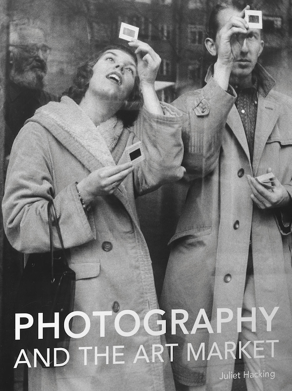
Here is an interesting book.* For £30 you get a handsome 266 hardback pages by the Programme Director of the MA in Contemporary Art at Sotheby’s Institute of Art.  She was previously Head of the Photography Department at Sotheby’s auction house and therefore has much experience of the book’s subject – how the art market for photography functions.

The book is divided into two sections.  The first is aimed at potential collectors and deals with how to navigate the market for art photography.  It starts off at worm’s eye level but soon enough rises to the aspirational.  If you were thinking of starting off a photograph collection then it would be pretty essential reading.  There is detailed advice on establishing authenticity, researching value, analysing auction reports, and recognising pitfalls.  Some of this works on a pretty big scale.  For example, there is what Dr Hacking describes as ‘rebranding an alternative investment portfolio as a curated collection.’ Here is what you do.  You promote a Fund (that is, you interest both private individuals and institutions with the right kind of money) and go scouting for reliably valuable photographs, hoovering up whole collections along the way and attracting more investors as you go.  With a wave of the wand, Investment Portfolio becomes Collection in its own right when you start persuading influential people to talk it up, you sponsor serious exhibitions in which it features, you promote academic conferences which highlight it and you even publish catalogues dedicated to your Collection. Having maximised your brand you then “bring it to the market” and if your timing and technique are right you should have generated such a frenzy that you will make many times what you have spent in putting the brand together.  The author says that the knack for “successful monetisation” is to “conjure up aura”.  

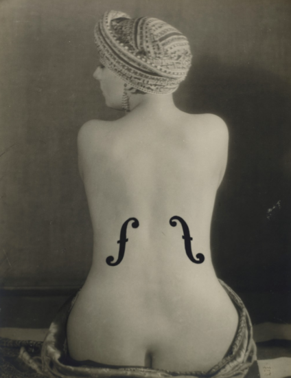
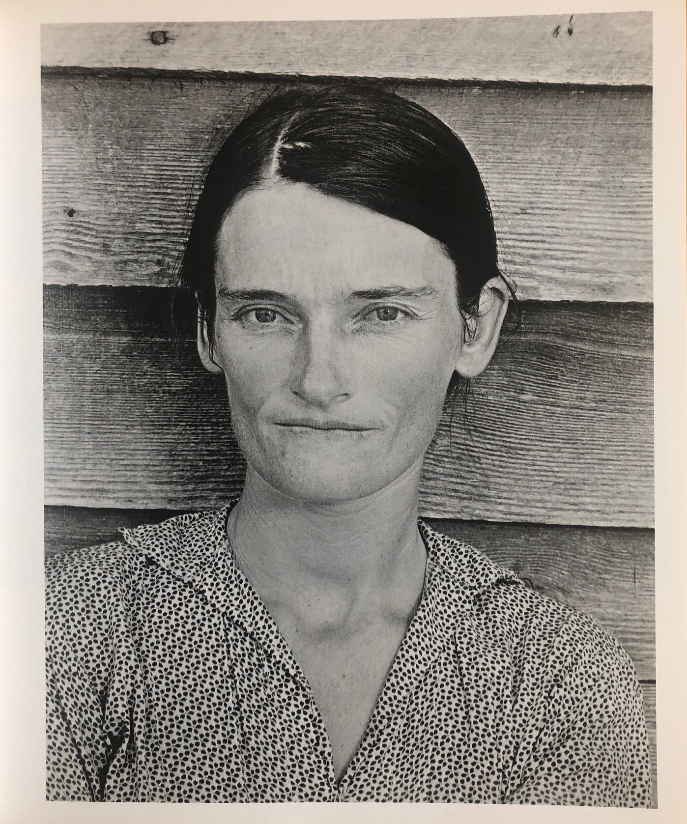
It is Dr Hacking’s main theme that the market is crucial to the making of Art (as opposed to art) and the second half of the book addresses that theme: how photography (or some photography anyway) became Art and therefore became very  valuable.  Dr Hacking’s argument is that there has always been, from the very beginning of photographic history, a distinction drawn between Art-as-photography and photography-as-art.  Few would argue with that. The former is what artists do and the latter is what photographers do.  There is overlap and there are grey areas: for example, in Sotheby’s, Robert Mapplethorpe has been sold as an artist in London but as a photographer in New York.  Traditionally the reverse has been more true, however: those who are big in photography may be unheard of in contemporary Art and vice versa.

Dr Hacking’s survey of the market history of photography makes clear that until well into the second half of the twentieth century it was difficult to get any sort of a decent price for a photo.  But as the value of older art went into the stratosphere, photography helped fill the market gap that was left.  Between 1975 and 1991, for example, photography prices increased by some 680%.  Then when contemporary art began to take off at the beginning of this century photography had to try and hang onto its coat-tails.  By the 21st century six figures for a photograph was no longer exceptional but 99% of all sold photography still falls outside of the contemporary art market and therefore the really, really big prices.

So, if there are these fairly simple economic arguments about supply and demand then how is it, we might ask, that the market can impute cultural value?  Surely, the price paid is a result of that very cultural value and not a determinant of it?

What enables an image to arc across the photography/Art electrodes is a complex institutional circuit, according to Dr Hacking, the wiring of which encompasses critics, dealers, writers, specialists and institutions.  In essence, Art photography is whatever this coterie decides it to be – its nose being guided by artistic pedigrees, track records, market history and personal opinion.  This does seem a curious argument.  It must lead ineluctably to the conclusion that there is no intrinsic quality in the picture itself which makes it Art.   Good, bad or indifferent – it makes no odds.  It is simply the opinions and prices which trail in their wake.  Taking the example of Andreas Gursky’s Rhin II – sold for over £3 million several years ago which was then a world record price for a photograph – you might well conclude that it is indeed a pretty mediocre image.  But the rub is that everything points to its being a very safe investment vehicle.

Like all circuits, the one described by this book might be seen as ending at its own starting point.  What underpins it, that cultural value is determined by price and price is determined by cultural value, may well be true within the walls of the auction house, but it is not necessarily so outside them. It is also an argument which has an interesting parallel with banking until 2008: that was another world in which a group of people considered themselves to be too expert by half - and look where that ended.

Towards the end of this book the author says that we should be asking not why Rhin II is so valuable but how it has come to be so.  Indeed we should, because this Foucauldian question inevitably leads us onto the issue of discourse.  Viewed from this angle we can see that the book is not so much a commentary on that discourse as part of the discourse itself.  The first half is after all a scholarly explanation of how the market functions and the second half is a scholarly account of the history of art photography based on an examination of historical values.  By its very nature it is an account for participants of all kinds and its advice will influence behaviour.

Perhaps surprisingly, there is no comparison in the book between the photographic commodity market and any other enthusiast-based commodity market.   For example, in the historic vehicle market (where Art is not in issue) prices in the last fifty years have also gone through the roof.  If a graph of comparison showed significant similarities in its peaks and troughs with those of the photography market then we might well conclude that it was overall macro-economic factors that affected value as much as judgments about Art.   Put bluntly, the quality of what is being bought doesn’t matter so long as the commodity can deliver a return.  One of Lawrence of Arabia’s series of old Broughs, for example, is always going to maintain value even if that marque’s rear cylinder did overheat with monotonous regularity.

The book is a good read.  The prose is clear, the annotation copious and the author’s pedigree impeccable.  If you want to be a collector you had better read it.  Even if you don’t, its market-based view of photographic history is, I think, a first and, whether you agree with it or not, it is very interesting food for thought. 

*Photography And The Art Market by Juliet Hacking (Lund Humphries, 2018)    

MORE SHADOWS, LESS LIGHT

Back To Tanizaki

The Tanizaki book that I wrote about a couple of posts below continues to smoke around my brain.  I see a link with something that Barthes says in La Chambre Claire: “I  have always had the impression that in any photograph, colour is a coating applied after the event to the original truth of black and white.”

You might think that the opposite was true: that black and white is a style applied to a world of colour.  Don’t you see colour all around you after all?

Yet when I get up each morning for my meditation session something curious happens.  Here in northern Europe at around 6.30 am in winter it is dark.  I settle into meditation and the world that I see through my half-open eyes is monochrome. 

My rudimentary understanding of the physiology of sight is that in low light levels the eye makes use of rod cells – which do not perceive colour, only black and white.   The greyscale in between those two extremes is the rod cells’ version of colour, known as “ghosting in”.  As the meditative minutes pass, the sun comes up and, even on a rainy day, light levels rise.  Cone cells then come into play and replace the monochrome of the rod cells with colour.  The same happens in reverse in the evening but artificial illumination masks it.  For that reason it is much clearer in the countryside than urban areas.  So we see in monochrome or colour depending on the amount of light available.

The decline of black and white photography might be seen as coinciding with the increasing use of electric light.  Since we are drenching the world in colour that is what we replicate photographically.  In older buildings the subtlety of shadow has profound effects.  In churches, castles, old houses, old farm buildings the eye seems often to revert to the monochrome world.  Other senses are brought into play then.  It is a more complete world because it does not rely on acute vision alone.

Seen in this way, colour photography is not a technological advance producing a more accurate view of the world.  It is a regime whose account of the world is a construction.  Your saturation slider therefore has its Faustian aspect: you can have fun - but the price you pay is dazzling.   Tanizaki’s lament for the shadows of his youth and Barthes’ insight into the nature of photography lead us inexorably to this conclusion.

HOKUSAI CRACKS A JOKE

At least I think it’s a joke….

“From the age of six I have had a mania for sketching the form of things. From about the age of fifty I produced a number of designs, yet of all I drew prior to the age of seventy- there is truly nothing of any great note. At the age of seventy-three, I finally came to understand somewhat the true quality of birds, animals, insects, fishes - the vital nature of grasses and trees. Therefore, at eighty I shall gradually have made progress, at ninety I shall have penetrated even further the deep meaning of things, at one hundred I shall have become truly marvellous, and at one hundred and ten, each dot, each line shall surely possess a life of its own. I only beg that gentlemen of sufficiently long life take care to note the truth of my words.” Hokusai.

186583cc3c3e3bae46f4b0b8147809b4.png

GETTING OUT OF THE WAY

 What Is The Photographer’s Input?

CNV00016-2.jpg

A camera is a machine which can stop time and frame space.  A photograph is an image of time stopped and space framed.  That seems to be about it.  The artist might say: “This is how I see it”.  The photographer might say: “This is how it was”.  There may be a little overlap but not enough to suggest that the two are embarked on a common endeavour.   The photograph seems to me to be more like a short poem, or a paragraph that you read somewhere and try to remember because it strikes a chord and sends something wraith-like smoking through your brain.  You try to pin it down but you can’t – any more than you can pin down the essence of your own thoughts.  Or maybe a pop song would be a better simile: something potent but ephemeral.  Some people like to discuss photography’s status as Art and good luck to them: but I feel no impulse to do that. 

I took the photograph above when I was in Paris recently.  Naturally, you can’t be in Paris, camera in hand, and not think of the great French photographers.  They seemed to understand that a photograph is not a message from the photographer but a message from the world.  So they got out of the way of the world’s message.   I have no doubt that their ghosts were in the back of my mind as I peered over this balcony.    Snap, I went.  Time stopped and space framed.